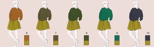
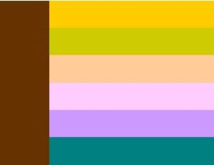
Colors that go together. Matching colors: brown color combinations
It's no secret that people are most often greeted by their clothes. The same can be said about our home. It is assessed by external factors. It's about about stylish and expensive furniture, beautiful wallpaper, modern technology, dishes, etc. At the same time, color combinations in the interior play an important role. Even if you have everything done according to last word and you've invested a lot of money, without the right color combination it could all be in vain. The combination of colors in the interior plays almost the main role. Besides, correct selection color can also play a functional role.
This article is about color design. You will learn what this or that color goes with, its role in the interior and functionality. And, of course, we have prepared a lot of visual photos for you.
What role does color play?
Apartment decoration, furniture, textiles, decorative elements - all this must be correctly selected when it comes to color schemes. The thing is that color evokes certain emotional responses in us. Despite the fact that each shade is responsible for one or another emotion. For example, yellow and orange can tone you up and have a stimulating effect. Blue is calming, refreshing and induces drowsiness. But red, due to its longest waves, excites, gives energy, stimulates and energizes.
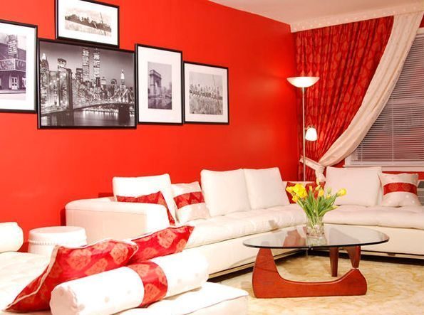
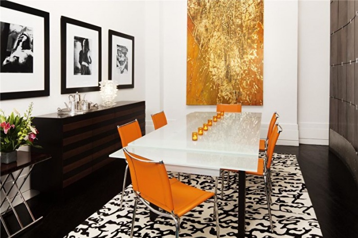
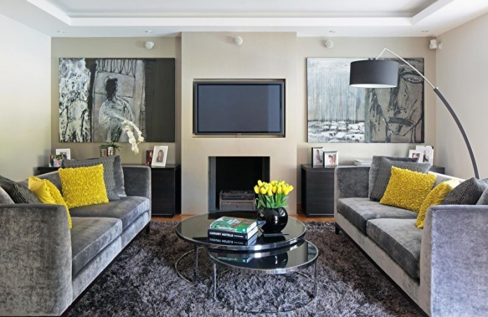
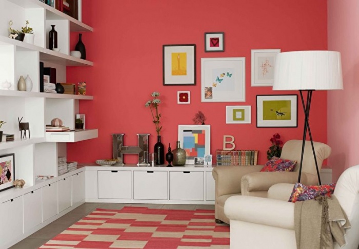
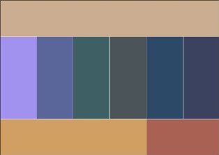
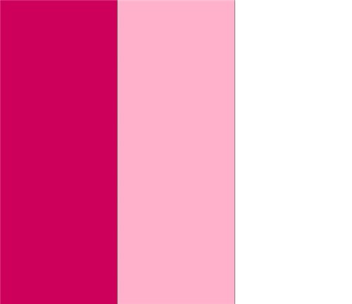
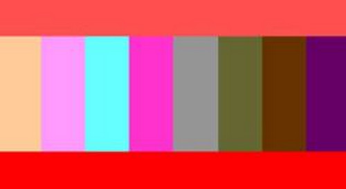
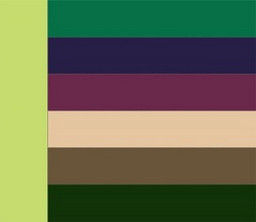
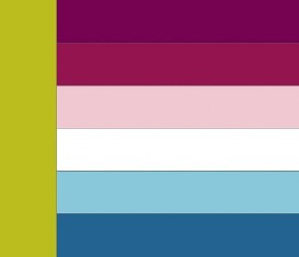
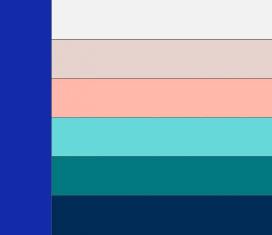
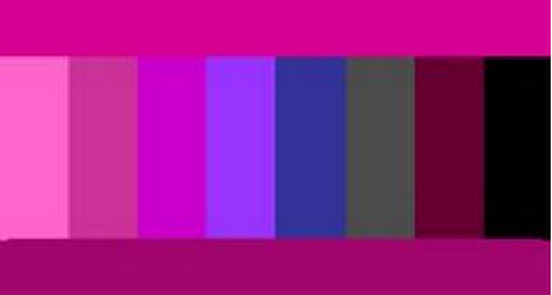
As for combination with other colors, they can be perceived vaguely, cause negative or positive impressions. For example, a combination can promote a cheerful mood or constant irritation, increase your activity or decrease it. Therefore, you need to approach this issue correctly in order to combine one color with other shades wisely and to your advantage. Look at the photo how interesting red and white look for the living room.
But, in addition to this kind of influence on a person, color also determines the perception of space. What does it mean? Agree that the same room, made in light or dark colors, will look completely different. The fact is that light shades expand the space, making it larger, while dark shades, on the contrary, absorb it.
Advice! In this regard, designers use this trick to compensate for the small size of rooms or vice versa.
If you choose the right color palette, it will help you accomplish the following tasks in the interior:
- make the room larger or smaller;
- focus attention on a specific area;
- make the room deep and voluminous;
- make the ceiling larger or smaller visually;
- expand or narrow the space;
- make the interior warm or cold.
As you can see, the color plays vital role in the design of the room. It has the ability to influence us, positively or negatively, and transform a room. Therefore, it is important to find out what certain shades are combined with in order to make your interior harmonious, beautiful, stylish and pleasant.
Shade combination table
Color combination is not just a hobby, it is a huge science that needs to be studied. We won’t go too deep into this, but we’ll look at the basic rules that will help you combine colors to your advantage. So, they will emphasize each other, carry a certain message and fulfill a certain role.
There are 4 methods of combining one color or another in the interior, which are considered basic:
As you can see, the combination of colors in the interior is very important, as it sets the tone for the entire room. Now, let's look at the combination of each individual color so that you can create the perfect interior for your home.
White combination
Everyone noticed that White color is in the center of the circle and adjacent to all other shades. That's why it's called basic.
What can it be combined with advantageously: with everything pastel and clean bright colors. For example, white is combined with black, gray, gold. As for warm tones, the use of cream is recommended.
The advantage of white is that it goes with every other color. What influence does it have? It makes the room seem clean, spacious and filled with daylight.
Note! If you go overboard with white and do not dilute it with other shades, the room will look like a laboratory or hospital.
White is suitable for those who want to decorate their bedroom, bathroom or living room.
Gray combination
It is a bit reminiscent of white and also goes with many colors, almost all. Here is a list of recommended tones:
- green;
- blue;
- blue;
- yellow;
- purple;
- orange;
- white;
- pink;
- black;
- red.
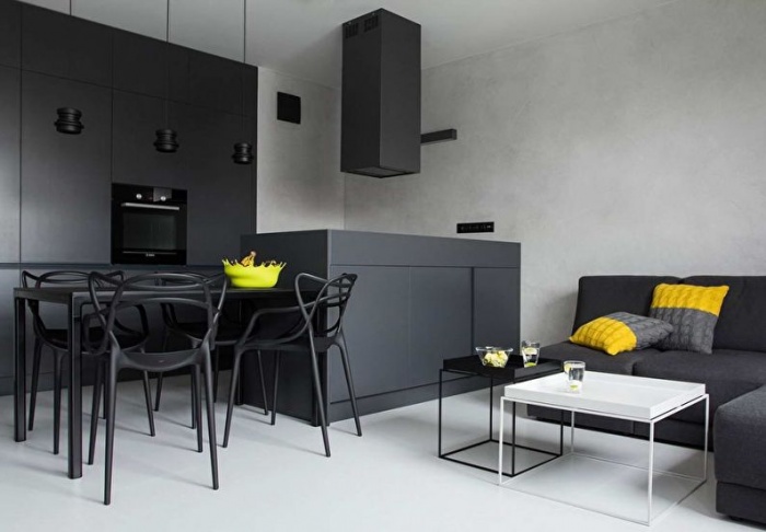
Look at the photo of the combination of gray and beige in the interior.
It looks really beautiful and mesmerizing. The only two colors that gray does not go well with are brown and gold. Gray itself is neutral and does not evoke any emotions. It is associated with shade, rain and winter.
Note! If you make the gray monochrome, then such a gloomy interior can cause depression. You need to be careful in this matter.
The color can be used for bedrooms, kitchens, offices or studios.
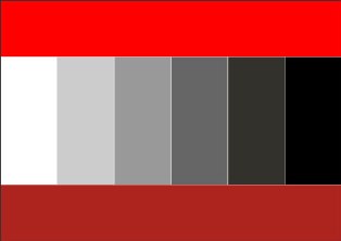
Black combination
This is a special color that does not go well with everyone. You can combine it with gray, white, gold, green, purple, red, orange. But it is not recommended to use it with pastel, blurred and shaded colors. It doesn't fit with them.
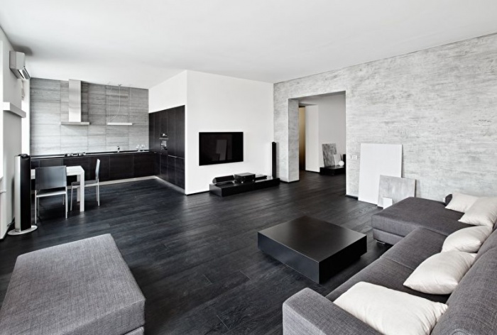
The black color itself has status and creates a luxurious atmosphere. It will remind everyone of the night. However, it is not suitable for small rooms, as it can visually reduce the space. Therefore it is used for large hall or studio.
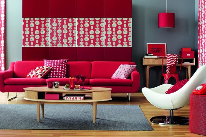
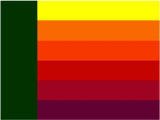
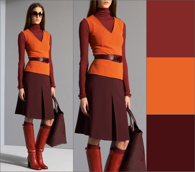
Combination of red
A favorite color for many. Ideal for Brown, white, gray, gold, black, blue. It doesn't look so good with pastel colors, but with green it can seem extravagant.
Red has a very active effect on a person, promoting arousal. nervous system and increased activity. Although, on the other hand, it is not entirely suitable for children, as it can cause aggression or anxiety in them.
The color can be used in the kitchen, living room and hallway.
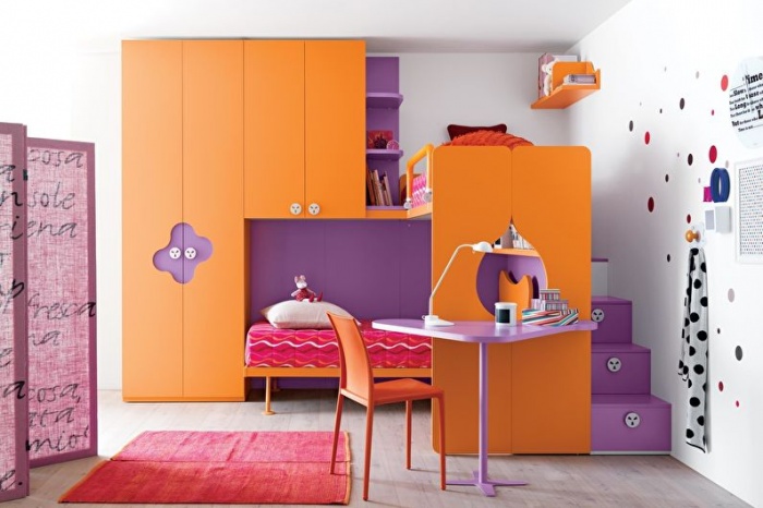
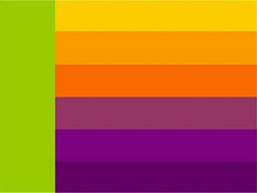
Orange combination
It can also be called unique, as it goes with everyone. The most advantageous combination of orange color looks along with brown, green, purple, pink, white and blue.
The color is friendly, warms and pleases. It is a vibrant representation of sun, summer and citrus. Thanks to the color orange, you can improve your communication skills, gain energy and get in a great mood.
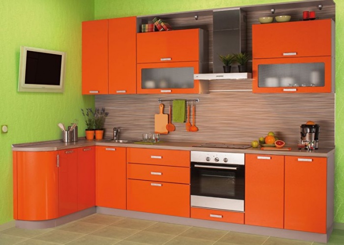
However, it is not recommended for use in hot climates. But it does not promote relaxation. Can be used for the interior of kitchens, living rooms, children's rooms.
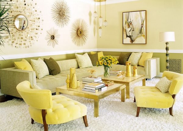
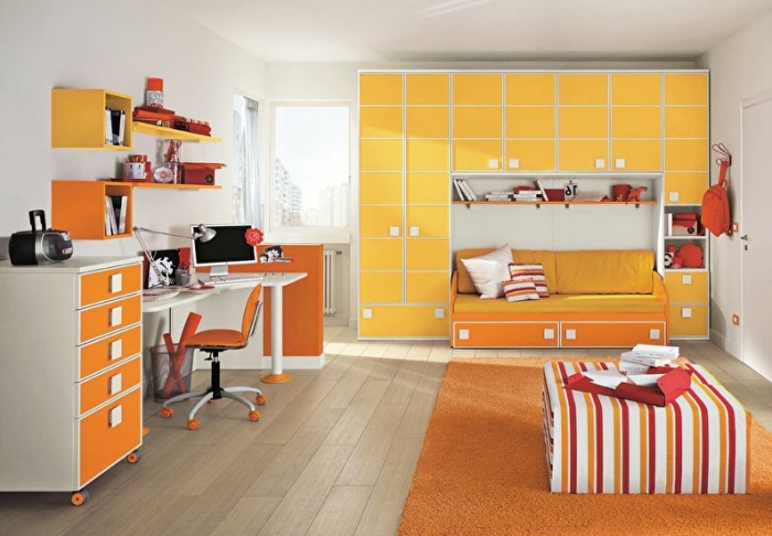
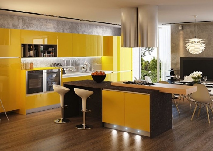
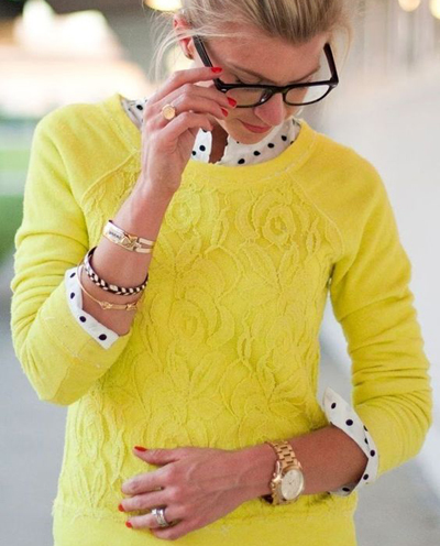
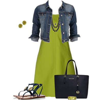
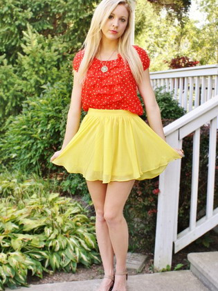
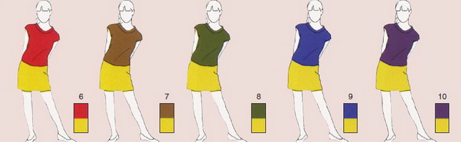
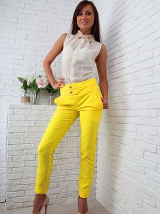
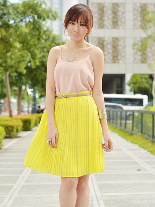
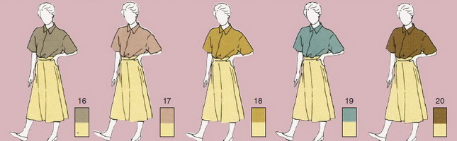
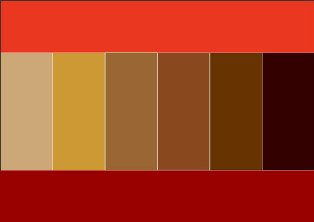
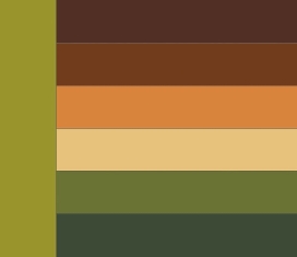
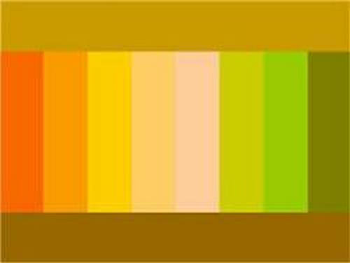
Yellow combination
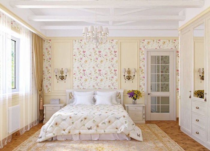
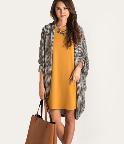
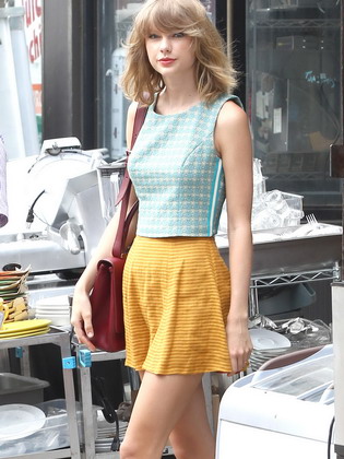
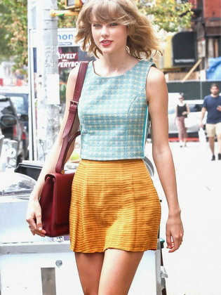
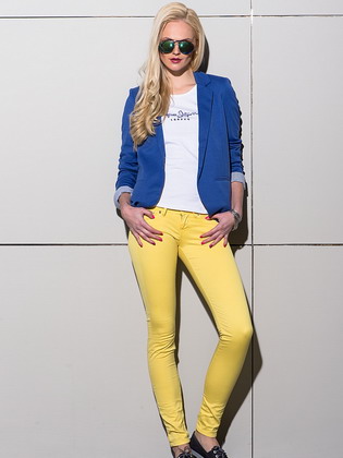
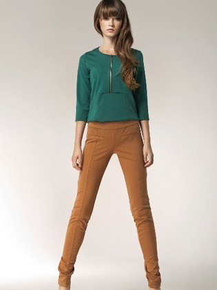
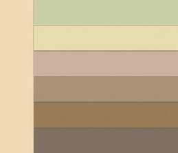
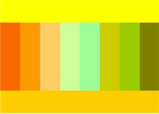
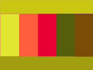
It can be combined with brown, orange, purple, gray, white and light green. Although, it also goes well with other shades, like white and orange. Look at the photo how laconic it looks with brown and hints of light green.
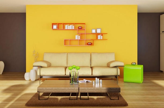
It is an open color filled with warmth, joy and mood. It is able to illuminate a room, concentrates attention and gives a boost of energy.
Advice! Long-term exposure to bright yellow color causes fatigue.
This is an ideal option for offices, kitchens, living rooms and children's rooms.
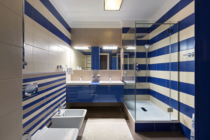
Blue combination
Combination of blue color very interesting. It looks great with white, gray, orange. Blue and dark green also suit him. Blue goes with everything if used skillfully. But in combination with red you need to be careful.
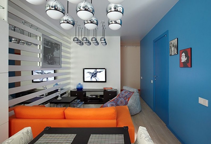
Blue is immediately associated with the sea, darkening sky, thunderstorm. It gives peace of mind. Use is recommended for bathrooms, living rooms, bedrooms and children's rooms.
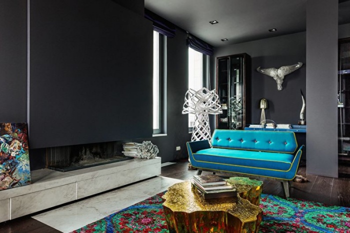
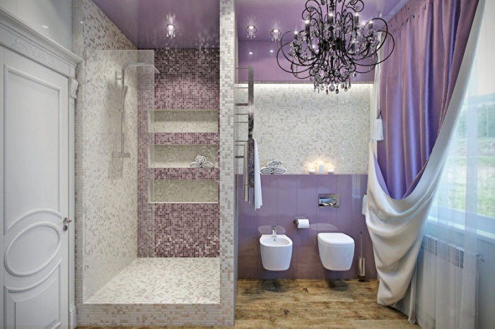
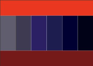
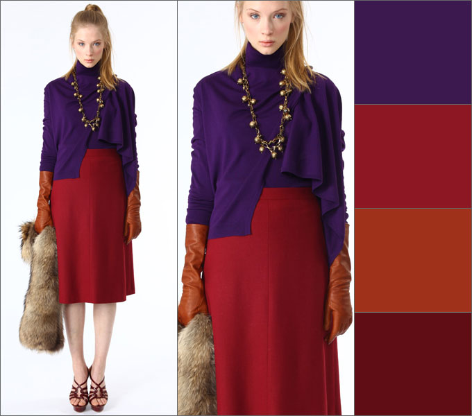
Combination of purple
Purple color is not used very often in interiors, as you need to be careful when using it. It looks great with white, green, beige, yellow and orange. But it doesn’t go well with brown and black.
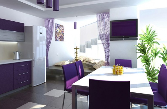
The color is quite mysterious, typical of romantics, dreamers and those who are delighted with fantasy. It can reduce appetite and even depress. Used for bathrooms and living rooms. Sometimes for the bedroom, but in minimal quantities.
A few more combination options
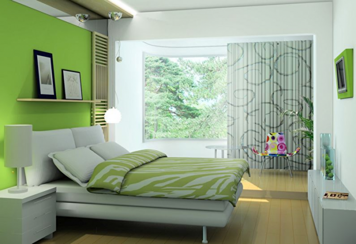
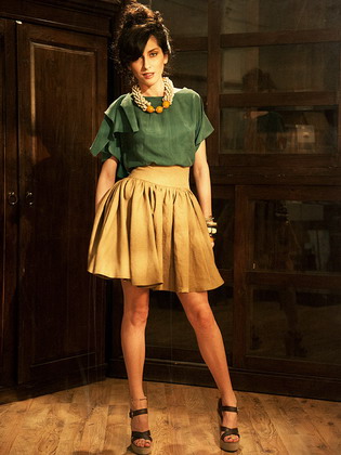
Now let's look at colors that are not used so often. Eg, green color in the interior it is combined with brown, gray, white, black, pink and yellow. This is a calming color that can refresh you and give your eyes a rest.
Pink color is suitable for white, gray, beige, pastel blue. It is more feminine and is able to create a pleasant, soft and light atmosphere. In the interior it helps eliminate depressive thoughts. Although, it irritates very active and tense people.
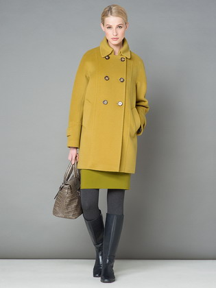
In order for the combination of yellow color in clothes to look harmonious, you need to know which colors are best to combine it with. This warm, cheerful shade has a wide range of tones, from washed out cream to rich mustard. Experts believe that yellow the color is coming girls with both warm and cold color types of appearance. The main thing is to find your ideal tone.
Shades of yellow for different types appearance
“Spring” color type. The main advantage of this type of appearance is the warm honey skin tone. Representatives of this color type have light hair and eyes. Golden freckles are often present on the skin. If we talk about color in clothes, then the “spring” wardrobe may contain cold, medium and warm colors. Representatives of this color type are suitable for almost the entire yellow palette. The only exceptions are shades that are too pale or contain an admixture of gray.
The “autumn” color type also refers to warm color type. Unlike “spring,” she needs darker, richer, richer colors in her clothes. Yellow color is suitable for “autumn”, you just need to choose shades that have a blue or red undertone. These include:
- pale yellow;
- pink-yellow;
- yellow-orange;
- pear color;
- pale yellow;
- mustard;
- apricot;
- honey
Summer color type. The main feature of the appearance of this type is a cold skin tone. Moreover, it can be both light and dark. The wardrobe of representatives of this color type should consist of clothes and accessories in cool or neutral colors. Warm shades will only emphasize the pallor of the skin. Complex multifaceted shades should be preferred to bright colors. Greenish shades of yellow are not suitable for cold “summer”. Ideal option: sand, golden, straw shades. Absolutely not suitable dark shades yellow.
“Winter” color type. Type of appearance based on contrasts: dark hair color, bright eyes, pure shade without impurities, snow-white or bluish whites. The skin is most often light, with a blue glow; it can also be dark, but then it has an olive undertone.
“Winter” is suitable:
- pure yellow;
- neon yellow;
- lemon yellow.
Contrasting appearance types do not suit:
- golden;
- egg yolk color;
- light delicate yellow shades;
- orange-yellow.
Cream - a feminine shade for real princesses
Cream color consists of a combination of yellow and white with an admixture of beige. This is a soft, sweet and delicate color. This is not the most universal color. You need to be careful when choosing companions for this shade. Creamy does not go well with bright colors. For everyday look A combination of cream with darkened shades of green and blue is preferable.
Choosing cream for special occasion, you should complement it with gold accessories. A small shiny handbag will complete the look. A cream-colored evening outfit goes well with all shades of darkened red: wine, lingonberry, cherry.
Cream is an excellent choice for a “summer” type of appearance. A light bleached shade of yellow will emphasize aristocratic appearance and good taste.
Fawn - universal yellow
A muted yellow color that will look good both during the season and in the snowy winter. Its universal qualities do not end there: the shade is suitable for girls and women of any color type. The main thing is to correctly combine it with other colors.
Fawn looks good in everyday urban ensembles. It is suitable for styles such as casual, shabby chic, smart casual, rustic, Greek. Fawn is a shade more suitable for plain items, but it is also good for clothes with floral ornament or folk motives. For bright evening looks, it is better to choose richer shades of yellow.
This is a light natural color that blends organically with soft tones. In autumn and winter, ensembles made from muted yellow shades and the entire spectrum of shades of brown look especially expressive. Dilute and apply bright colors Pumpkin, carrot, olive, indigo will help.
Spring and summer require a more saturated color scheme in the image. IN sunny days The fawn shade is best combined with natural shades of red, blue and green. It can be brick, pale carmine, ultramarine, blue, asparagus, sky blue. For stylish look You should choose no more than three shades in natural colors. They can also be diluted with white.
The classic combination is a combination of fawn with, black, gray. For dynamic street style A look with muted yellow and distressed or washed denim works great.
Lemon shade - a juicy symbol of summer
This color suits blue-eyed girls with blond hair and snow-white skin. The only caveat is that the color should not contain green inclusions. Stylists also recommend that blondes combine lemon with contrasting shades. For ladies with tanned skin, a bright lemon shade is suitable. This outfit should be paired with cool colors.
Buttercup petal color (calm yellow)
It is believed that pure yellow suits everyone. But still, a lady with a “spring” type of appearance needs to be careful with bright colors. If you want bright colors, then it is better to buy a yellow skirt and choose a neutral color for the top. These include white, shades of denim, sky blue, pale blue, cornflower blue. An unusual set can be made from a blouse in blackberry, cherry and raspberry tones and yellow or trousers.
Canary - color with the aroma of mimosa and lemon
This shade is suitable for girls with a contrasting type of appearance. Color is associated with sun rays and the Brazilian carnival. To create an understated look, canary can be combined with muted shades of lilac, pink and purple. For a bright, dynamic look, pure shades of blue and green are suitable for this color. A win-win option is a union of mimosa color and white, black or gray. Like any other shade of yellow, canary goes well with any denim outfit.
Chartreuse - the color of spring and youth
A complex, multifaceted shade that combines yellow and green tones. Chartreuse is the color of spring dandelions and the first, timidly emerging leaves on the trees. This color is ideal for people with the “spring” color type. Chartreuse works great in both contrasting bright combinations, and in tender unions, where one shade passes into another.
The main companions for this color are green, gray, blue, cyan, warm and cold pink, orange, red.
Brave and bright composition colors for spring or summer: chartreuse combined with pink, nude peach, royal blue, chocolate, brown and deep black. It will be difficult to take your eyes off such a complex but incredibly beautiful flower arrangement.
Composition of shades for yokes: chartreuse in combination with light pink, magenta, golden olive and ultramarine.
Union of flowers reminiscent East Dance: Medium Chartreuse, Tangerine Orange, Crimson Red, Royal Blue and Brushed Bronze.
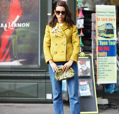
Mustard
Mustard is a rich dark yellow color of a fiery spice. Girls with a cold appearance need to be careful with this shade.
0No, not my thing at all 1 19 19 0
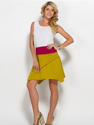
The combination of yellow in clothes is always advantageous - it creates a feeling of joy and high spirits. Such ensembles look amazingly sunny and bright. Combinations in clothing look no less harmonious mustard color and soft cream. These sets are usually delicate and sophisticated. Look what good images can be created using clothing parts of these colors.
Successful combinations of yellow with other colors in clothes
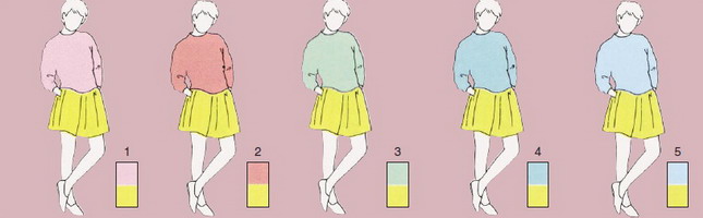
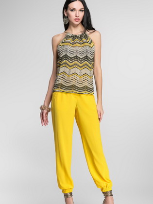
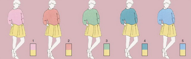
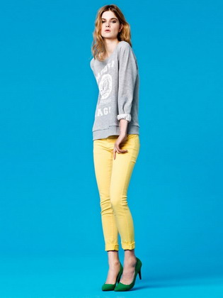
Dandelion color is a bright and vibrant shade of yellow. Pairs well with warm and cold color scheme, as well as with neutral shades. The combination of yellow with other colors in clothing always makes a pleasant impression on others.

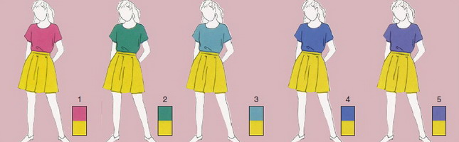
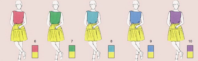
1 - good combination yellow with “sweet” pink. 2 is a cheerful and refreshing turquoise. 3 - . 4 - sports marine. 5 - perky light purple.

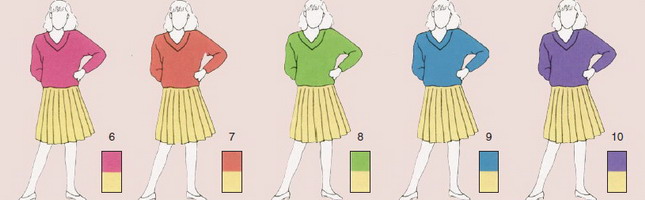
6 - a cheerful combination of red and yellow. 7, 8 - natural shades of gray, in an interesting way combined with yellow. 9 - classic bright marine. 10 - eccentric purple.

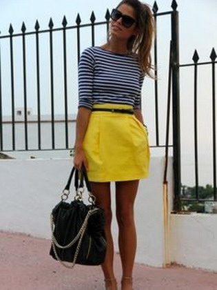

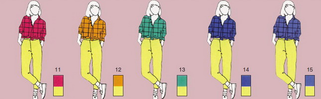
What to combine yellow with in everyday outfits? 13 - strict brown; for everyday wear. 14 - ash gray, for city walks in the autumn season. 15 - unique taupe.
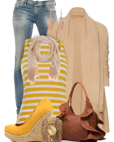
Pay attention to the photo: it is always beneficial to complement the combination of yellow color in clothes with jewelry:


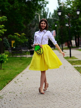
The combination of yellow with white and other colors in clothes
Yellow Primrose is a fresh, bright and light shade of yellow. It is a soft and lively color, great for pairing with bright shades. Good replacement basic yellow and orange flowers, in comparison with which primrose looks softer and suits everyone. A wonderful choice for the spring season.
1-5 - pale pastel shades will serve good decision for creating unusual image. You should focus on cotton fabrics.

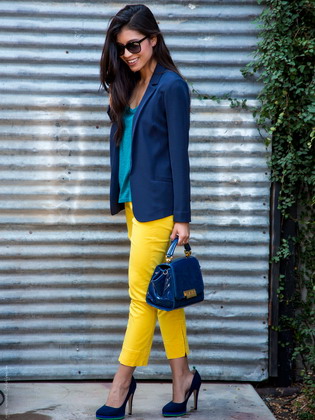
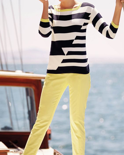
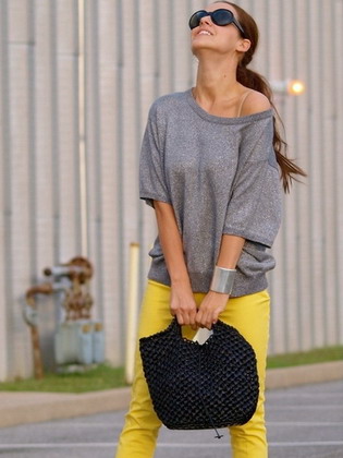
6-15 - bright, vibrant colors and light pastel shades, pleasant and refreshing. Will bring a completely new mood to your appearance. The combination of blue and yellow creates a cheerful mood; you can also use various colors for this purpose.
![]()
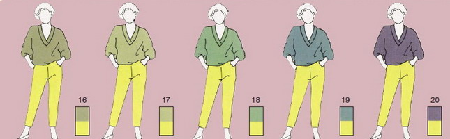
16-20 - pay attention to the photo: combination of yellow in clothes gray shades creates a pleasant effect of softness and modesty in appearance. It's lightweight and elegant style, suitable for the work environment. It should be noted that in in this case It is better to use natural cotton trousers as bottoms.


21, 22 - the combination of blue and yellow is modern solution to create an intelligent appearance. 23-25 - combination with shades of khaki and olive will make you feel quite free. A good choice for summer holidays.


26 - coffee shade will add elegance and grace. 27 - this combination of yellow and white in clothes will add brightness and smoothness to your outfit, significantly refreshing your appearance. 28-30 - yellow and gray color scheme is a reasonable and not too harsh combination. Thus, you will look stylish and modern, fitting well into a working office environment. The combination of yellow with white and other delicate colors in clothes always looks win-win.
Cream color and its combination in clothes
Slightly soft yellow tint. Knitted cream dresses and trousers are an excellent solution for autumn and winter for ladies of any age. Try pairing cream with a flannel oversized sweater for an everyday outfit. Avoid wearing clothing made from rough fabric or wool.

1-5 - pale pastel colors, intelligently combined with a cream bottom. A compromise between severity and softness in appearance.


6-15 - a range of shades that pleasantly please the eye in any environment, allowing you to look neat and impeccable. When combined with open tops, this solution is ideal for summer sun and green vegetation.
16-25 - neutral and perfect for anyone who is looking for not too bright and catchy solutions for the autumn winter season, especially older ladies. This is a suitable pattern for a casual outfit for the spring or fall season.
16-20 - soft grayish shades outerwear will please the eye in a calm environment. At the same time, a successful combination with a cream bottom will create smooth transitions in appearance.


21-25 - more bright shades Great for creating contrast. This color scheme in combination with fashionable trousers will give your appearance more sexuality and intelligence.

25 and 26 - deep blue and purple shades, literally created for regularity and elegance. 27 - dark blue harmonizes well with a light bottom and will look bright in the winter season. 28 is a good combination with gray, which is refreshing and elegant. 29 - is classic solution for every day, giving a strict appearance without frills. 30 - an almost black shade will also make you look businesslike and perfectly diversify your work style.
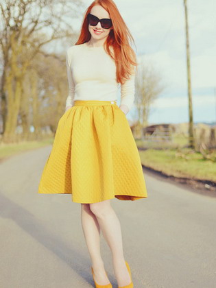
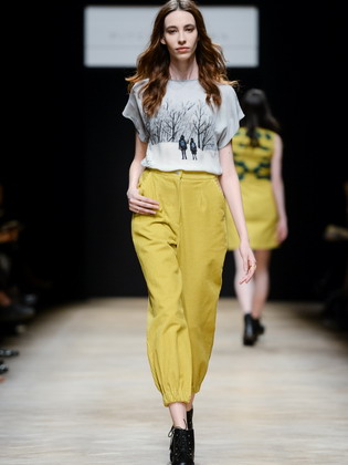
Beautiful combinations of mustard color in clothes
Mustard is a dark yellow, rich shade. Creates an expressive and vibrant appearance in beautiful combination with the same rich colors. With softer shades it looks calmer - for example, in combination with brown. When combining mustard color with other colors in clothes, trousers are perfect as a bottom, which can be worn in the summer and autumn seasons.


1-5 are a bright combination, moderately serious and moderately playful, which is suitable for every day.
![]()
6-8 - dark gray shades are excellent in compatibility with mustard, creating smooth transition between top and bottom. This scheme is good in quality office suit, as well as attire for special occasions.

9-13 - a wide variety of shades from red to blue allows you to use all your imagination and choose the most suitable combination in style. This way you can always stay on top of fashion. 14 - a refreshing white color will be a compromise option that will look great in any environment. 15 - classic combination with black it will be a worthy solution for every day.
Dressing monochrome, when all the details of your toilet are the same color, has long been a sign of bad taste.
There are few exceptions to this rule - if you are not a bride or in mourning, then your clothes should contain three shades - the main color, an additional color that harmonizes and shades the main one, and, possibly, a contrasting detail, an intriguing color accent.
Selecting and combining them correctly is often a very difficult task. We already talked about this in the post
There are colors that are most flattering for you. And their skillful combination with the rest creates the concept of elegance and taste. The lucky few are naturally endowed with subtle artistic taste and color perception, can choose color scheme wardrobe, relying on your intuition. For everyone else, in order to always be stylishly and tastefully dressed, you need to learn a few rules.
White color goes with all colors. White lifts the mood and is used to treat diseases of the central nervous system. White is the color of purity and clarity. The color of justice, faith, innocence and beginnings. This is a blank slate from which history is written. By giving it preference in clothing, you are entering a new time for yourself. It is better suited for creating contrast than any other.
White and black are the best combination of colors in clothes: photos of women in them always look solemn. When combining it with other colors, it is worth considering the fact that white casts glare and visually enlarges things.
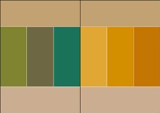
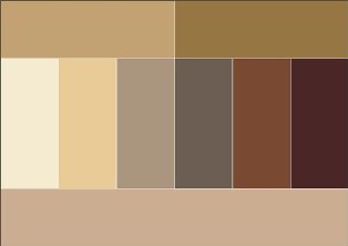
Beige color combination table
Beige color boldly combines with calm tones, and can also be perfectly combined with richer and brighter tones. Beige color is combined with colors: khaki, marsh, cocoa, gray, taupe, chestnut, chocolate, yellow-green, olive, rusty brown, terracotta, eggplant, purple, bright blue.
 |
 |
 |
 |
 |
 |
Pink color combines with white and soft blue, with light gray, intermediate between red and white tones.
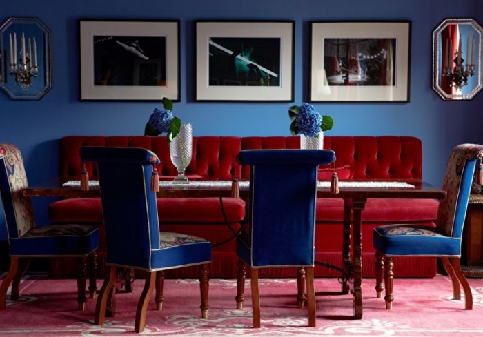
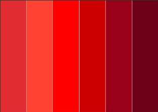
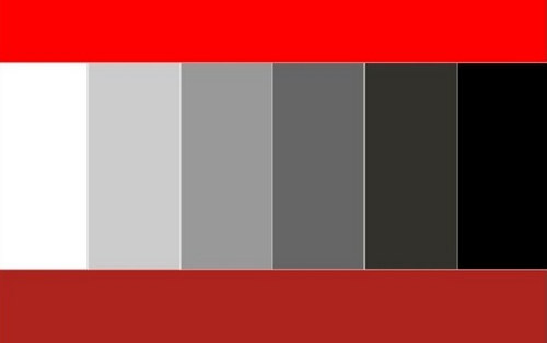
Red color combination table
Red color combines with yellow, white, brown, blue and black, lilac and pink, black and silver, black-brown and sand. Red tones are now boldly mixed with each other, and look stunning at the same time. A more moderate option is to combine red with black.
 |
 |
 |
 |
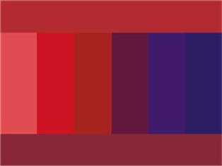
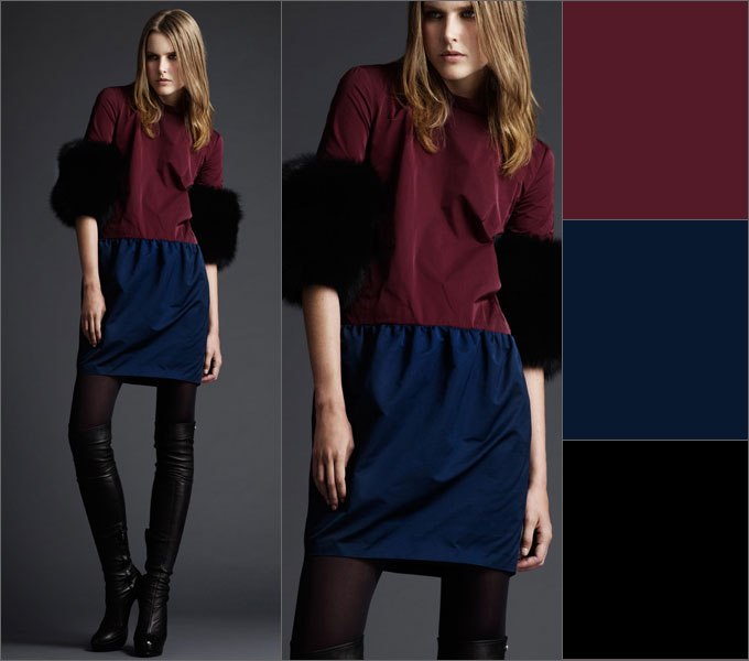
Bordeaux color combination table
Bordeaux- the color of a woman who knows her worth. Bordeaux goes well with black and dark blue, as well as with colors: green, olive, gray, blue-green, tomato and other shades of red. Berry tones go very well with Bordeaux: blackberry, blueberry, elderberry.
 |
 |
Raspberry color combination table
Fuchsia, crimson, purple colors combined with colors: yellow, orange, dark green, green, bright blue, purple. Raspberry color also harmonizes well with pink and white colors.
Coral color combination table
Coral color has twelve varieties, these include pink-orange shades and rich red-orange. Combines with colors: white, beige, gold, nude, brown, dark brown, khaki, shades of gray, scarlet, pink-peach, lilac, lilac, hot pink, orange, yellow-orange, pale yellow, dark blue , gray-blue, black.
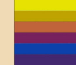
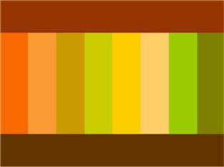
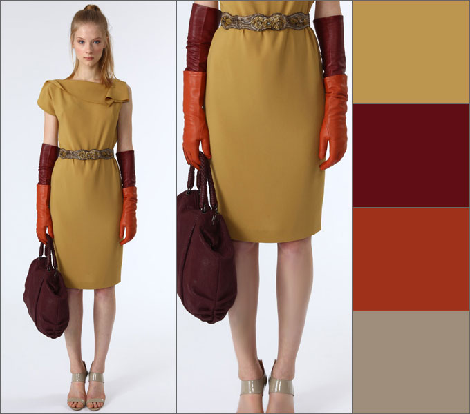
Yellow color combination table
Yellow- represents the sun, wisdom, fun, self-confidence and freedom. Golden color- This is the color of fame and wealth.
Yellow color goes well with colors: marsh, blue-green, orange, warm brown, chocolate, black, dark blue.
Golden color goes well with colors: olive, brown, red, purple, dark green, violet.
Yellow color - with blue, violet, lilac, turquoise. Yellow color without decoration or addition to it is unattractive.
 |
 |
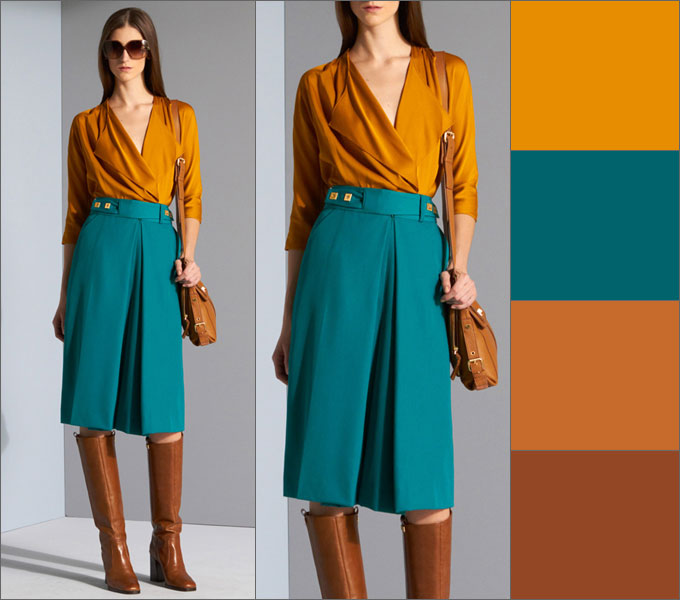
Orange color combination table
Orange color- cheerful, bright, summer and positive color, dynamic and ethnic, the color of the brilliance of the setting sun.
Bright orange color goes well with bright colors: bright yellow, mustard, beige, purple, brown. Muted orange or terracotta goes well with calm shades - pale yellow, gray-green, khaki, brown, chestnut, chocolate, navy or taupe.
To orange and yellow flowers The contrasting black color is very suitable.
 |
 |
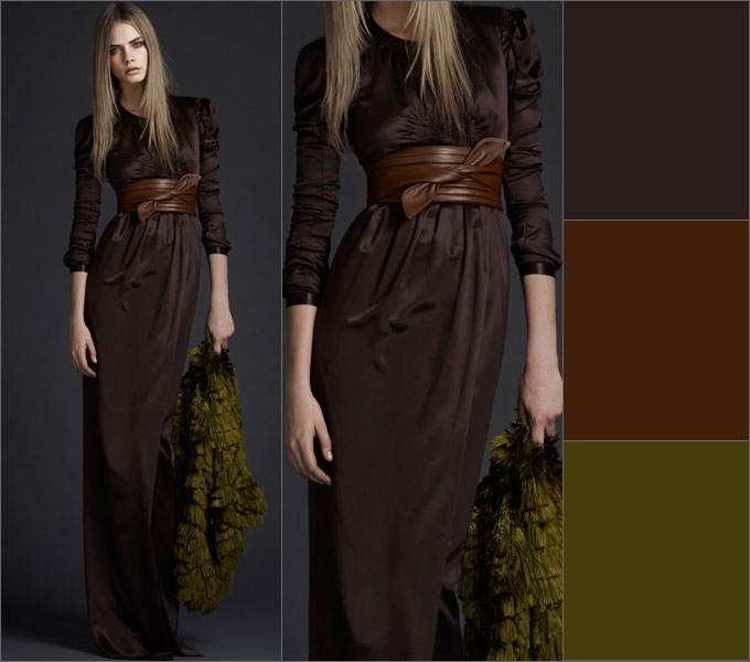
Brown color combination table
Brown color goes with sky, cream, yellow, green and beige, denim blue, smoky blue, light green and white; the color of May grass and very light green, lilac and faded pink.
Brown color goes well with olive, gold, blue-green, orange, lilac, light pink, all shades of beige, ivory and gray. And the unexpected and extremely successful combination of warm brown and turquoise will make an excellent impression.
Rusty brown combined with plum and brown; purple with orange and creamy white; light green with camel; red with yellow and creamy white; brown with blackberry.
 |
 |
 |
 |
Green color combination table
Green color- with brown, orange, light green, yellow and white flowers and only light greens - with gray and black tones. It is intermediate between cold and warm tones.
 |
 |
Olive color combination table
Olive color harmonizes with colors: blue-green, warm green, khaki, apple green, herbal, eggplant, burgundy, cherry, purple, dark purple, brown, golden, red, orange.
 |
 |
Mustard color combination table
Color of mustard goes with colors: brown, chocolate, terracotta, yellow, beige, khaki, blue-green, coral, hot pink.
|
|
 |
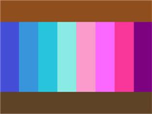
Blue color combination table
Blue color goes with orange; brown and peach, khaki and faded orange, creamy white, blackberry with splashes of brown, light brown and tomato; greyish-orange and purple.
Combine night blue with caustic pink and pine green; red and white; pale pink with dark brown and silver; May greens with blue-green; gray with bright yellow and pale pink.
Blue color comes in light and dark tones.
Light blue- with white, yellow, orange, pink flowers, is intermediate between red and blue.
Dark blue- with light blue (cyan), gray, red,
denim blue, smoky, plum blue; with green and white; gray, light pink and brown; pink and green-blue; vanilla yellow and light blue; dark brown, purple.
 |
 |

Blue color combination table
Blue goes with colors: pink, lilac, coral, light purple, yellow, bright blue, dark blue, gray, white, beige.
Turquoise combines with white, yellow, orange, purple, blue-green.
 |
 |
Table of combinations of purple and lilac colors
Purple- the color of nobility and luxury. Pairs best with blue.
Purple- with white, yellow, orange, pink flowers, is intermediate between red and blue.
Bright hues purple are called purple. They are combined with yellow, orange, gray and white colors.
To lilac color They include the colors of violets or dark lilac inflorescences, violet. Lilac is the color of femininity and is associated with sophistication, grace and elegance. The color lilac goes best with dark neutral shades - black, gray or dark blue.
Purple colour and all its various shades are considered one of the sexiest, mysterious, mysterious and sensual flowers.
Lilac color goes well with colors: pink, white, blue, lilac darker or darker light shade, lemon, faded rose color, silver shades, blue, cornflower blue, lilac and violet.
Lilac pink goes well with lavender and dark blue; dark brown with pink-red; brown with light brown; silver with denim blue and yellow, goes well with lavender.
|
|
 |
Gray color combination table
Grey colour- the color of elegance, intelligent, harmonious, calms contrasting combinations, used in a business dress code. Light gray looks good in the finest natural lace or sensual silk, graphite gray in suede, and smoky gray in fine wool.
Gray color is boring, so it is better to combine it with contrasting colors: white, blue, black, burgundy, red. For an elegant outfit can be combined with other shades of gray, lighter or darker, and even beige color. Light gray color is best combined with pastel colors: soft pink, yellow, lilac, blue, purple, coral.
Gray-blue goes well with ocher, white and brown; with brown and beige; with purple and pink; with lobster red, turquoise and white; with silver and blue; with May greens and white.
 |
 |
Apricot blossom goes well with camel and brown; light brown, beige and splashes of pink; gray-blue, blue and ocher; sky blue; green, white and silver; red and white.
Camel color combines with gray-blue and purple; beige-brown, blue and lilac; ocher and brown; yellow, red and white; green and white; lobster red.
Khaki color combination table
Khaki combines with gray-orange and tomato; lobster red and white fur color; blackberry, plum and yellow-gold; golden and blue-green; red, soft green and peach; purple, red and peach.
 |
|
 |
 |
It's even better if you pair a solid khaki with a printed garment in these vibrant colors.
Black, white and gray colors
Looks good black color
Here are examples of some successful color combinations
1.
light and dark olive, dark pink and magenta
2.
burgundy, dark blue, black
3.
pink, blue, sepia tones
4.
light blue, blue, beige and dark brown
5.
6.
ash pink, anthracite, blue majolica, ocher
A rare example when light contrast in an active multi-color combination looks organic: 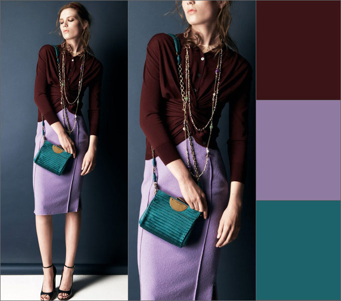
7.
shades of beige and brown, ash lilac, gray
8.
blue, dark olive, dark blue, deep purple
9.
The two looks are based on the same thing color combination - terracotta, khaki, turquoise, nude
10.
terracotta, carrot, dark cherry
11.
cherry, blue and plum, complemented by achromatic shades
12.
indigo, lingonberry, dark orange and burgundy
13. taupe
, burgundy, dark orange and brown
14.
plum brown, cinnamon, dark olive
15.
saffron and turquoise with red-brown shades
16.
mustard, burgundy, dark orange,
taupe
Avoid:
Red and purple, brick, orange, olive, pink, brown, chestnut.
Pink and with blue, olive, red, chestnut, ultramarine, lilac.
Orange And purple, red.
Dark blue and black, sgreen, pink, brown.
Fpurple and with lilac, red, brick.
Lavender and parma color.
Golden And pink, lilac
Yellow and burgundy, pink.
Grey And brown, beige.
Black, white and gray often used as decoration.
Looks good black color in the vicinity of orange, yellow, pink, red, lilac and salad tones, with caustic pink, gray, lemon, indigo, gray, lush green with azure, pale green with bright green.
General rules color combinations in clothes
The right combination of colors in clothes will make your look complete and harmonious. General rules say that this can be achieved by combining:
- contrasting colors, for example, cherry - pink, blue - cornflower blue, lilac - lilac, green - light green. Such combinations are used in various types clothes.
- P olutonal colors, for example, soft pink - soft blue, soft salad - soft lilac.
- solid colors, for example, brown - beige, light red - dark red. Such combinations are used in casual wear and clothes of overweight women.
All pastel colors are combined with each other, regardless of shade.
Pastel colors - beige, peach, pink, light blue, etc. Those. all colors that add a lot of white. These colors can be combined with each other in any order. Be careful with pink - the only color that is fattening.
Use from 2 to 4 colors. If you use only 1 color, it creates a feeling of dullness and paleness. If you use more than 4 colors in your clothes, then when they see you, people's eyes jump from one color to another, not knowing where to stop, which unconsciously increases anxiety.
Can be combined with each other either related or contrasting colors
. All other options are inharmonious.
Related- these are colors that differ from each other in shade (red, pink, dark red).
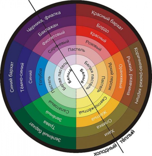
Contrasting- these are colors that are completely opposite (purple - yellow, blue - orange). The only contrasting combination that is risky is green and red. You can find out which colors are related and which are contrasting using the color wheel.
Choosing the right color of clothing and correctly putting together a style ensemble is a very difficult task, but very necessary. The ability to do this stylishly and successfully will save you from questions about whether this scarf will suit my look, what jewelry to choose today, whether my bag matches my shoes, etc. It would seem that such simple questions, but they require solutions every day. Just look at these diagrams like a cheat sheet - and everything will be fine.
Based on materials from izuminka-club.ru, fashion-fashion.ru