Brown saturated color and enhanced contrast. Color contrasts
The word "contrast" is constantly present in our lives. We use it when we compare two things that have different values on one feature, and the further these values are, the stronger the contrast. Now I want to talk about color contrast - how it happens and why you need to know it.
In coloring, 7 types of contrast are distinguished:
color contrast,
contrast additional colors,
contrast of light and dark,
saturation contrast,
temperature contrast,
area contrast,
simultaneous contrast.
Let's see what each of them represents.
color contrast
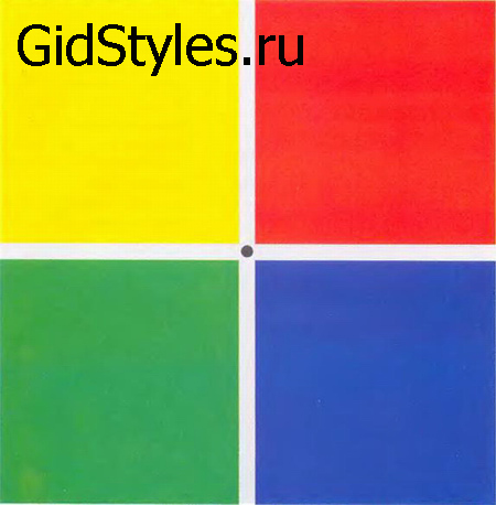
The simplest of all types of contrasts is a combination of pure colors of the spectrum. The strongest contrast is created by the basic colors: blue, red and yellow. Color contrast can be enhanced by adding achromatic white or black. The use of contrast in color in clothes gives it brightness, decorativeness.
Complementary color contrast.
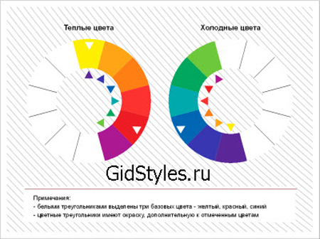
To understand the essence of this contrast, it is necessary to introduce the concept color wheel. Isaac Newton, back in the 17th century, decomposed the color of the sun into 12 shades of the spectrum and placed them on a circle. In addition to the 7 primary colors of the rainbow, such a circle also includes transitional colors.
The contrast of complementary colors is based on the combination of colors that are diametrically opposed on the circle. Being side by side, these colors emphasize, reinforce each other, thereby creating a beautiful contrast.
Lightness Contrast
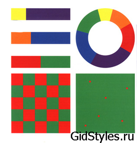
The strongest contrast in lightness is formed by white and black, when comparing shades of gray, the contrast decreases. But not only achromatic (black, white and gray) colors can be contrasting in lightness. This is where the color wheel comes in handy again. If we translate chromatic colors into black and white, we will see different shades gray - from almost white (yellow) to almost black (purple). The weakest contrast is created by red and green, since in black and white they correspond to approximately the same shade of gray.
The contrast in lightness in clothes allows you to play with proportions and visually correct figure flaws, and the contrast in lightness in appearance determines the features colors your wardrobe.
Saturation Contrast
The saturation of a hue is determined by the presence of a pure chromatic color in it. Adding achromatic white, black, or other chromatic color reduces saturation. Thus, contrast in saturation occurs between pure and muted hue.
It is important to distinguish contrast in saturation from contrast in lightness: the contrast of light and dark within the same tone is not necessarily a contrast in saturation. Saturation contrast in clothing allows you to create a soft, beautiful color scheme.
Area contrast
This type of contrast is based on the perception of objects in the form of color spots occupying different area. Area contrast usually enhances another kind of contrast. Features of perception say that light looks larger compared to dark ones of equal area. Thus, by changing the ratio of areas, one can achieve a sense of balance in clothes, or, on the contrary, draw attention to a certain detail with a strong contrast.
Temperature contrast
Let's go back to the color wheel. At first glance, it seems that on one pole there are "hot" shades - red, yellow and orange, and on the opposite - "cold" ones: blue, purple, green. But this feeling is true so far we are talking about comparing the pure colors of the spectrum with each other. Objectively, the color is neutral in temperature, and its shades are warm or cold, due to the admixture of yellow or blue pigment, respectively. The nuances of temperature are often not even discernible to the untrained eye.
In practice, temperature contrast can be used if you really want to wear shades that do not suit the temperature features of your appearance, to soften the transition.
Simultaneous Contrast
Physically, this kind of contrast does not exist, this contrast is only a feature of color perception. human eye and brain. Its essence is that chromatic or achromatic color, placed on a colored background, acquires a hue complementary to the background (opposite on the circle) color.
In life, simultaneous contrast is used to enhance the natural colors of appearance, such as eye color.
Simultaneous contrast is also insidious in that it creates undesirable effects: it gives a greenish tint blond hair, if they are next to a large area of red, or makes the blond cheap yellow next to purple clothes and accessories.
Color theory is not just abstract knowledge, it is the world around us. Understanding the essence of contrasts allows you to correctly emphasize your strengths, obscure your flaws, attract the attention of others and collect compliments in your address.
During the interaction of two opposites, differing in any sign or quality, the properties of each of these groups increase. For example, a long stick will appear even longer next to a short stick.
If seven contrasts are used, then one or another sign can be favorably emphasized in color.
1) Contrast in tone.
It is built on the difference between shades of colors. This contrast is a combination of colors that are close to certain spectra.
Contrast in tone affects the subconscious of a person. If we consider color as a source of some information about the world around us, then, accordingly, a combination of several colors will contain an informational message for us (there were cases when some color contrasts caused epilepsy in a person).
2) Contrast light tone with dark.
 A bit of theory. Lightness is a measure of the difference between a certain color and black and white. If the difference between the selected color and black is greater than between the same color and white, then the color is light. And if vice versa - then dark. However, it happens that the difference between black and white colors is equal, then this color belongs to the average shades of lightness.
It is much more convenient to determine the lightness of a color, without being distracted by its tone, that is, to translate the color into a black and white color spectrum.
Lightness is an important indicator of color. Therefore, the definition of dark tone and light comes from their antiquity. Even the simplest unicellular animals used and still use this ancient mechanism to distinguish between light and darkness. The evolution of this particular ability of the eyes led to color vision. Therefore, until now, our eye is more willing and faster hooked on the color contrast of light and dark than any other.
The most striking and expressive example will be the well-known combination of white and black colors.
This contrast is ideal for achieving the effect of certainty and getting the result.
The difference between shades of light and dark is easier to see than to correlate these shades. And, as a result, due to such a contrast, you can easily achieve the volume and realism of the picture.
3) The contrast of cold tone and warm.
 It is based on the difference between excitatory and "inhibitory" colors. To obtain thermal contrast in a color, in its pure form, the colors must be chosen the same in their lightness.
This contrast is perfect for recreating images with different activities. For example, getting the image of a "fighter for justice" and "snow queen".
4) Contrast complementary colors.
 Complementary colors are colors that, when mixed, will produce gray. And if you mix the spectra of complementary colors, you will get a white color.
In Itten's color wheel, complementary colors are opposite each other.
 The contrast of complementary colors is the most balanced contrast because the complementary colors together reach the "golden mean" ( white color). However, there is a problem, and it lies in the fact that additional colors do not create, do not direct to movements, do not lead to the goal. Because of this, it is advised to use this combination less often in everyday life, because it creates a feeling of "heat of passions", and it is difficult for a person to be in such a tense state for a long time.
And for painting, this tool will be indispensable.
5) Simultaneous contrast.
 Simultaneous contrast is a contract that creates the illusion of complementary color on an adjacent shade.
Most often, it appears in combination with black or gray with aromatic (in other words, distinctive from the black and white combination) colors.
This contrast is always located in our perception. He more than others directs our subconscious to strive for the golden mean.
Let's find out in practice.
Look carefully at each gray rectangle for several minutes in turn, wait until your eyes get tired, and only then the gray color will change its hue to a complementary color in relation to the background on which it is located.
On an orange background, gray will take on a bluish tinge.
 On a red background - a greenish tint.
On a purple background - a yellowish tint.
Although this contrast will be more harmful than useful. In order to extinguish it, you should add a tint of the main one to the color being changed. For example, if you add yellow to gray and mark it on an orange background, then the simultaneous contrast will be reduced to almost zero.
6) Saturation contrast.
 Saturation (or intensity) is an indicator of the external severity of a particular color. This definition operates within a single hue, where its degree of saturation will be measured by the degree of difference from gray color: The ratio of saturation to lightness.
The definition of saturation is also directly related to the brightness index, because the most saturated tone among its lineup will also be the brightest tone.
If you look at the lightness scale, you will notice that the higher the saturation value, the lighter the tone will be.
Note that desaturated colors can also be darkened and brightened, as well as complex, not bright colors.
Pure saturation contrast is considered to be a contrast built on the basis of the difference between bright and non-bright colors. bright colors, located in the same ruler in lightness.
This contrast gives us the illusion of moving forward more bright colors against a less bright background. With the help of contrast in saturation of shades, it is easy to distinguish desired part of your outfit, arrange correct accents image.
7) Contrast in the size of color spots.
 The basis of this contrast is the quantitative difference between the colors. With the help of such a contrast, equilibrium or, conversely, dynamics is achieved.
Note that in order to achieve harmony light shades should be larger than the dark ones.
Likewise, the lighter and brighter the spot on dark background, the less space he needs to achieve harmony and balance.
I hope this article will help you when choosing colors for your wardrobe and interior design.
Complementary Color Contrast
We call two colors complementary if their pigments, when mixed, give a neutral grey-black color. In physics, two chromatic lights that, when mixed, give White light, are also considered optional. The two complementary colors form an odd pair. They are opposite to each other, but they need each other. Placed side by side, they excite each other to the maximum and destroy each other when mixed, forming a gray-black tone, like fire and water. Each color has only one single color that is complementary to it. In the color wheel in Figure 3, complementary colors are located diametrically to one another. They form the following pairs of complementary colors:
- yellow - purple
- yellow-orange - blue-violet
- orange - blue
- red-orange - blue-green
- Red Green
- red-violet - yellow-green.
If we analyze these pairs of complementary colors, we find that they always contain all three primary colors:
- yellow, red and blue: yellow - purple = yellow, red + blue;
- blue - orange = blue, yellow + red;
- red - green = red, yellow + blue.
Just as a mixture of yellow, red and blue produces gray, so a mixture of two complementary colors also becomes a variant of gray.
One can also recall the experience from the "Physics of Color" section, when, with the exclusion of one of the colors of the spectrum, all other colors, being mixed, gave its additional color. For each of the colors of the spectrum, the sum of all the others forms its complementary color. It has been physiologically proven that both the phenomenon of the afterimage and the simultaneous contrast illustrate the amazing and still inexplicable fact of the appearance in our eyes, when perceiving one or another color, at the same time of another complementary color that balances it, which, in the case of its real absence, is spontaneously generated in our consciousness. This phenomenon is very important for everyone who practically works with color. In the section “color harmony”, it was established that the law of complementary colors is the basis of compositional harmony, because when it is observed, a feeling of complete balance is created in the eyes.
Complementary colors, in their proportionally correct ratio, give the work a statically strong basis of influence. At the same time, each color remains unchanged in its intensity. The impressions produced by complementary colors are identical to the essence of the color itself. This statistical power of complementary colors plays a special role. important role For wall painting. However, in addition to this, each pair of complementary colors has other features. So, a pair of yellow - purple is not only a contrast of complementary colors, but also a strong contrast of light and dark. Red-orange - blue-green is also not only a pair of complementary colors, but at the same time an extremely strong contrast of cold and warm. Red and its complementary green are equivalent in their lightness. In order to more clearly grasp the elementary essence of the contrast of complementary colors, we present the following few exercises.
Figures 23-28 show three pairs of complementary colors and their mixtures to achieve a gray tone. The color gradation of the bands formed by mixing each pair of additional colors is determined by the gradual increase in the amount of color added to the main one. At the same time, in the center of each of these rows, that neutral gray appears, which indicates that this pair of colors is additional. If this gray is not obtained, then the selected colors are not additional. Figure 29 shows a composition of red and green and the various modulations that result from mixing them. Figure 30 is made up of squares formed by mixing two pairs of complementary colors: orange and blue and red-orange and blue-green.
In many paintings built on the contrasts of complementary colors, these colors are used not only in their own contrasting qualities, but also form the basis of mixtures, which, on the contrary, serve as a means of tonal alignment of works.
Nature very often shows us such color mixing. It can be seen on the stems and leaves of red rose bushes before the buds have blossomed. The red color of future roses is mixed here with in green stems and leaves, resulting in beautiful red-gray and green-gray shades.
With the help of two complementary colors, particularly beautiful grays can be achieved. The old masters achieved such a colorful gray, for example, due to the fact that the opposite color was superimposed on the main color in stripes or the first color layer was covered with the thinnest layer of an additional color to it.
Pointillists achieved color gray in a different way. They applied pure colors in tiny dots next to each other, and the appearance of the actual gray tone occurred already in the eyes of the viewer.
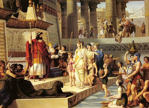
Examples of using complementary color contrast are following pictures: “Madonna of Chancellor Rolen” by Jan van Eyck (1390-1441), Paris, Louvre; "King Solomon meeting the Queen of Sheba" in Arezzo and the work of Paul Cezanne "Mount Saint Victor", Philadelphia, Museum of Art.
Complementary Color Contrast
2 colors are complementary if their pigments, when mixed, give a gray color.
Placed side by side, they maximize each other. Each color has only one additional.
Couples:
Yellow: Purple (Yellow: Red + Blue)
Blue: Orange (Blue: Yellow + Red)
Red: Green (Red: Blue + Yellow)
Yellow-orange: blue-violet
Yellow-green: red-purple
Blue-green: red-orange
Primary colors are always present in these pairs: blue, red, yellow.
With the help of two complementary colors, particularly beautiful grays can be achieved.
Examples: Paul Cezanne "Mount Saint-Victor":

King Solomon meeting the Queen of Sheba:
Rook (Dymkovo toy): ![]()
Rook (to suzanne): 
Simulated contrast.
Simultaneous contrast is a phenomenon in which our eye, when perceiving a color, requires the appearance of its additional color, and if there is none, it generates it itself. Simultaneously generated colors arise as a sensation and do not objectively exist.
Experiment: in each of the 6 squares painted in pure colors, a small square of neutral gray is placed, the lightness of which corresponds to the lightness of the primary colors. Each of these gray squares begins to take on a complementary color to the main color of the larger square. Simultaneous action is stronger, the more active the main color.
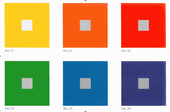
Simultaneously occurring colors evoke in us a feeling of excitement and lively vibration from the continuously changing intensity of these color sensations. With prolonged viewing, the main color seems to lose its strength, and the perception of the simultaneous increases.
Mixed contrast also occurs when two pure colors are combined, which are not strictly complementary. Each of these colors will tend to move the other towards its complementary, and in most cases both colors lose something of their inherent character and take on new hues. Colors seem to "swing", passing from their reality to a new dimension. The color begins to lose its materiality.
Simultaneous contrast can be enhanced or neutralized by adding a color that is complementary to the adjacent color (gain) or by adding the adjacent color itself (neutralization). Neutralization or reduction of simultaneous contrast also occurs in the presence of a contrast of light and dark.
Simultaneous manifestations of pure colors also occur when instead of additional colors of the 12-part color wheel, colors are taken that are located to the left or right of the selected initial color (not yellow to purple, but yellow to red-violet or blue-violet, in each of them yellow will reveal its additional purple etc.).
Examples:
"Satan and the Locust", Apocalypse in Saint-Sever: 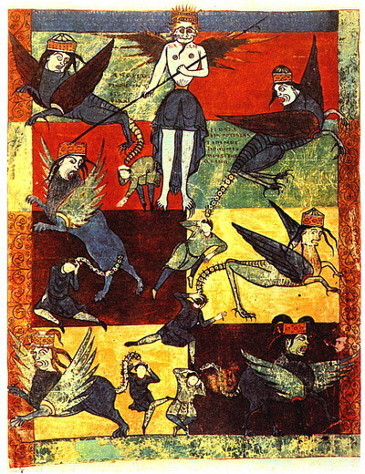
"Night Cafe", Van Gogh: 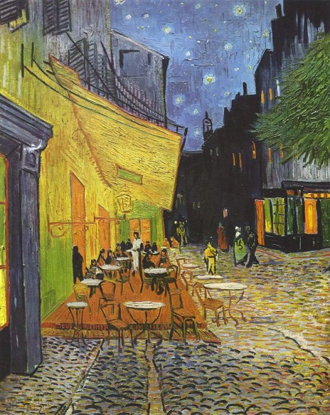
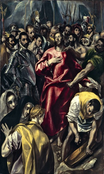
El Greco, "The Stripping of the Clothes of Christ":
Saturation Contrast
The contrast between colors is rich, pure and faded, muted.
As soon as pure colors are darkened or lightened, they lose their saturation:
1.
A pure color can be mixed with white to give it a cooler character.
2.
Pure color can be mixed with black. Black color robs flowers of their purity. He moves them away from the light and more or less quickly "kills".
3.
A saturated color can be weakened by adding gray (a mixture of white and black) to it. mixed with gray tone more faded than the original hues and are neutralized by the simultaneous contrast.
4.
Pure colors can be modified by adding appropriate complementary colors.
The action of the contrast "faded - saturated" is relative. A color may appear saturated next to a faded color, and faded next to a more saturated one.
If we want to achieve expressiveness of the whole composition, using only contrast in saturation without any other contrasts, then faded colors should be composed on color basis saturated, that is, pure red should contrast with faded red, pure blue with faded blue. But you can't use pure red next to faded blue or pure green next to faded red. Otherwise, the contrast in saturation will be drowned out by other contrasts, for example, the contrast of cold and warm.
Faded colors (mainly grays) appear alive due to the pure colors surrounding them.
Examples:
Georges de la Tour, "The Newborn" 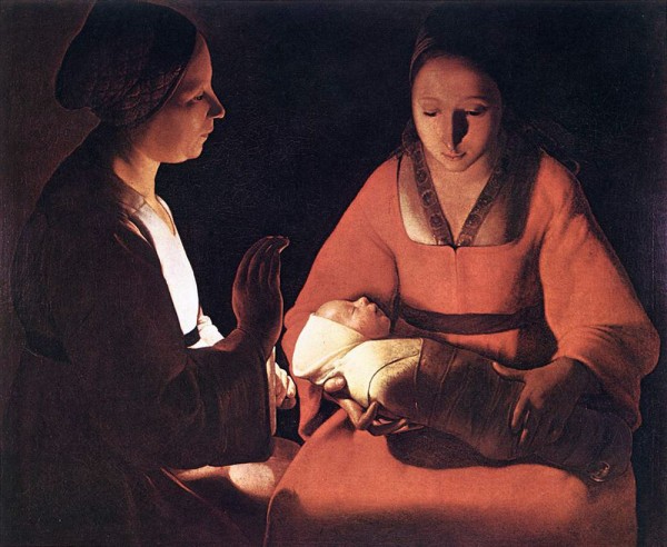
Paul Klee, "Magic Fish" 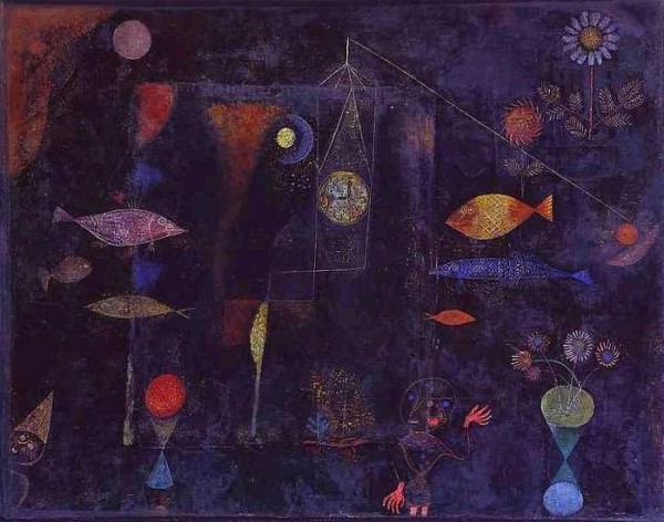
Tintoretto, "Slavyanka" 
Matisse: 
Van Gogh: 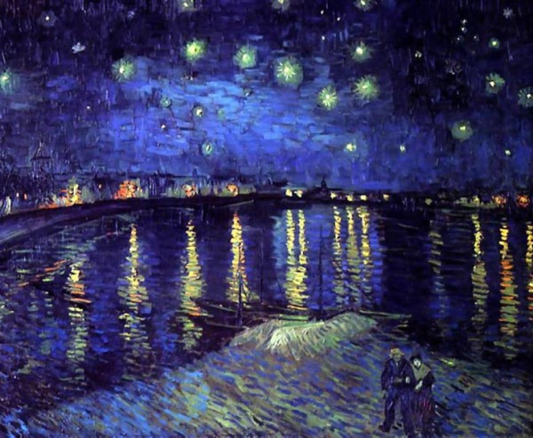
Contrast in area of color spots
Contrast between "many" and "little", "big" and "small".
The strength of the effect of color is determined by two factors: the lightness of the bloom and the size of the color spot.
According to Goethe, the degree of lightness of primary colors can be represented by the system of the following ratios:
Yellow 9
Orange 8
Red 6
Purple 3
Blue 4
Green 6
Examples of the lightness ratio of color pairs:
Yellow: purple = 9:3 = 3:1 = ¾:¼.
Orange: Blue = 8: 4 = 2: 1 = 2/3: 1/3
Red: Green = 6:6 = 1:1 = ½:½
Harmonious ratios of spots filled with additional colors (the degree of lightness is inverse to the size of the spot):
Yellow: purple = ¼: ¾
Orange: Blue = 1/3: 2/3
Red: Green = ½: ½
Harmonious dimensions of planes:
Yellow 3
Orange 4
Red 6
Purple 9
Blue 8
Green 6
Or:
Yellow: orange = 3:4
Yellow:purple=3:9
Yellow: Red: Blue = 3:6:8
Orange:Purple:Green=4:9:6
And so on.
Harmonized within their limits, color spots give the impression of calmness and stability. The presented system of quantitative ratios is valid only when using colors in their maximum saturation. The size and saturation of the color spot are closely related.
If in color composition between the colors one color dominates, the composition acquires a particularly expressive activity.
If, during a long contemplation of a picture, one focuses one's attention on any color that occupies an insignificant area, then this color begins to seem more and more intense and has an exciting effect.
The contrast in the area of color spots is able to manifest and enhance the effect of all other contrasts.
The shapes, sizes and outlines of color spots should be determined by the nature of the color and its intensity.
If a yellow spot is to stand out among light tones, it must occupy a much larger area than when the same spot is surrounded by dark tones. A small enough yellow spot, because its lightness is enhanced by the surroundings.
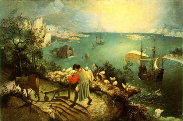
Brueghel, "The Fall of Icarus" (on a blue-green-brownish background, a bright orange spot on the collar and sleeve):