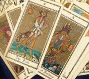
What colors are pastel tones? Pastel colors and shades - what are they?
The word “pastel” comes from the Latin pasta, which means “dough”. The material itself comes in three types - oil, wax and dry. You can find any of them in an art store. The colors seem bright while they are in the box, but if you start painting, you will see that the image turns out to be light and delicate. Moreover, the strokes of even the brightest crayons are soft and muted. These are pastel colors.How to get pastel colors?
The need to obtain pastel colors in practice arises quite often. For example, during renovation, when you want the room to seem larger and brighter. Pastel color can be obtained from any paint. For an experiment, take gouache. Place some basic paint (green, blue, black, brown) in a separate container. Start adding white. The more white paint, the lighter the shade. This is how you get light brown, gray, pale green, blue, that is, those colors that are most often called pastel in everyday life. Even if you take red paint, you can easily turn it into a soft pink using white paint. In the same way you can mix oil paints. As for watercolors, when working with this technique, a pastel tone can be achieved by adding more water.Warm and cool colors
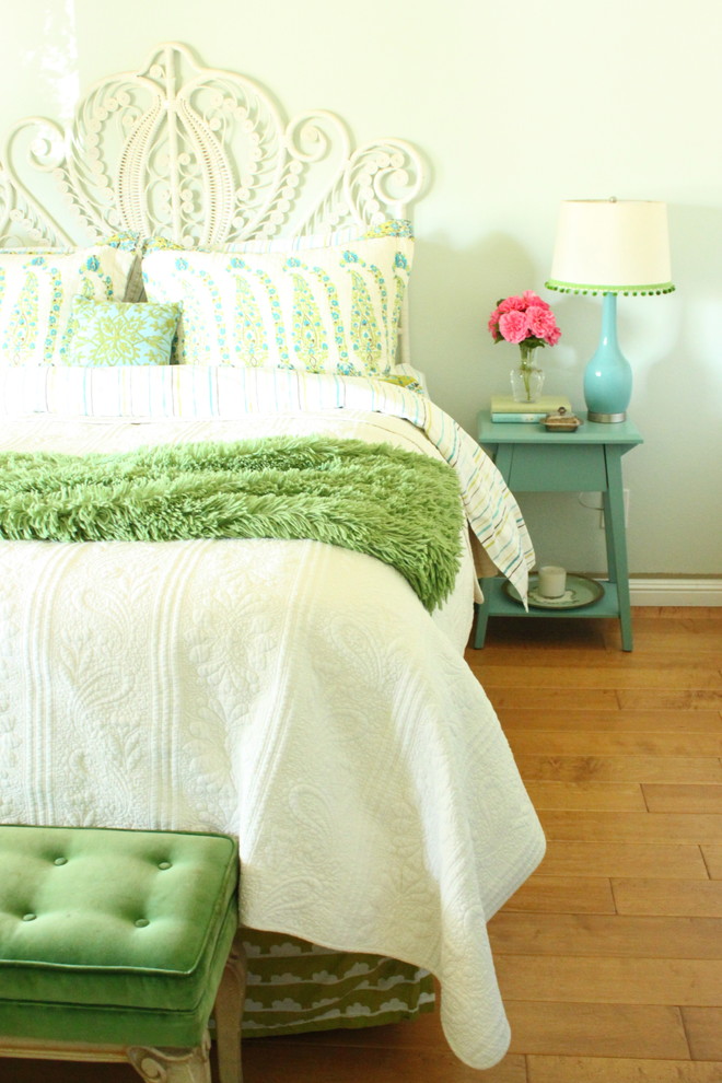
Like any other, pastel colors are divided into warm and cold. To the warm ones pastel colors include pink, beige, lilac with a predominance of pink, light yellow, light orange. Cold pastel colors - light green, blue, some shades of gray, lilac with a predominance of blue.If you are going to use pastel colors to decorate the premises, keep in mind that such shades visually expand the space. In addition, take into account the connection between visual and tactile receptors in humans. A room with walls painted in warm pastel colors seems warmer in itself. If we talk about human figure, some pastel colors visually increase its size.
Mutual influence of colors
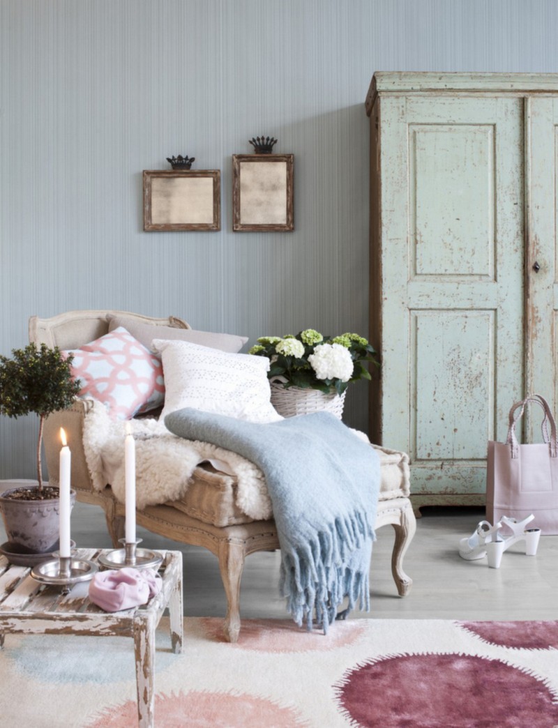
Pastel colors don't always go well with other colors. This is important to know if you are going, for example, to model clothes, make jewelry from cold porcelain, or are interested in patchwork. Try this experiment. Take a light yellow or beige scarf and try it on with a bright blue or bright red dress. With blue the pastel color will appear brighter than it is, with bright red it will appear even duller. Experiment with different combinations of pastels and bright colors to find the most successful combination of them.Pastel colors are created by adding white pigment to deep colors. Rich and translucent shades in the design create the illusion of a large space. About how to aesthetically arrange cold and warm colors, you will find out from the article.
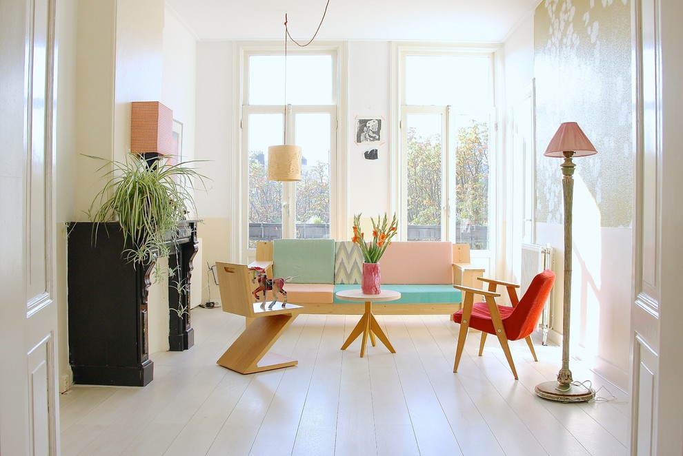
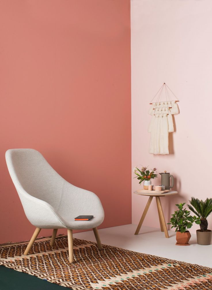
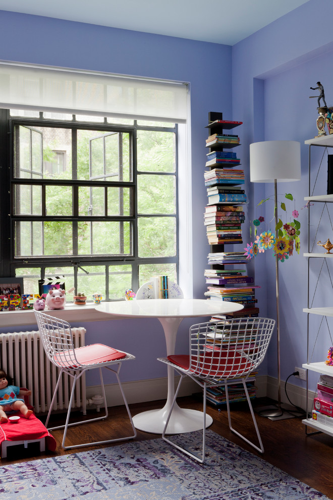
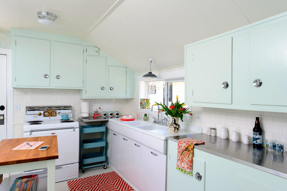
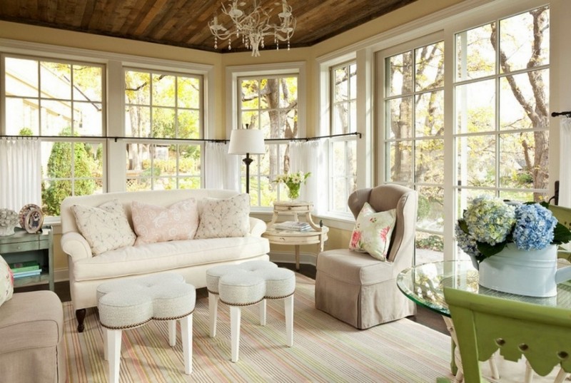
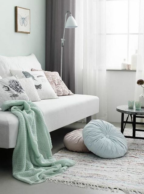
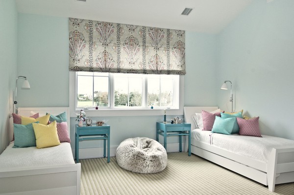
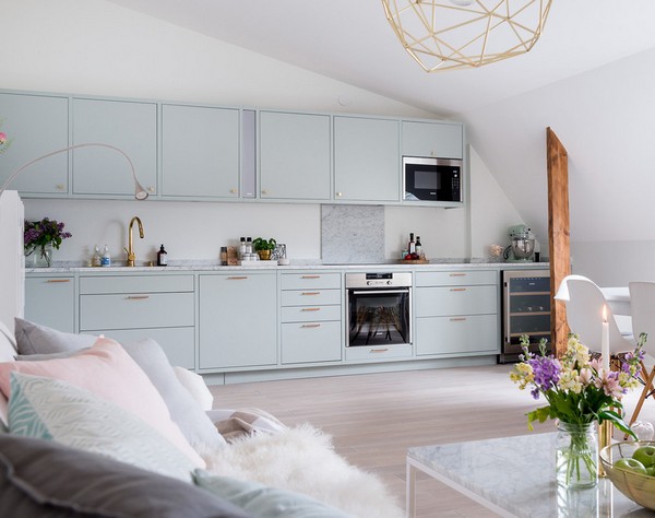
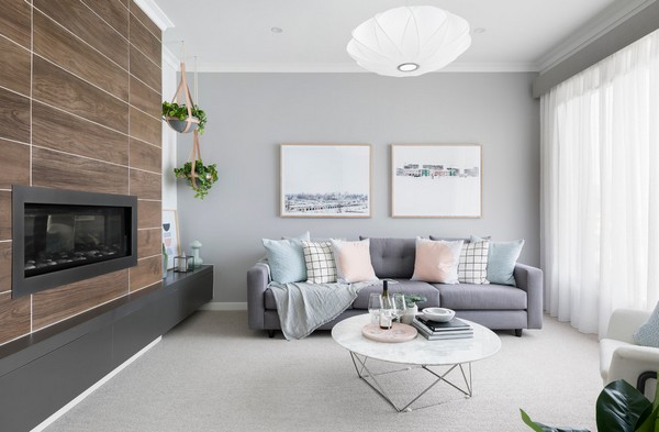
Turquoise pastel shade good for living room
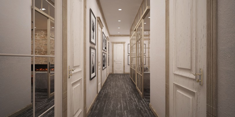
Pastel colors in the interior create a chamber atmosphere, emphasize the depth of the dominant tone, level out the contrast created by opposing colors, and are ideal for compromise combinations. Watercolor blur of shades depends on the amount of component. Drop some white into red- and it will immediately turn pink. Sprinkle them in green, and associations will helpfully remind you of pistachio ice cream. This principle produces numerous shades of 12 copies color wheel, which serve as a background for compositions or become the basis of a monochrome design.
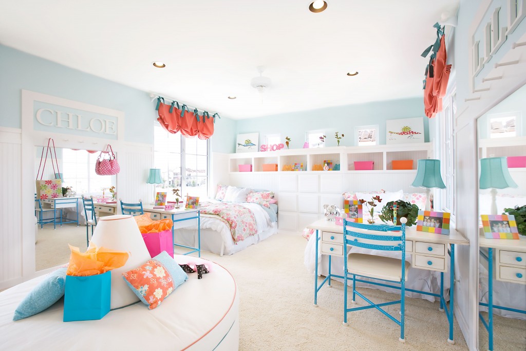
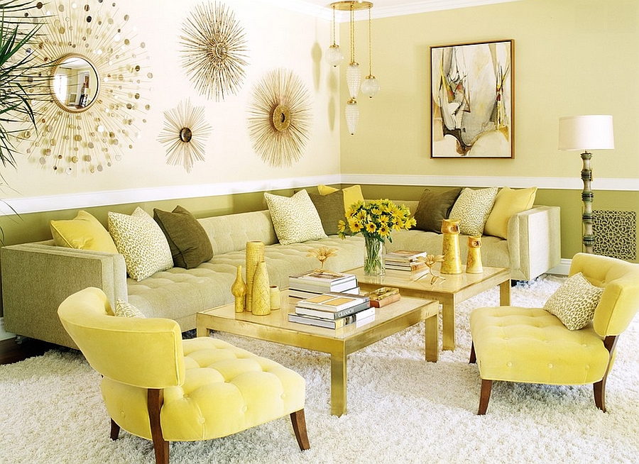
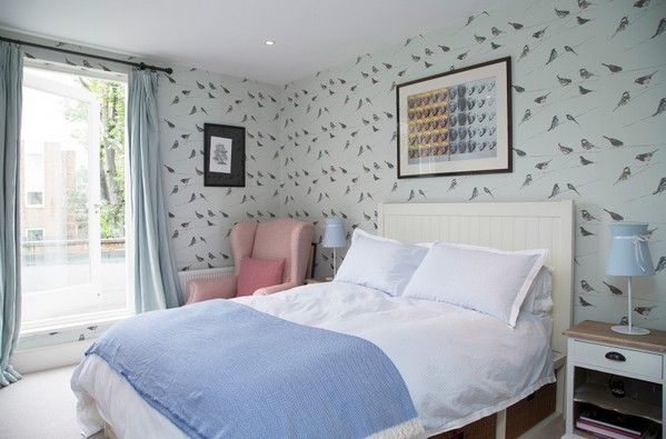
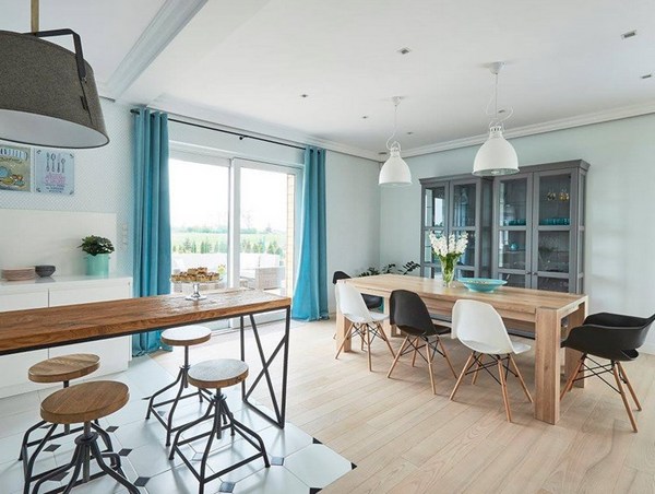
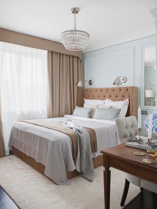
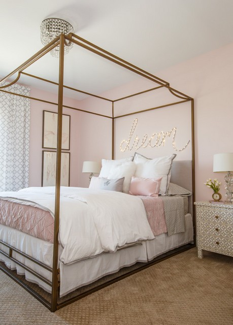
Eclectic mixes dilute the monosyllabic design in minimalist and classic styles, allow you to create new color schemes. Judging by the photos from the designers' portfolios, pastel colors are ideal for shabby chic, country, eco-style. The shades of the sun, sky and nature do not irritate with the intensity of the colors, they calm you down. Therefore, light colors are relevant for decorating homes and offices. If the bedroom is decorated in calm shades, then the nursery, kitchen, and living room look more interesting with bright fragments. The ability to combine pale and bright palettes - blue, brown, light blue, green, beige - softens the brutal restraint in the interior of a man's bedroom or study.

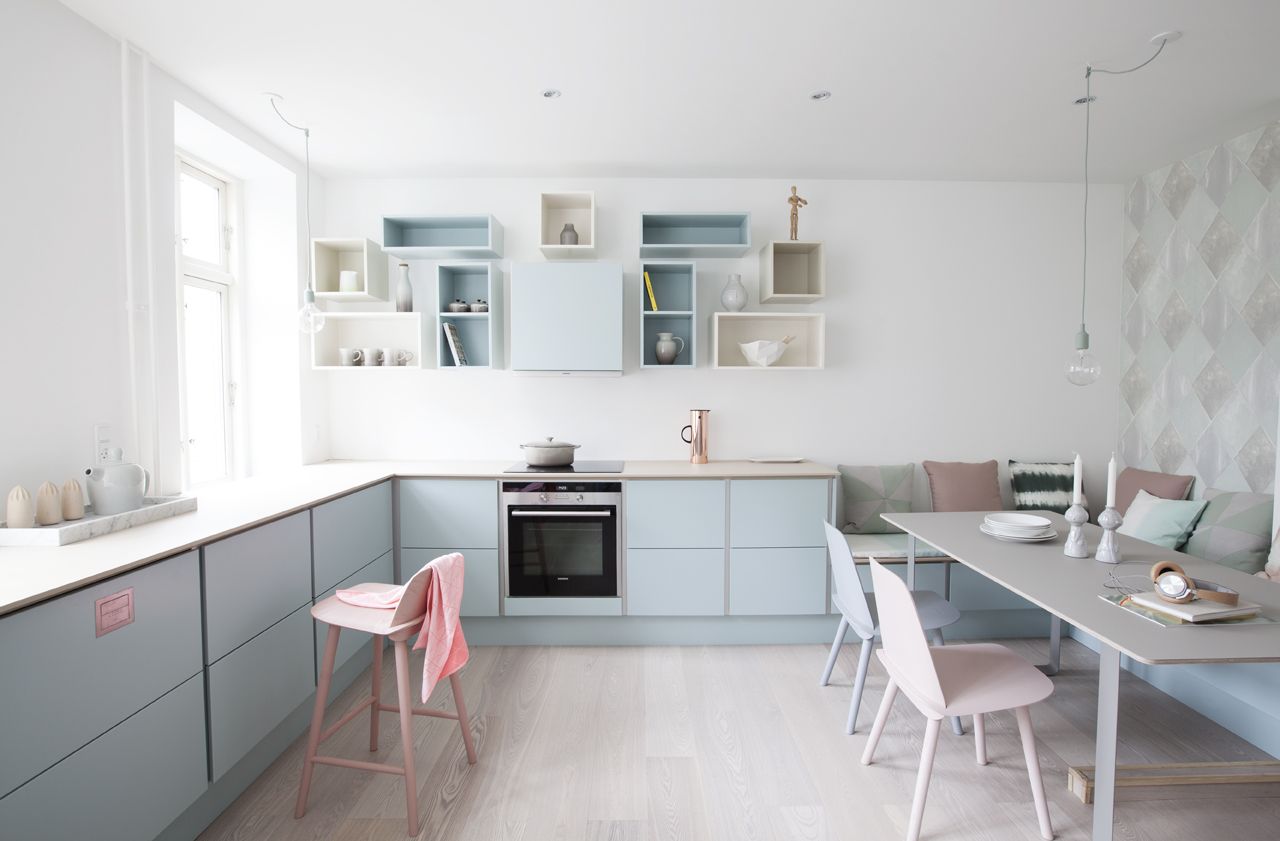
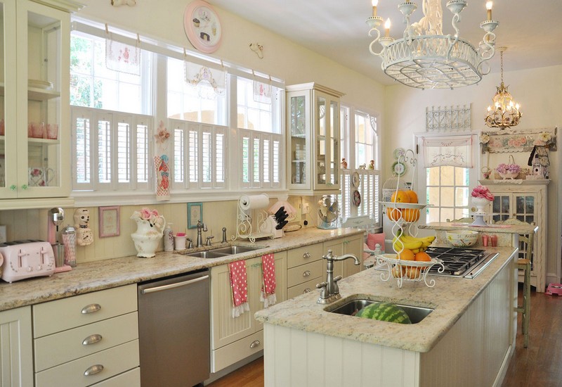
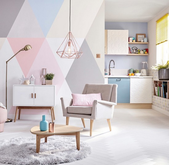
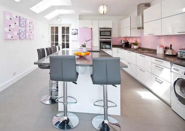
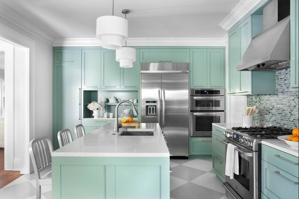
The combination of white and light pink walls also looks good in a high-tech kitchen with a bright bar counter


Advice! Notice which pastel colors inspire or relax you. Take one as a basis and choose companion colors for them. Inspiring photos will help you with your design idea.
How to decide on color
Warm pastel colors are usually used in north-facing rooms. Selected for decoration peach, sand, yellow-orange, beige-brown pigments.
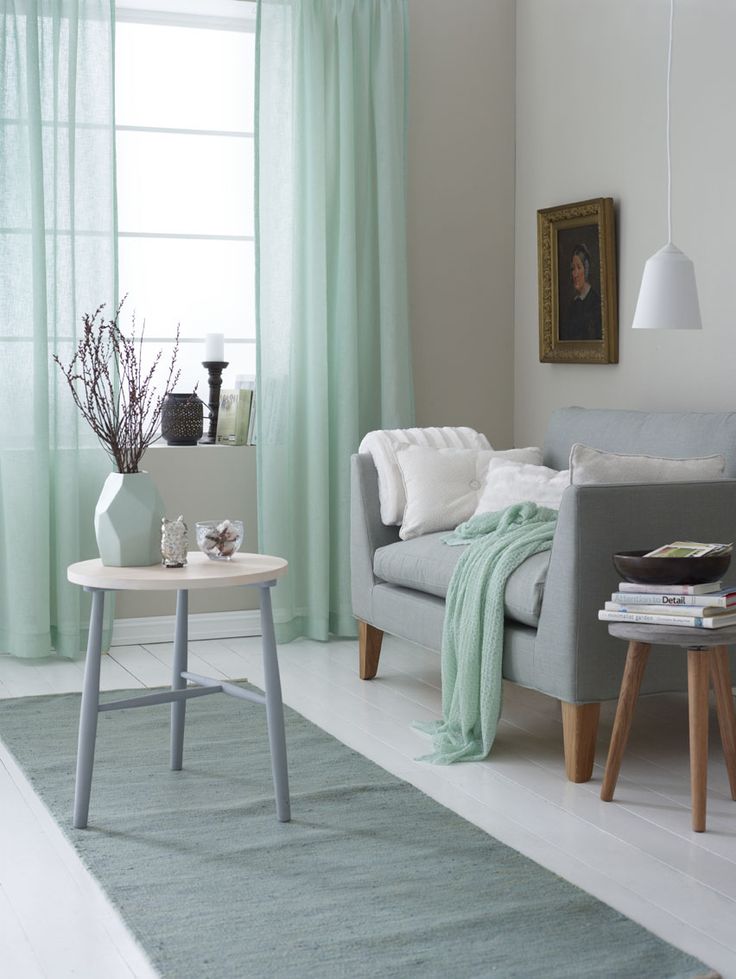
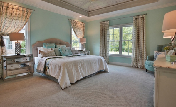
Light ultramarine, turquoise, blue, pearl, shades of gray. The palette is good for large rooms in the southern part of the house. For example, a fashionable mint shade in accessories, upholstery, the curtains are in harmony with the ivory walls. Other decor options can be selected from the photo.

If you don’t dare experiment with patterns, turn to the ombre technique - a color stretch that involves smooth transition from light to rich tones. First, decide on a color scheme, select spectral shades for it. To get an idea, look at the photos, which show a smooth color transformation. Which tones to make dominant depends on personal preference. Then select decorative items to match them.
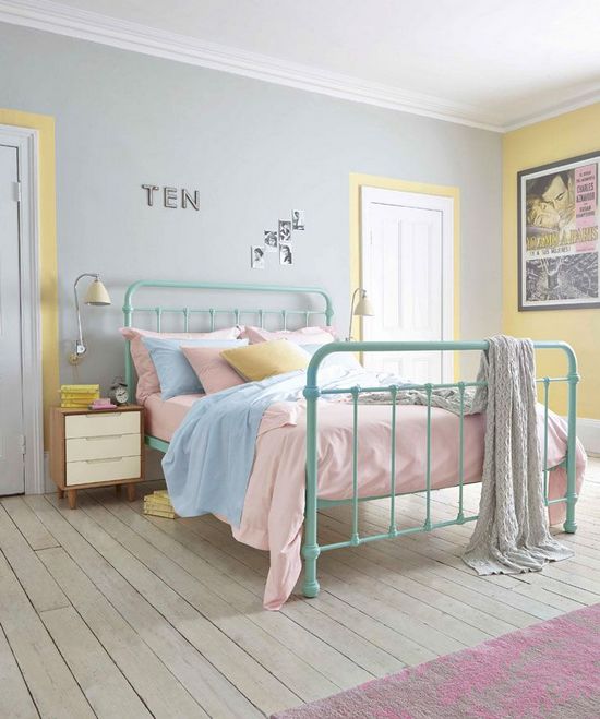
- Fashion trend for a girl's bedroom - fuchsia color, passing into dark grey and pink, soft lilac gradient flowing into pink and white.
- In the interior for a boy, classic white-blue with a transition to intense blue or pearlescent - blue - cobalt, pale purple - lilac - is often used. lilac.
- The scheme: beige - cream - brown is good for an office or bedroom. Can be changed beige to yellow and decorate the living room with these colors.


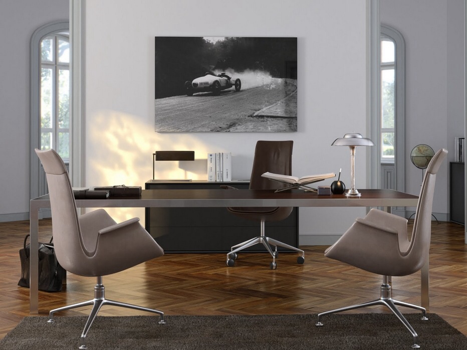
Advice! To maintain a business atmosphere, color balance should be maintained in the interior of offices. The dark surface of the table looks organic against the background of light drapery. The rich flooring perfectly rhymes with milky walls, curtains, and dark furniture.
Which pastel colors to choose for your home
Considering the ability of dark and light to influence spatial volumes, it is possible to correct the shortcomings of the perimeter.
- In a small functional area, pastel colors in addition to colorful inclusions are relevant. Colorful still life, mosaic panel on the wall will serve as decoration and create a different aesthetic perception.
- If you use a mix of rich shades (2-3 colors are allowed) in the interior of a large kitchen, the room will become more comfortable against the light background of the walls and a two-color set of furniture.

Advice! When creating a monochromatic design, duplicate the shade of the set on the walls. Curtains You can choose a brighter tone from the photo, patterned ones, or combine them with a colored chandelier or tablecloth. Then the laconic background will enhance the depth of the colors used in the decor.
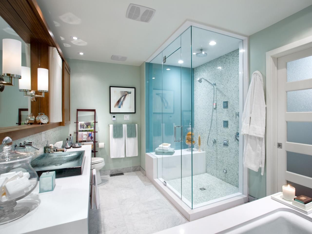
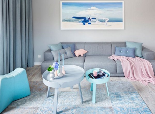
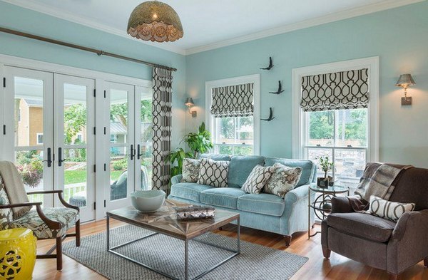
An eclectic mix of cool tones in bathroom interior Gives objects and design expressiveness. Thus, a blue bowl next to a turquoise mirror frame or cabinet facades stands out effectively against the background of light walls and emphasizes the texture of the finishing material. In a small perimeter, peach, pearlescent, pink and other light pigments have an advantage.

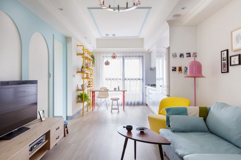
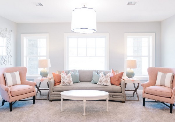
The bright living room is painted in different shades pastels
We decorate the living room, bedroom
To bed tones in living room looked more expressive, contrasting elements were added. Accents on walls, furniture, textiles, and attributes instantly transform the space. Graphic prints and abstract drawings are used in doses. Upholstery with geometry or a floral composition on a soft group, curtains, paintings in a colorful frame is enough.
Pastel shades stand out from others due to their versatility, since their use is possible not only in offices, but also in expensive country houses. While bright colors are annoying and not everyone's cup of tea, when added to them white become pastel and will appeal to the most picky person. There is only one drawback: the design of a room made in pastel colors may seem boring. However the right combination colors and styles pastel colors can radically transform a room.
If it was originally bright, then its pastel version will look a little colder. When creating an interior, it is necessary to pay attention to lighting, since with a small amount of it, the furniture will become visually darker. Directional light sources will look harmonious, while diffused light will make the interior nondescript. When using pastel colors, the room will become visually wider. A combination of white and pastel shades will help highlight the areas of their use, in contrast to bright color, which will focus attention on itself.


Pastel colors in the interior have already acquired quite a lot of stereotypes. Some people think pastel colors business card government agencies such as schools or hospitals. Others believe that an interior in pastel colors cannot be original and not memorable. In a sense, pastel shades can be called inappropriate, but only for some interior styles. For example, this is not the best color scheme for a living room in a minimalist style, as this will add formality to it. But Provence, classic or vintage style will look harmonious in pastel shades. It is also appropriate to use pastels for a kitchen in a country style, and for a bedroom in a shabby chic style. Pastel shades will look good not only in modern interior styles, but also in the styles of past centuries. For example, houses under construction are perfect for implementing interior projects in pastel colors.
Pastel colors They look good with any texture, but they look especially impressive on a matte surface. To decorate walls, furniture and bedspreads, it is better to use organza, linen, cotton or satin; this will give the interior comfort and expressiveness. Wallpaper with imitation silk, or Venetian plaster in pastel colors will add tenderness and sophistication. Pastel colors are especially good for children's rooms. For the kitchen, the use of pastels is appropriate in floor tiles, and in other rooms it can be laminate or carpet. This color scheme will add softness and comfort to the room. Glossy pastel coatings will make the room airy. Dark colors in pastels they will become natural and silky, and light ones will be clean.
Pastel colors are widely used in carpet production. For example, on the website www.elite-opt.ru you can choose many attractive carpets of this color. They will be a great addition to almost any interior.
Using pastel colors to decorate your home, you will fill it with comfort and tranquility; your home will become the place where you want to return and relax from hectic everyday life.
Pastel is quiet and calm. She doesn't speak, but whispers. Pastel colors are unobtrusive and tireless. They don't irritate, don't cause anxiety, don't make you nervous. That is why they are often used where mental comfort is needed - for example, in clinics, psychologists' offices, spa salons, etc. Pastel colors are also popular for residential interiors. It is very easy to create with pastels - there is practically no risk in working with it.
Pastel colors - what are they?
Pastels include the family light shades with low saturation. They are “velvety”, as if powdered or sprinkled with flour.
The fact is that initially pastels were crayons pressed from powder paints. The same term was assigned to drawings made with crayons. The paints on them are quite light, with a “powder” texture.
Every chromatic color has a pastel version. To create it you need to mix the base paint with white or pale yellow. A pastel version of purple is or pale lavender, green is mint, orange is peach, red is light pink or light coral.
Advantages of pastel colors
1. Pastel aura calms and relaxes a person. If you want to turn your home into a quiet haven that promotes relaxation, choose these colors for your interiors.
2. Pastel is almost “characterless”. Due to the low content of the chromatic component, the temperament and character of color are noticeably smoothed out. For example, blue walls make the room gloomy and cold, while pastel blue on the walls only slightly refreshes it. With a predominance of red, the interior looks scorching hot and stuffy, and with pale coral or light pink, a moderate “temperature” reigns in it.

3. Pastel is weak. She does not press or squeeze in her arms, but softly and tenderly envelops. Therefore, it can be used in large quantities without fear - for example, to decorate all the walls of a room.
4. Different pastel colors go well together. Few people would dare to mix, for example, red, green and purple in one interior. With pastel versions, everything is much simpler: the combination of pale pink, lavender and mint will not be harsh, nor flashy, nor exciting. The interior will be quite calm and balanced.
5. Pastels are refreshing. These shades belong to the spring range - associated with purity and youth, they evoke a feeling of lightness and airiness. Do you want to bring spring into your home? Give preference to a pastel palette.
1. Pastel background
As already mentioned, light powdery tones lose a significant share of the properties that are inherent in the main color. That's why they are so good as a color base. In this they compete with neutral tones (white, beige, gray), often used to create a background.

With a pastel background, the interior can be monochrome, consisting of shades of the same color of different saturation.

2. Mix of pastel colors
All shades of this kind combine perfectly with each other. You can combine them in the interior in any way. For example, in painting walls in blocks (using the “color blocking” method) or in grouping multi-colored pillows on the sofa.


Pastel multi-colors are much safer and more pleasing to the eye than mixing rich tones.


3. Pastel accents
Yes, elements of not only deep, but also muted colors can serve as bright touches. True, the range of their application is limited - pastel accents “work”, as a rule, only in neutral interiors.

4. Pastel furniture
Furniture in soft spring tones looks light, sometimes even weightless. It doesn't overload the space. This makes her ideal solution for small rooms.
Pastel furniture brings lightness and spring freshness to the interior.
This is also a great solution for interiors in a retro style, because light powdery tones were very popular in the middle of the last century.

By the way! Most often, pastel shades in the interior are combined with very light, sometimes subtle variations of gray, beige, gray-beige.
![]()
Pastel colors in the interior: photo


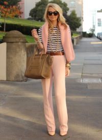
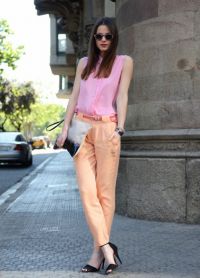
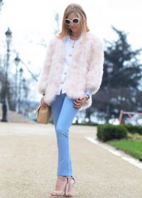
Pastel colors are delicate shades. Clothes in these colors are suitable for any occasion: business negotiations, a date or a simple evening walk with friends. The pastel palette includes many colors, such as beige, pink, blue, ivory, and champagne splashes. In artist's terms, by “diluting” the primary colors with water or milk (imagine this), we get a pastel palette. These tones are ideal for both young girls and mature women.
An image in pastel colors is the choice of a sophisticated woman
Dresses in pastel colors. The peculiarity of “pastels” is that they can visually correct female figure. If you are short, but want to be a little taller, then the solution to this problem is pastel colors. Pay attention to short dresses of any delicate shade that suits you best. If you are of a larger build, this does not mean that you are contraindicated from wearing things in this color scheme. Just find good combination clothing and accessories.
Accessories in pastel colors. Here it is very important to take into account for what occasion this or that accessory is selected, with what color scheme it will match. Towards the dark evening dress A beige or milky clutch is suitable. Some brides are faced with the problem of choosing the right shade for wedding accessories, for fear of spoiling it. An unmistakable move is colors from the same range, but darker or lighter by a tone or two.
You ask, what do pastel colors go with? Almost with everything. The “top” of a pastel shade will go well with jeans, a skirt or shorts from a dark palette. Bright, catchy things can be diluted with gentle ones light colors. For example, to a blouse rich color and dark trousers, you can choose a vest in delicate colors, which will add sophistication and femininity to your look.
And finally important detail wardrobe - shoes. Shoes in pastel colors are best purchased with open tops. This will make your legs appear slimmer. A manicure in pastel colors will help complement the look. Well-groomed nails and hands, discreet varnish color.
Each of us is an individual, and things help to emphasize this if they are chosen with taste.
 |
 |
 |