Accent wall - a special technique in the interior of a room guarantees an excellent result
It is known that even a small inclusion bright color can bring the picture to life by making general form more interesting, more attractive, more effective. This technique works flawlessly for interiors, landscapes, and external image person. For example, bright ties transform men into formal suits, and accent bags and scarves for women in neutral outfits. Even one flowering flowerbed is enough to make the garden much more beautiful. By adding a few bright “spots”, we will bring a “spark of life” to the interior.
Placing bright accents in the interior is not as easy as it seems at first glance. Difficulties arise at the stage of selecting an accent color and determining its quantity. If there are a lot of color accents, the room will turn out to be overly bright. And the effect of accenting will be lost, since the accent color will “blur” in space and turn into an auxiliary one. If there are not enough accents, the desired result will not be achieved.
Accents in the interior: choosing a color
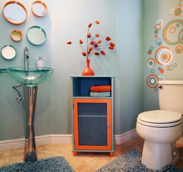
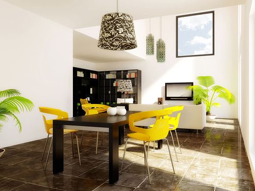
Color accents in the interior are objects that have a color different from the main colors that predominate in the room. For example, textiles, furniture, accessories and orange decor in a white and blue room are color accents. But light blue objects in the same room are a complement to the main color. In a lilac-beige room, green items will be accents, and purple, cream or lavender will be complementary. In a beige room, pink items will be accent pieces, and light brown items will be complementary.

Add-ons
So, the first rule of color accenting: if you want to introduce bright accents, you need to choose not a different shade, but a different color. But which one? The choice should depend on desired effect.
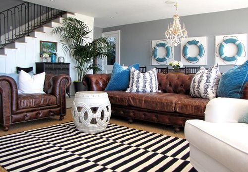
1. “Warm-Cold” scheme. If you want to emphasize the warmth of a room in which “sultry” tones predominate (yellow, orange, peach, apricot, terracotta, red, etc.), you should choose a cool color as an accent color. These can be shades of blue, green, purple. Cool accents will not only emphasize the warmth of the room, but also slightly cool its ardor.
Blue accents in a warm interior
And vice versa: if you like a cool atmosphere created with light, fresh or slightly dark tones, you can emphasize its coldness by contrasting with warm accents. To do this, you should use accents in orange, yellow, terracotta, and honey shades.
2. “Additional” scheme. To bring a lot of life, energy and color into the interior, they use another scheme - “additional”. In this case, a complementary color to the primary or secondary color is used for emphasis.
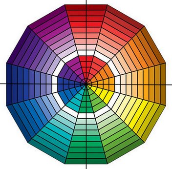
Complementary colors are those located on color wheel in front of each other.
For example, if the room is dominated by Orange color, additional accents should be in one of the shades of blue or blue, and vice versa. In a green room, red or purple accents are placed according to this scheme.

The “Additional” scheme is quite complex - it charges the interior with powerful energy. Therefore, this option is recommended for use only in living rooms, dining rooms, playrooms, etc.
3. “Similar” scheme. If you want to create a calm atmosphere, as an accent color you need to choose a color located on the color wheel next to the main or secondary one.
So, if the room is dominated by blue, the accents can be green or light purple (lilac, lavender). A peach room will be refreshed by accents of red berry shades.

With this accent scheme, peace and harmony reign in the interior. Therefore, this option is preferable for bedrooms, recreation rooms, libraries, etc.
4. Accents in a neutral interior. If the room contains only neutral tones, such as white, black, gray, beige and brown, any existing color can be an accent color. Moreover, there can be several accent colors.

The good thing about a neutral interior is that the accents can be changed according to your mood. Or, for example, by time of year. In autumn - in orange-red tones; in winter - in blue and dark blue; in spring - in delicate floral ones; in summer - in green ones.
In very light neutral interiors you can introduce a lot at once different colors, and it doesn’t matter what place they occupy in relation to each other on the color wheel. However, it is desirable that these accent colors be combined with each other in saturation and brightness. For example, soft blue can be adjacent to pink, lilac, pistachio, but not to burgundy, jade or dark purple.

![]()
How to maintain balance when placing bright accents in the interior?
Eat classic rule. Or rather, the formula. It looks like this: 60-30-10. What does this mean?
60% - main color
30% - additional (secondary) color or shades of the primary color
10% - accent color
Yellow: primary color
Green: secondary color
Blue: accent color
This formula is also valid for classic clothes. It turns out something like this: 60% is a suit, 30% is a shirt, 10% is a tie, that is, an accent.
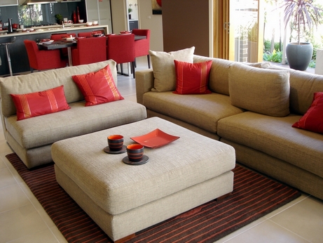
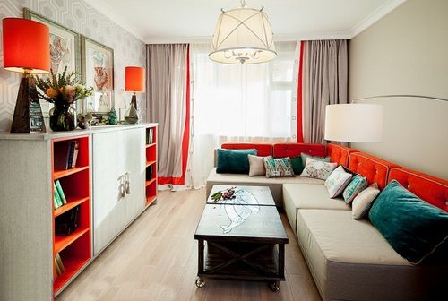
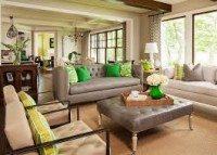
Let's look at an example with an interior. Let's say the walls are painted beige color, and the floors, shelving and TV stand are wood-colored. Thus, the beige-brown color palette predominates, accounting for approximately 60%. Let's assume that the curtains and cushioned furniture in this room - in purple. Purple in in this case- secondary color, occupying approximately 30%. Accents can be yellow, green or blue depending on the desired effect. They should account for approximately 10%: for example, a small carpet on the floor, a pouf, four sofa cushions, a blanket on one of the chairs and two floor vases.
Second example. Walls and upholstered furniture are in blue and light blue shades (60%). Floors and furniture - gray(thirty%). Accents - orange (10%).
Of course, the numbers are very approximate and conditional. You just need to strive to ensure that the main color takes up a little more than half. The secondary color (or shades close to the main one) is half the size of the main one. Accent - about one tenth of the main one.
The color of the wood is neutral and may not be included in the formula. That is, wooden floors can be ignored, but a rug lying on the floor is a must. You can also ignore white ceilings and walls, wooden or white doors and window frames, a part of the wall lined with stone, a fireplace lined with brick, etc.
If the interior is monochrome and there is no secondary color, accents can take up a little more than 10%.
Sometimes it's enough one bright accent in room. But it must be either large or very impressive. This could be, for example, an accent sofa in a monochrome interior or a stunning chandelier. Single accents make the interior impressive. Comparisons come to mind: a completely black cat with emerald eyes or a white winter forest with one red rowan bush.

The less accent color, the more it stands out, drawing attention to itself and to everything that surrounds it.
Bright accents in the interior: what to place and where?
Most often used for color accents in the interior. various items decor: vases, figurines, sofa cushions, photo frames, carpets, rugs. However, surfaces, pieces of furniture, and works of art can also be accent pieces.
As for furniture, accent pieces are often made of armchairs and ottomans, and less often sofas. In the bedroom, the headboard can be an accent piece. In the kitchen there are chairs and part of the kitchen furniture facades.

The accent can be a wall or part of a wall. For example, at the head of the bed, behind the TV, behind the sofa. In the kitchen, the apron of the work area is accentuated. At the same time, you should always keep the 10% rule in mind.


Curtains can also be accents, like other textiles: covers on chairs, tablecloths, napkins, bedspreads.
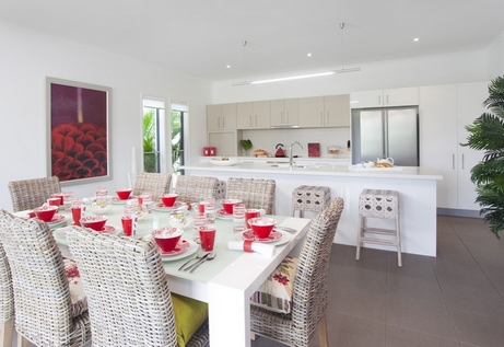
The use of accent lights is in fashion, especially in kitchens and dining rooms.
Of course, bright accents in the interior are not always and not everywhere needed. Calm monochrome or two-color interiors are beautiful in themselves. But if you wish, you can always “spray” a little color, fortunately, this will not require you to radically change anything and spend a lot of money. The interior will sparkle with new colors, transform and come to life!
We offer a selection of interiors with bright accents. Get inspired!
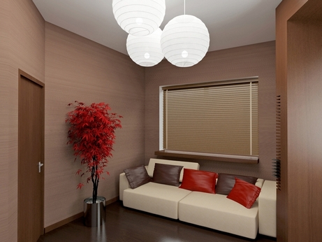
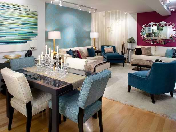
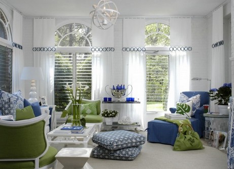
Hot pink and red accents: a win-win option for neutral interiors

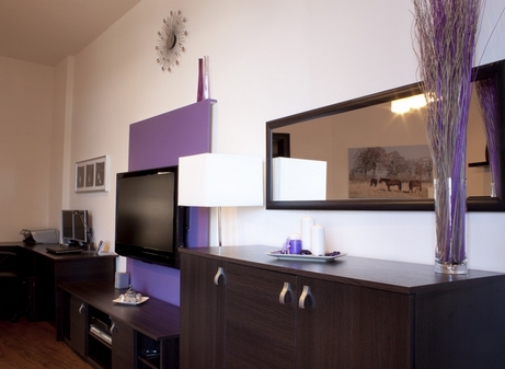
Purple accents give the interior an air of mystery
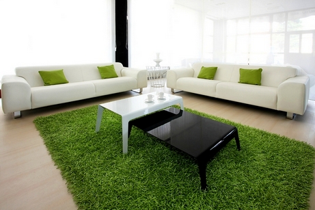
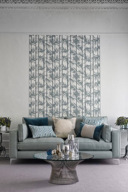
Green accents: create a feeling of freshness and lightness
Bright interior items can transform the most boring room. But such accents are quite capricious. If you use bright objects excessively, the room design will look ridiculous. If it’s insufficient, it’s monotonous. How to find the “golden mean” and place accents in the right quantity and in the desired order? Designers recommend not to overdo it with colors and shades. To prevent the room from looking like a clown's dressing room, it is better to use two primary colors and two or three shades. This will saturate the room with color and not go beyond the color saturation limit.
Choosing a color palette
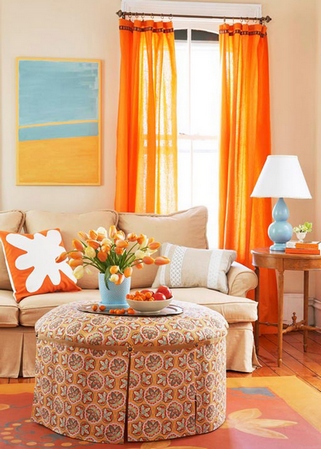
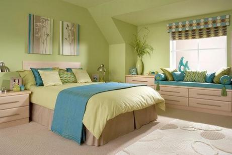
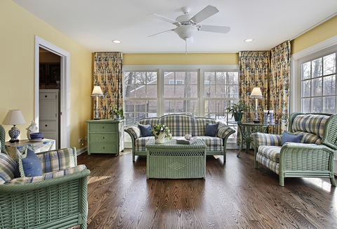
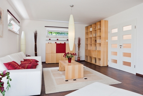
Before you start arranging bright details in the room, you need to decide on the color scheme. What, in essence, are accents in the interior? These are ordinary household items that, in addition to their functional meaning, carry a decorative meaning. For example, if the background of the room is made in white and blue tones, then decorative pillows, lamps and curtains in orange will act as color accents, as shown in the photo. At this stage, the main task of the designer is to choose the right color combination. If the room is decorated in light lilac tones with hints of beige, the best option the elements will become green. If the design is dominated by beige shades, the additions should be pink. Colorful accents in beige interior attract interest, but do not distract from the beauty of the environment.
Basic Rules
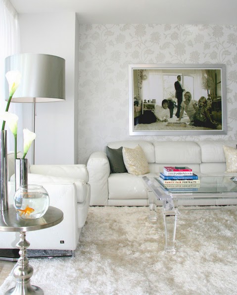
It is quite difficult to choose color elements if you do not have design skills. But today, this is not a problem. Experts are happy to share the secrets of their work. So, if the living room is made in warm colors, details of green, blue, and purple colors will help emphasize the warmth of the interior. Bright accents in the living room interior can be made in the form of sofa cushions, carpeting, original paintings, hung on the walls. Set up in the same way white interior with bright accents. Since white creates a feeling of sterility, you can dilute it with yellow, black, and red details. Generally white - perfect color for decorating walls in a small living room. Against such a background, all the details of bright, rich colors, on the picture.
If the interior of the kitchen or bedroom requires energetic notes, it is also worth using additional colors. For a bedroom decorated in beige tones, additional elements should be cornflower blue or sky blue. Purple and red additions will fit perfectly into a light green kitchen design. Although the latter option is quite capricious, since this color combination carries powerful energy. Combining light green, purple and scarlet details is not recommended for bedrooms, children's rooms and offices.
When decorating an office, study, bedroom or cozy living room, you can use details of companion flowers. So, for an interior design made in a blue palette, bright accents can be lavender, purple or lilac. A peachy, bright room with bright accents will look great if the details are in berry or scarlet colors.

The easiest way to select details is if the design is brown and gray with bright additions. For example, sofa cushions, bedspreads, napkins and furniture covers can be light green in summer, yellow-orange in autumn, blue-blue in winter. Changing color accents and selecting color scheme In accordance with the time of year, you will not only decorate the room, but also create a special mood.
Number of accents
Choosing a color palette that perfectly matches the main color scheme of the living room, kitchen or office does not mean completing the design of the room. It is important that bright details do not overload the space.

- Main color palette should occupy 60% of the total space of the bedroom, living room, kitchen.
- 30% of the area is allocated for the use of a companion color.
- 10% should be accents.
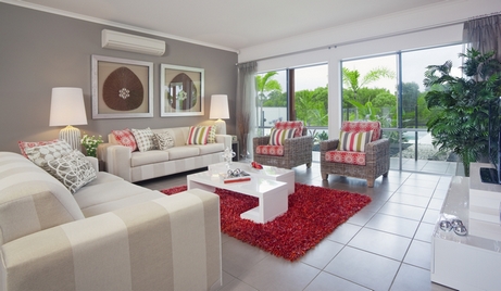
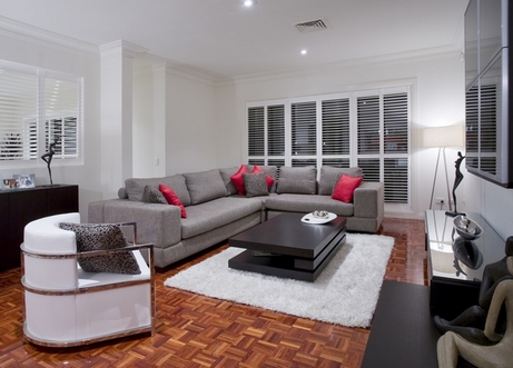
In practice, this may look like this: walls, flooring, bedside tables and shelves - beige or Brown. Furniture and curtains are decorated in lilac tones. And bright accents are presented in the form of an elegant carpet, sofa cushions, and one large floor vase in sky blue or yellow in the photo.

In conclusion, we note that it is important not only to choose the right color of bright accents, but also to determine their quantity to create beautiful design interior, you need to think about the arrangement of parts. The best solution, is the use of frames for paintings and photographs, napkins, tablecloths in the kitchen, vases, sculptures, textiles in the living room.
In the bedroom, curtains, bedspreads, and pillows can serve as bright elements. In the study and office, bright accents are objects of art, stationery, lamps.
In contact with
How to choose the right color for a room? When creating a new interior, you will most likely want to radically change the color of the walls, floor and ceiling, add color accents. Make everything as beautiful as in some interior design magazine.
Regardless of which color in the interior is considered the favorite during the renovation period, first of all you need to take into account your own preferences for the color scheme. Fashion passes, but taste remains. In addition, in order to create a room design that is interesting and correct from the point of view color combinations, the shape of the room, its size and lighting, you need to take into account some nuances.
Three main reference points will help you decide on the color of the room::
1. What color the walls should be is decided by the owner of the future room. Children, for example, choose warm, “cheerful” shades. If this is a living room, then the color is chosen neutral or taking into account the size of the room and its lighting.
2. The color of the room must be consistent with the future interior style.
Eg:
** is presented only in soft pastel, very light colors.
** Style – natural shades of wood and stone.
** “Baroque” – rich burgundy, gold, blue, etc.
3. An object that will become the center of attention in the room can be fundamental when choosing a paint color for the walls (floor or ceiling). For example, you decided to create a design around an antique mirror (portrait or painting) framed in a dark green frame. Accordingly, all other colors will be repeated ( different shades one color) in the design of the room.
How to choose wall paint color
Indoor color distribution:
- 60-70% is the main color;
- 20-30% - additional, second color;
- 10% - color accents.
Basic painting (main) is done on the walls. And it is this color that we will see constantly. The most common recommendation is to choose neutral shades, or even white.
In this version, the walls seem to reflect everything else in the room: carpets, furniture, interior accessories. On neutral With a light background on the walls, updating the interior is much easier: just change the color of the curtains, furniture covers, hang new picture, change the lamp shade or make a new tablecloth.
When choosing a primary color, you must take into account the final result: a visual increase or decrease in the height and width of the room.
Pay attention to Itten's circle. It shows the combinations of the most harmonious combination of colors. Itten Johannes (1888-1967), a Swiss artist and teacher, developed schemes by which you can choose the most correct color for interior design.
(colors located at the vertices of a triangle (rectangle) combine well. 
What color to choose for the floor and ceiling in a small room
Since it is easier to create an interior in large rooms, let’s look at how you can “expand” the walls in a small room using paint.
** To visually expand the space, choose shades of sand, beige and yellow as the base coat.
** If you want to visually lengthen the room, then choose cold and light shades blue, green, gray-blue colors.
Floor in a small room should also be light, in one color scheme with walls, but darker. If the floor and ceiling are made of the same (very light) color, you will get the effect of the absence of a lower plane - everything will merge together, which is also not very good.
** as if it absorbs part of the space, and this cannot be allowed in a small room.
What color should the doors be?
Previously, the color of the doors matched the color of the floor. Currently this is considered not the best option. The door in the interior of the room should give the impression of being one with the wall. In this regard, you need to choose “closely related” shades to the base paint.
We choose the color of the walls taking into account the lighting of the room.
Basic room color you need to choose taking into account natural and artificial lighting. Eg, purple under artificial light it can take on shades of black.
In rooms with large windows facing south, walls in cool shades of blue, gray, and purple will look best. If you choose the main color in this case warm shades, then in combination with bright sunlight, you may experience a feeling of increased body temperature.
If the windows face the north side of the house, you need to choose warm colors, which create a more comfortable atmosphere.
 Additional colors in the interior of the room
As stated above, they occupy 20-30%.
Basically, these will be colors from the same palette as the main color, but darker or lighter. Thanks to the additional color, even the most nondescript interior acquires its own unique identity.
Complementary color is the color of furniture, curtains, carpets, pillows.
If you are bored of living in one color, vary the shades and create a contrasting interior. From the experience of designers, a combination of contrasting tones looks extremely advantageous from the point of view aesthetic perception, but it is very difficult to constantly be in such a room - general fatigue quickly sets in.
Another important point: An interior in contrasting colors is not suitable for small rooms. Therefore, the main and additional colors in a small room we “dilute” it with color spots.
How to apply a color spot in the interior
The role of color spots is played by small objects that attract the eye.
It could be:
- Picture or ;
- flower pots or flower vases;
- curtain rods;
- photo frames and even books with bright covers;
- figurines and other interior decorations.
There must be at least three color spots. This means three (or more) items in the same color.
For example: a green pillow on the sofa, a large climbing flower on the wall, a photograph (painting or mirror) in a green frame, green patterns on the curtains or a green napkin on the table. This entire ensemble will create a color accent.
** If you make three color spots, then it will already look like random, disparate objects (green pillow, red flower pot, yellow curtains...).
Color of furniture in the interior.
And finally, a little about the color of the furniture. Bright upholstery on a sofa or armchair, in contrast to the main color on the walls, would only be appropriate in a large room. Typically, such furniture acts as a separate design object in the room.
In a small room, a more rational approach is suitable: against the background of light walls, darker furniture (3-4 shades darker, but in the same color scheme).
May your home be filled bright colors: joy, warmth and boundless happiness.
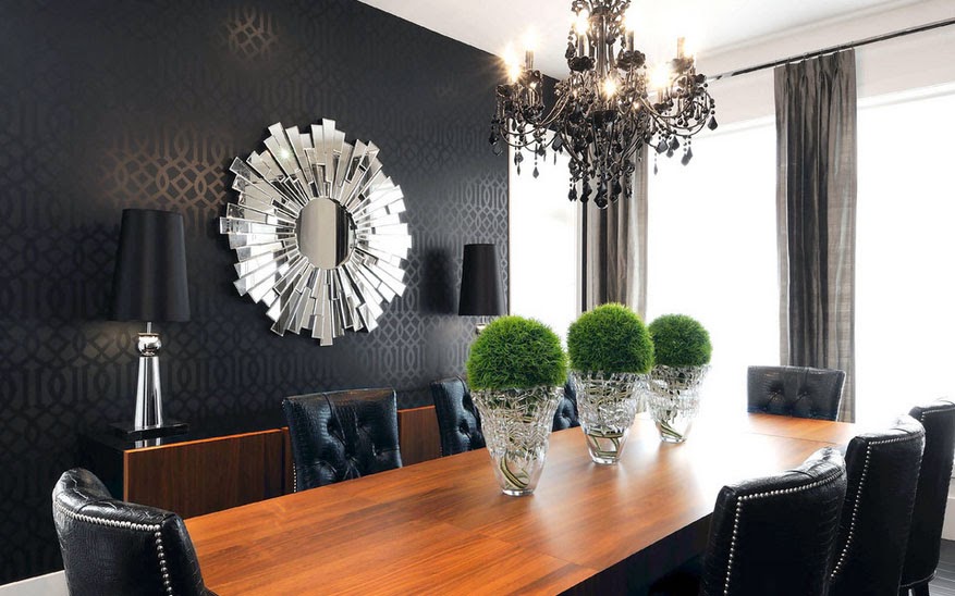
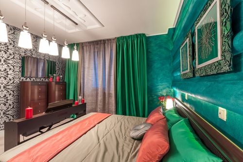
Many designers like to use such a feature as an “Accent Wall” in their work. Even without explaining the meaning of this term, on an intuitive level, it still becomes clear what we're talking about. An accent wall is a wall that is significantly different from the rest of the walls in the room and attracts attention due to its unusual texture, bright color or pattern.
This trick is designed for the “wow” effect and almost all designers love to use it in order to attract additional attention. It has been scientifically proven that a person’s impression of his location is formed in a quarter of a minute, and everything he sees after this time is perceived by the brain under the yoke of the first impression.
A reception with an emphasis on one of the walls of the room not only serves to attract the first glance of the guest, it can serve as a decoration with an original design solution. Its function depends on the type of accent. In this way, you can visually change the room to increase the space, narrow it, highlight bright decorative elements, or architectural features rooms.
Let's figure out in what cases it is appropriate to make an accent wall and consider some rules. Let's see in which rooms it is most appropriate to use this technique, and what are the rules for the correct placement of emphasis.
Conditions for using this effect:
- Typically, the accent wall is the one that first comes into the guest’s field of vision when entering the room;
- The emphasis is placed only on one wall, not on two, and especially not on all four;
- You can not place emphasis on the entire wall, but only highlight certain fragments or protrusions (optional);
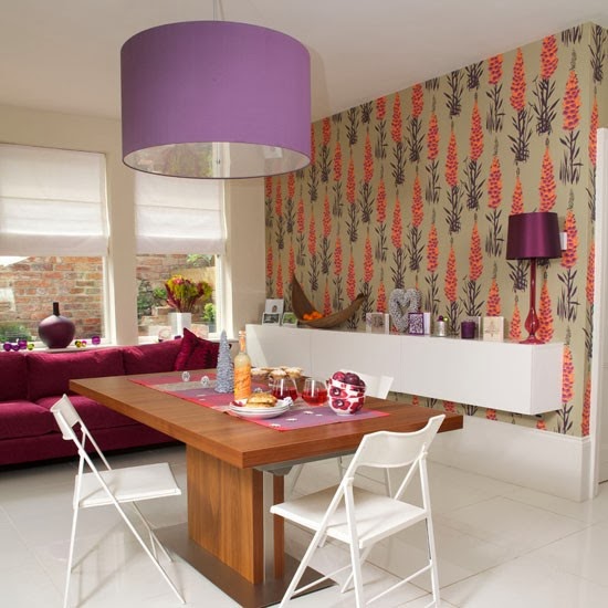
- The wall is decorated not only with unusual wallpaper. The accent can be made with paint, using brick or decorative ceramic tiles, wood panels, etc.;
- You can play with visual effects. By using warm accent colors (orange, red and yellow tones) you can bring the wall closer. If you paint one of the small walls in an elongated room with this color, you can bring it closer to a square. But do not do a similar procedure with a long wall, otherwise you will narrow your room even more;
- Using cool accent colors (blue, green and purple tones) will, on the contrary, visually remove the wall. Therefore, if you still want to emphasize the long wall of the room, then use a cool color for this. It will help move the wall away and thereby expand the space;
- To ensure a calm atmosphere in the room, it is better to do without the use of saturated and bright colors in the interior, but focus on a shade close to the base color of the walls, the emphasis can be placed on the pattern or different texture of materials;
- And, conversely, for a bright accent, use the exact opposite color, which, due to the contrast, will provide a “wow” effect;
- If the room design is made in neutral colors, then you can use any color you like for an accent without worrying that it won’t suit;
An accent wall can be decorated in any room in your apartment and is completely different ways, but most often designers prefer to place the accent on the wall in the living room or bedroom. In both the first and second options, the accent wall is most often highlighted with wallpaper.
Living room
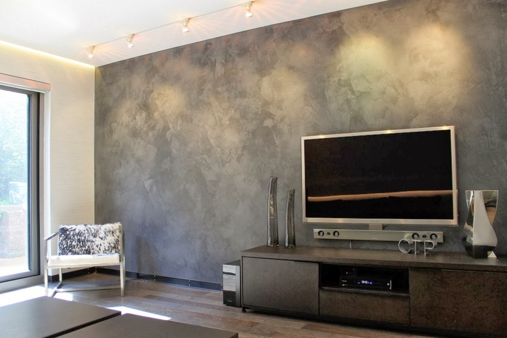
In this room, an accent in the TV viewing area, where you can place or hang a plasma, will look beautiful. They also often draw attention to the affected area by completely changing the color of the wall behind the sofa or by sticking a wide strip of contrasting wallpaper in the middle of the wall.
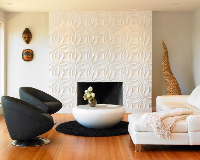
If the living room area is quite impressive, then in this case you shouldn’t highlight the entire wall; it will be enough to focus on a small space. It may serve them workplace, a section of wall near a bookcase, etc. An impeccable look is created by the accent in the fireplace area.


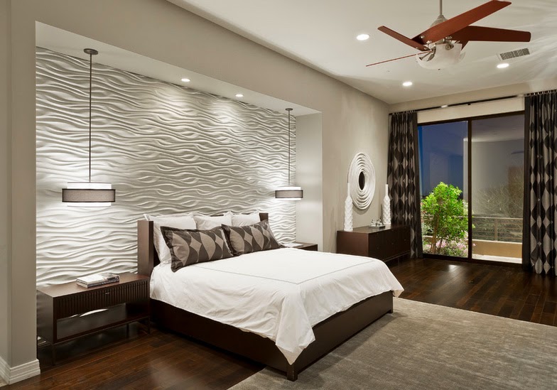
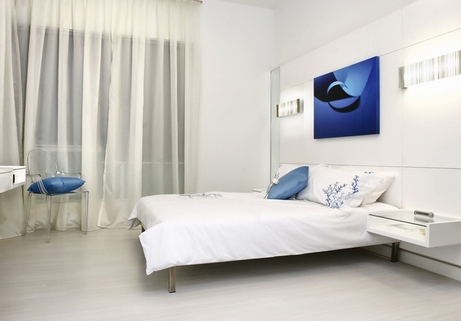
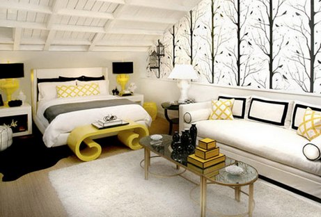
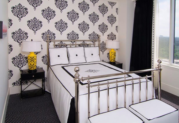
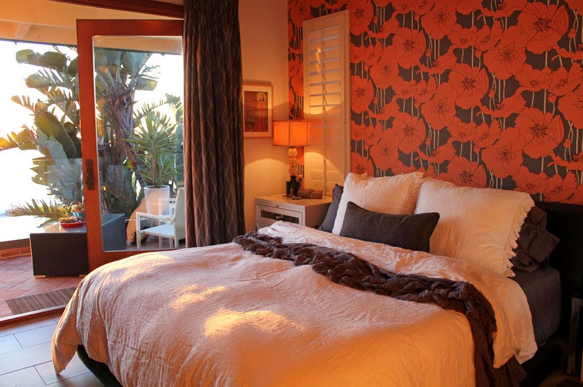
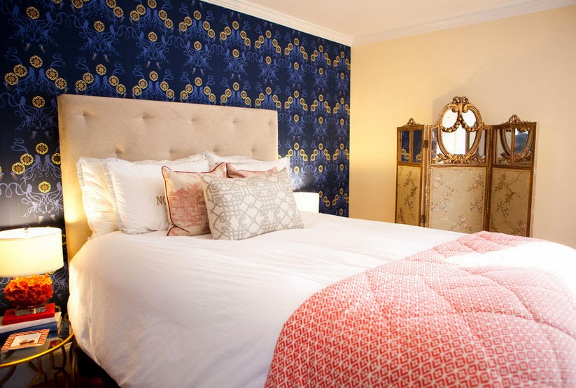
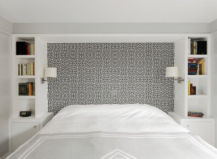
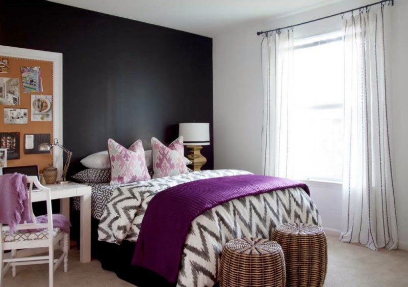
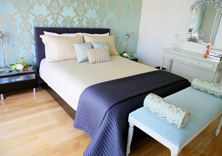
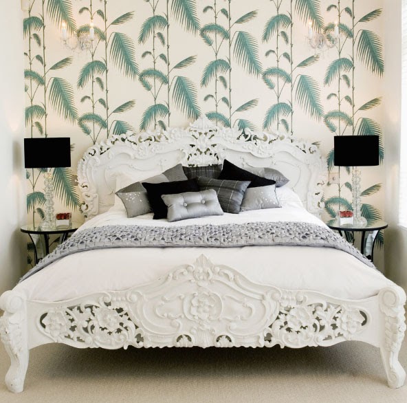
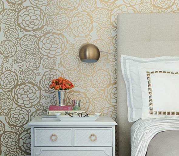
Bedroom
There is not much choice here; basically, the wall or part of it at the head of the bed is used as an accent wall. Wall paneling with wood panels also looks very nice in the bedroom. Take a look for yourself and appreciate the uniqueness and unusualness of this design.


![]()
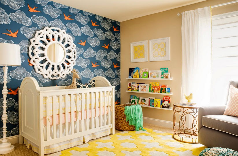
And a few examples of how an accent wall looks in a hallway, a nursery, and how it can zone a spacious room. Notice how attractive it is when the pattern on it matches some decorative elements.