Pastel landscape. Pastel drawing lessons
For work we will need: oil pastels (I always use Sonnet). Watercolor paper (I took A4 format), (you can use special paper for pastels). Cotton buds(for rubbing pastels).
To begin with, we lay the sheet vertically, mark (with a pencil) the sun, it will be slightly below the middle, closer to the right (lower) corner.
We take crayons: red, scarlet, orange, yellow, red-brown. Let's start working on the sunset (background). We apply the colors of all the crayons (previously mentioned) onto a sheet of paper. Except red-brown; We apply it along the edges of the top sheet of paper (the effect can be seen in the photo). Closer to the sun, paint the leaf with red, slightly scarlet, and yellow chalk.

Now our fingers will work :) Very often in landscapes using the oil pastel technique you have to rub in and smear the colors. Thus, when rubbing, we fix the pastel pigments among the unevenness of the paper (watercolor paper). I always use my fingers when I need to rub something in. There are many ways, cotton pads, cotton swabs, etc. Well, let's not stray too far from the process...
We begin to rub in the pastel horizontally, just as we did the sketches with crayons.

After rubbing in the pastel, we see that in the previous photo we have a lot of white gaps left, and a very small layer of pastel.
Thus, we don’t need such a result, and we start again on top of the first rubbed pastel, sketching the second layer, / Using the same colors /.
.... Then we begin to rub again, until the result: until we have no white highlights.
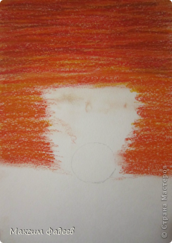
That's basically what we got. We see that the higher our background, the darker the tone (but in the future we will have darkening in both directions).
We make the surface smooth, uniform, without pastel crumbs.

After which we start working on the foreground. We take a pink or burgundy chalk and make sketches in the same way. Then we rub it in. We leave light colors around the sun.

This is what we got. We rubbed and leveled everything. Now let's start working on our sun.

In this lesson I will introduce you to pastel crayons; I'll tell you what they are and how to use them. You will discover a new direction in creating bright and colorful works, which do not lose their qualities and which can be drawn both at home and outside.
Why pastel?
I have to admit that pastel is my absolute favorite among all the drawing methods. The dynamics of the incredible variety of colors amazes the imagination, and the detail is sometimes amazing. To work, you only need a piece of paper and pastels - nothing more. You can quickly get your finished drawing at home or outside the walls, and you don't have to wait for it to dry.
For me, painting with pastels is something of a conscious choice to take advantage of subtleties, and by that I mean:
— different shades pastel crayons and pencils that I work with;
- the color of the paper or cardboard that I use (should it shine under my drawing or not?);
- colors that I have already used and the effect that appears when applying new colors to them;
— how shading with a finger can change a drawing;
- Do I have the courage to leave clear lines unshaded?
What pastel crayons are not
Chalk
Pastel- not what teachers use to write on the blackboard and not what children use to draw on the asphalt. Chalk is made from carbonate lime and mixed with dye, and is usually too faded and quite hard.
Oil pastel
Like pastel crayons, oil pastel are made entirely from pigment, but oil pastels are mixed with a non-drying oil substance and a wax binder. It can be used along with resin to make a paste.
1. Pastel
Pastel is a pure powdery pigment mixed with a small amount binder. This makes them softer than chalk and makes them more versatile. They vary in color from calm tones to very bright ones and are an excellent tool for creating large and small paintings in any environment.

Some pastels are harder than usual and I think there is little difference between them. I use both for large-scale drawings and for creating details - although some types are more fragile. I only feel the difference in color.

Pastels are produced in round and square shapes. Again, I use both crayons for both scale and detail. However, each type has its own advantages - they provide different types strokes. Below you can see a fragment of a painting with the fur of a howling wolf. You can see the different strokes and places where I used round and square crayons, but I deliberately applied the strokes with the edge of the square chalk to give the fur a matted effect.
Advice
When you start drawing, do not outline the base with a graphite pencil, as chalk does not adhere well to it. Use a pastel pencil or, if you don't have one, a comte pencil, charcoal or, finally, pastel itself.

Which crayons should I choose?
You can buy a box of pastels from different colors. The Inscribe company offers a good set for beginners, 48 colors with various shades at a reasonable price. However, their crayons are quite hard and a little smudgeable; they are difficult to draw with fine lines. Avoid sets that contain a lot bright colors, because when drawing you will realize that such “diversity” is too limiting.
The lesson is translated from the site design.tutsplus.com.
Complexity: | low |
Working hours: | 2 hours |
What dreams of an exotic island do not lead to))... This is how the still life turned out, from winter fruits and berries, reminiscent of palm trees, the sea and warm countries. It's very easy to draw!
You will need:
1. Dry pastel, I have Sennelier. You can take any, your favorite, be sure to be dry.
Approximate colors:

2. Pastel pencils, we need approximately the same colors. in principle there is not much in this still life detailed study, so you can make do with sharp pieces of pastel if you don’t have pencils.

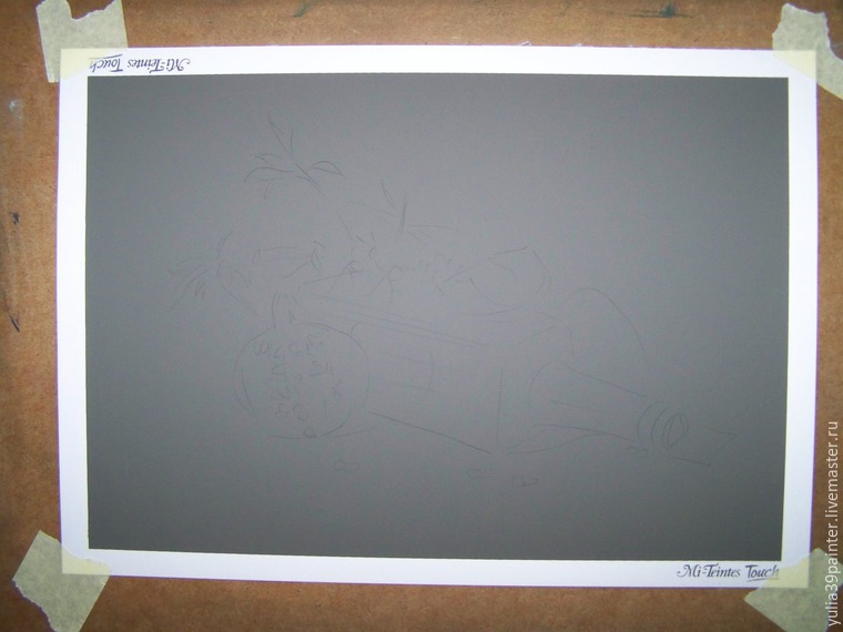
3. A3 pastel paper. Please note that the background in this drawing is paper. Therefore, you need to choose the color of paper that matches the color you want to make the background! Well, you need to choose the appropriate small detail for the shadow. Those. if the paper is brown, like mine, then the shadow is dark brown; if the paper is gray, then the shadow is dark gray. IN in this case we do not follow the laws of chiaroscuro in its literal sense, we must have an emphasis on the object itself, decorative in such an angle, the shadow must be effective, but not stand out, so we make it in that background.
4. A tablet or a piece of plywood for drawing at an angle.
Let's get started!
1. We draw the contours of our drawing in any way convenient for you.
2. We start with a bottle and green leaves. Apply bright spots with several shades of green.

3. Shade with your finger

4. Then apply red, pink and white areas to the pomegranate. We don’t highlight the grains, we work in spots.

5. Shade, but do not mix the colors, each color separately, mix only the borders. We apply shadows on the wall, from a bottle, from a twig, under scattered berries. We also shade it a little.

6. Take orange shades and nude chalk and apply the color to the sea buckthorn berries.

7. Now we are finalizing our drawing with pencils. Let's do small parts, twigs. We emphasize the shadows. All! Our drawing is ready!

I have already shown this picture and several photos of how I painted it :) Today I decided to show the process in more detail, although I don’t have many photos of the stages, so this will be a mini-lesson on drawing landscapes with pastels.
Here is the original picture:) This is Croatia:)
The “sunset” landscape has its own characteristics. Firstly, it will use a fairly limited palette of colors, but these colors will have a lot of shades. Secondly, contrasts, which are often especially strong on the line where the sky ends and either the earth or some objects on the earth begin. In our picture, the bright sun contrasts very strongly with the very dark mountains.
In order to draw a landscape, you need to choose these crayons for the sky. We will use the same crayons when drawing water.

Paper - pastel, cornflower blue. Format - a3. Apply these colors as shown in the photo below.


Add them to both the water and the sky.

Then blend everything out with your fingers. The sky can be shaded with horizontal movements, and the water with vertical movements.

Paint the mountains with dark purple (or even black) and lilac.

Blend the mountains with your fingers, and add waves in the form of wavy lines. Use different colors for them - blue, yellow, pink. The closest waves will be the largest.
Let's consider clear example pastel drawing techniques from photographs. For this we use a photo of the Taos Mountains in the early evening from El Prado, a suburb of northern Taos, New Mexico.
When creating this pastel, I worked directly on white grainy paper. I was drawing charcoal pencil basic outlines freely but precisely, creating the most important shapes, major lines and relationships of light and shadow.

As always, at the very beginning of the work I determined the center of the composition and then acted so that each element of the picture supported it. For example, from the moment the white adobe building was identified as the center of the composition, I began to draw it on dark background, and against the background of a bright array of trees, thereby I increased the contrast and combined the two opposite principles of the landscape. This stage of work took approximately 30 minutes.
When I draw or teach, I give great importance systematization of the process of working on a painting. I believe that first of all, the order of the stages of work on the painting must be correctly determined. By following these rules, I can be sure of the success of the painting at the very beginning of the work and really achieve acuity of perception by the end of the painting. In my art workshop, I help students overcome discouragement and disappointment in initial stages painting, teaching them how to plan and how to proceed step by step in the painting process. I approach each student individually, in accordance with their level artistic skill. Beginners and young inexperienced artists can avoid many failures if they build their work in stages.
When I paint in pastels or oils, I usually work on a surface that is exactly 50% neutral gray.
So, I quickly cover the surface of the drawing with paints that are close in tone to the final color scheme of the painting, but still somewhat darker. From the point of view of drawing, composition and color scheme, this is a complete pastel, but it is still rough, sharp, and somewhat unpleasant to the eye.

Then we pass over the work with a brush moistened with a solvent (without the smell of turpentine). It is interesting that for many it is this part of the work that is most enjoyable, and the result is enjoyable. Starting to blur the pastel from lighter tones, using wide, free strokes, I create a working surface that is correct in tone, fairly neutral, with well-established images.

It should be noted that depending on the subject of the painting and the impression that the artist wants to make on the viewer, some of the paintings at this stage of work can be exhibited as finished works. The described method makes it possible to use one of the features and advantages of pastel - the amazing variety of techniques used in it. At this stage the painting has the appearance and impression of watercolor, but this should not confuse the artist, because at the next stage of work the opaque pastel will cover everything the best way. We will leave the “washed” painting layer unwritten only in those places of the picture where the “transparency” effect is required. This step takes approximately 20 or 30 minutes.
With the completion of this stage occurs amazing thing: By stepping back from the painting a few steps, I can get an idea of what it will look like finished painting. In future work I will have to strictly follow the drawing already existing at this stage, although I will still be adding additional layers of pastel. Upon completion of this layer of “sub-painting” there is also an already established complete color scheme and the ratio of light and shadow in the work.
Now I can go to the center of the composition and bring it to a real conclusion. It is very important. The center of the composition should work. If the center of the composition is unsuccessful, then no matter how well the rest of its parts are executed, the picture will not be successful. Working in concentric circles around the center of the composition and moving further and further away from it, I bring the painting to full completion.

Even though I move back and forth across the entire surface as I work, I always make sure that the surface is painted evenly, without large jumps. The edge of the picture, giving a certain image, must be related in color and combination of light and shadow to the last part that has already been created correctly. This helps keep the light-shadow and color relationships consistent. This can be compared to building a bridge, which begins on one side of the river and continues step by step (across) to the other side. This bridge is more likely to hold firmly than if it were built starting on both sides of the river and building until the builders met presumably in the middle. The final stage of this painting takes about 1.5 hours.


