Create a watercolor logo in Photoshop. The process of working on a watercolor logo
Still like to spy on the process?
From the outside it seemed to me that drawing flower wreaths was very simple, just a blunder and the logo was ready. But when I started drawing, the first versions had to be redone several times. Watching other illustrators and reading various articles, I came up with the following order of work on orders:
1. Drawing up an “inspiration board”.
The main part here must be completed by the customer, sending me a description of what he wants and pictures, photographs, fonts that are associated with his project. Based on them, I create a moodboard and approve the general mood. At the same time, the customer makes a 50% prepayment.
2. Search for ideas.
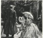
Then I start drawing and gluing everything I want on the topic in an A4 sketchbook. This kind of brainstorming with pencil and paints. For one project I allocate a spread that doesn’t fit and I paste it in.
![]()
3. First sketches.
In the case of this order, everything was described very specifically; usually I try to offer several options to choose from.
![]()
4. Detailed study contour sketch.
This is where a scanner and printer come to the rescue. In Photoshop I change the location, move it, add elements, make the drawing paler and print again. Then I trace the outline with a black pen and scan, and so on until the ideal version
![]()
![]()
5. Watercolor drawing.
After approval outline drawing I transfer it using the pressing method onto watercolor paper. So, without a pencil outline, the drawing turns out brighter and cleaner, and there is less cleaning to do when digitizing.
![]()
With a pressed outline, it is more convenient and correct to draw during the day, but this is already a luxury. For this logo, I drew ready-made logos, but more often I do them element by element to make it easier to make edits.
![]()
6. Digitization.
Editing composition, brightness-contrast, background cleaning (for *.png).
7. Design.
Selecting fonts and drawing the required text in a vector, choosing colors. Composing compositions for printing. Test printing is for verification, and color proofs are made by the customer at the printing house he has chosen.
![]()
....................................
This process may seem boring to some, but I still like the opportunity to control it and strictly follow the plan, this is very helpful during long breaks in work. Customers also like to know what to expect next. I don’t dare count how many hours I spend on developing a logo, but from this photo it’s clear that it’s a lot, plus correspondence with the customer and digitization and making changes.
![]()
In June, I wanted to try the 2-week system of working on a logo, but almost immediately we all got very sick and everything dragged on for a month. I’ll definitely show you the result and a little bit of the process, and today I’ll start working on a new one.
In this tutorial you will learn how to create watercolor logo using different brushes and textures.
Lesson materials:
Step 1. New document
Open Photoshop and create a new document with dimensions 1680x1050 pixels, background color white.

Step 2. Logo
On a new layer we write text using the tool Text Tool(Horizontal text). In my work I use fontBifurk, You can use any other font. We write each letter of our logo on a separate layer. I only needed two coats for the D and G (I rotated the G so it looked like a C).
Next, we create a separate folder for each letter; I ended up with two folders. Now you need to rasterize the text layers - right click on the layer with the letter, select the option in the drop-down menu Rasterize(Rasterize type). Repeat these steps for all text layers.

Step 3. Gradient and rotation.
First, I will explain how to create an unusual effect on the letter D, then you will need to apply this principle to another letter.
Duplicate the layer with the letter “D” twice. Let's take advantage Free Transform Tool(Free Transformation) or the keyboard shortcut Ctrl+T. We rotate these duplicated layers - one by 6.5 degrees, the other by -6.5 degrees. Rename them to “d_01” and “d_02”.


Add “d_01” to layers And " d_02" styleGradient Overlay(Gradient overlay), see the screenshot for settings. You can choose other colors to suit your taste.
Translator's note: Please note that the gradient angle in the first style is 90 degrees, and in the second - 50 degrees. The gradient colors in both styles are the same: b80000 position 0%, fed00b position 20%, feeb75 position 40%, d889ca position 60%, 5da2b2 position 80%, c10000 position 100%.


Reduce Opacity(Opacity) for these layers up to 50%
.
Repeat these steps for the other letter.


Step 4: Blur.
Select the two gradient layers and press the keyboard shortcut Ctrl+Alt+E, to get the merged layer. Place the merged layer that appears below the gradient layers. Apply to this layer (Filter - Blur - Gaussian Blur) 3 px. Rename the blur layer to «
d Blur", reduce itOpacity(Opacity) to 50%
.


Repeat these operations for another letter. Now create a folder and move the letter folders into it. Hide the layers with black letters by clicking on the eye next to the layer icon. Select all layers with letters except black ones, press the keys Ctrl+Atl+E to create a new merged layer. Move this layer below all layers, apply a filter to it Filter - Blur - Gaussian Blur(Filter - Blur - Gaussian Blur) 30 px. Change this layer's Opacity to 40%.

Step 5. Using watercolor textures.
In my work I use two textures, which you can find at the links: Texture1 and Texture2. Open the downloaded watercolor red-orange texture in FS, drag it into our document, transform it to the desired size, place it on top of the logo as in the screenshot. With Ctrl held down, click on the layer with the black letter D, then, without removing the selection, hold down the Ctrl+Shift keys and click on the layer with the black letter C - you will select two letters at once. Go to the layer with the watercolor texture and create a layer mask: Layer - Layer Mask - Reveal Selection(Layer - Layer Mask - Show Selection). Let's reduce this layer Opacity(Opacity) to 80%
.


Drag the second watercolor texture into our document. Create a selection of layers “d_01”, “d_02”, “c_01” and “c_02”, repeat all the steps according to the above described principle, change the blending mode of the texture layer to Overlay.


Step 6. Background.
Now we will create the background. To do this, you need to download archives with textures: 10 old paper texture by `Bleeding-Dragon and ShadyMedusa-stock’s. From the first archives we select the old paper texture we like, I use paper2. Open and drag this old paper texture into our document. Rotate it and transform it to the desired size Edit - Transform - Rotation 90°(Edit - Transform - Rotate 90 Clockwise). Place this layer below all layers.
Now we open the texture from the second archive, also rotate it and reduce it to the size of our document. Place this layer below the letter layers, but on top of the old paper texture layer. Reduce the opacity of this layer to 30%.

(click on image to enlarge)

(click on image to enlarge)
Step 7. Lines
Create a new layer using Rectangle Tool(Rectangle) draw thin line. We copy this layer three times, each time we copy we shift the line a little to the right. This way we will have 4 stripes. Combine these 4 layers into one. Copy the merged layer and place it as shown in the picture.

(click on image to enlarge)
Step 8. Texture on the lines.
Select two layers with lines and transform them through Free Transform Tool(Free Transformation) or use a keyboard shortcut Ctrl+T simultaneously rotate the stripes, then move one layer with the stripes down, as shown in the picture, as if connecting them to each other.
Load the watercolor Texture, open it in FS, drag it into our document, adjust it to size. Place it on top of the layer with top part stripes, right-click on the texture layer, select Create a Clipping Mask. If necessary, you can rotate and reduce or increase the watercolor texture on the stripes using Free Transform Tool(Free transformation). It should look something like this:

(click on image to enlarge)

(click on image to enlarge)
Step 9. Layer masks.
Create a selection of layers D, d_01 and d_02. Invert the selection and create masks on the layers with stripes. It should look like the picture:

(click on image to enlarge)
Step 10. Add paint splashes.
Download any splatter brushes, which you can download, for example, from the deviantART Brush Library. I painted splashes different colors, each on a new layer. You can apply different textures to some of the splash layers, like in the stripes example.
Translator's note: brushes with splashes can be taken from the archive

(click on image to enlarge)
Step 11 Add splashes to the background.
Create a new layer, rename it “Paint Brushes”, create a folder above the layers with background textures, move this layer there. Using the tool Brush Tool(Brush) draw splashes. Now we need to create a copy of the watercolor paint layer that we used as a clipping mask for the stripes layer. Let's use the keyboard shortcut Ctrl+J to copy this layer with watercolor paint. Move this layer to the folder with splashes on top of the “Paint Brushes” layer, right-click on the watercolor layer, select the option Create a Clipping Mask.


That's it, our lesson is over. I hope you enjoyed it!
(click on image to enlarge)
Logos are found everywhere in our lives. A logo is a business card of a company and it is very important that it is firmly associated with its activities. However, not only brands need a logo - they need it non-profit organizations, websites, sometimes even logos for events, such as festivals or sports competitions, are ordered from designers.
IN Lately A number of interesting trends have emerged in logo design. The style of many logos has become less formal, and the understanding of what it should look like has changed. trademark. Obviously, the development of Internet technologies allows a more creative approach to creating a corporate logo, which gives designers an excellent opportunity to dream up and create bright, memorable logos. What logo design trends will dominate 2015?
GEOMETRICAL FORMS
Laconic geometric shapes allow you to create simple, yet informative logos. Geometric shapes in logo design is a very promising direction. Such logos are suitable for almost any company, but this solution works best when creating a logo for construction companies, architectural studios. Logo created from simple geometric shapes, also perfect for a theater or museum.


TRANSPARENT ELEMENTS
Today, designers often use translucent elements when creating logos. Such logos look especially impressive on the displays of various electronic devices, but when the right approach Such logos can also be used in printing. When overlapping each other, the elements change color - this is the so-called “overlay effect”, which allows you to show their interaction with each other. Typically, when creating such logos, designers use bright colors, which makes the logo memorable and evoking positive emotions.

SPROUTS
Plant elements have always been used to create logos and it would seem difficult to come up with something new here. However interesting ideas appear every year and designers delight us with stylish logos. The sprout is a very effective symbol that is perfect for actively developing companies or startups. This symbol evokes associations with development, movement, growth and the desire for success.


POLYGONS
Polygonal logos will be very popular this year. They look very impressive and allow you to create very expressive logos. In web design, low-poly graphics were used to create backgrounds, but many designers found polygons to be great for creating logos.


WATERCOLOR
Every year, logos appear that completely do not correspond to our ideas of what a logo should look like. One of the main trends of 2015 is “watercolor” logos. Yes, such logos are not suitable for every brand, but, nevertheless, it is clearly visible that this trend is gradually gaining strength and we will soon see many “watercolor” logos.


LOGOS WITH MEANING
If a designer manages to create a logo that combines geometric elements and at the same time there is a parallel message in the sign, then this is a great success. Not all brands have names where the principle of a hidden concept can be used, but if this is possible, then this technique must be used. This trend appeared a long time ago and it will be one of the most important this year.


If you've ever painted with watercolors, you know that it's a completely different process when working with acrylics or oil paints, and unique images that you can't create with other materials. Achieving a perfectly layered watercolor image takes time, skill, and dedication.
Colorful abstract Watercolor logo design by GoodEnergy.
There is something intimate about watercolor that comes from knowing that every part of the image's composition, every point of saturation, and every color overlay has been chosen to create the complex mood you feel when you look at the image. That's why watercolor logos are a great way to communicate details. If your goal is to show a personal touch when designing your products, a watercolor logo can be a great choice for this.
Brands that want to portray a soft, calming persona are ideal for using watercolor logos. Watercolor logos offer a subtle touch, making them ideal for companies working in floral design, fashion, jewelry design, and women-focused products, but there can be many more of them. Take a look at some of the ways brands across a wide range of industries are using watercolors to showcase their unique curations. There may be many watercolor logos, but you won't find them general form on our list!
Watercolors often feel feminine
—
Perhaps the first thing you'll notice about watercolor logos is that many of them are aimed at female consumers. This may be due to the softness of the watercolor images or because many believe that water is a feminine element. It could also be a throwback to 19th century sensibilities, when watercolors were considered a "ladies' medium" and became popular with female artists.
Whether watercolors feel feminine due to nature or nurture, there is an established precedent for using watercolor logos to appeal to female consumers. Designers and retailers women's clothing, jewelry companies, and any other brands that primarily target female shoppers often use watercolors to connect with their target audience.
Huntress™ logo design.In particular, watercolors lend themselves well to maternal images
—
And since watercolor logos often have that feminine feel, it's no surprise that you'll find a lot of companies using them to communicate with moms. These logos use watercolors and associations with mothers to communicate that their brands are nurturers. These are the brands you can turn to when you need a soft place to land or some homemade nutrition.
Watercolors feel peaceful. They feel safe and serene. Logo registration via Arthena
And sometimes a watercolor logo is the visual equivalent of comfort. Logo for Moma Made Meals via The Bluebird
The watercolor is subtle in this logo, but look closely at the flowers to see how it is used in contrast to the solid colors in the woman's profile. Logo for Agape Beginners via Sign.Yra
Every now and then, mom needs a glass of wine. Lottery and business card entry via Cross Lime
But that doesn't mean they can't reach out to the guys
—
Don't think that watercolors are limited to women's brands. Lots of watercolor logos are designed to appeal to everyone, and you'll even find some skewed masculine center.
Watercolor logos that break the feminine stereotype do so using more dark colors, thicker lines and more masculine imagery than the average watercolor logo. They maintain the imprecision, artisan feel that every watercolor image has, but find ways to make it bolder.
Black watercolors add instant masculinity and coolness. Logo design by Ben Deltorov.Masculinity doesn't mean you're out of touch with your emotions. Via Victor Octaviano
More fierce animals, and this time the artist has mounted a watercolor with a confusing art to create an image that appeals to all genders. Tattoo for Marco Garnica via cazart
Contrast this block text with the script text that adorns many of the logos in the first section. How does it feel compared to them? Podcast design via nevergohungry
Straight lines, dark colors and an image of a "hard" animal, where the watercolors take the back seat. Logo competition entry via patrimonioSimple and subtle, this logo succinctly conveys the brand's commitment to high-quality ingredients. Application for registration of logo and identity through sanjar
Watercolors just feel natural
—
Nature is not about straight and uniform colors. Mother Nature has curves. It is washed out in some places and has lush, rich colors in others. With a watercolor logo, your brand can communicate that it is in touch with nature, and that like nature, it has its flaws. Keep your wabi-sabi going with a watercolor logo.
A watercolor logo can help a brand feel more in tune with nature. ananana14 logo design
This cookie looks so natural and real that you just want to bite into it. Logo input and business card via ananana14
Watercolors are also a popular choice for food processing companies focused on all natural ingredients. Logo and Social Media Registration Application via Identification Pulse
Watercolors are good at picking up natural highlights and shadows in images. Ava N Garda Logo DesignCrystals are another hot item in the natural healing community. Logo for Amy Basinstoke using sugar cane
A natural look is a priority for many companies in food and beverage spaces. Logo for my sister's kitchen via project 4
They are also great for florals
—
Flowers are a part of nature, so it follows that watercolor logos are also a great choice for companies that want to incorporate floral imagery into their brands. Watercolors have been a popular way to depict flowers and plants for centuries, first with watercolor pencils, like Albrecht Durer, a master of watercolors, then with watercolor paints when they became available in the 18th century.
Watercolor paints are a great choice for flower arrangements because the patchiness and variations of tones that make unique watercolor images, can easily capture the natural color and shade in a flower petal or leaf.
Floral designs can be quite abstract. Here is the impression of pink flower is all you need to understand the image. Logo and form style for Love and Bloom by ananana14And watercolor logos can be abstract
—
While watercolors can perfectly represent real things, they are a fantastic choice for abstract logos. Thanks to their interesting shades and effects, abstract watercolor shapes are fascinating to look at on their own and you can use them as a focal point in very simple minimalist designs. Additionally, their natural red edges can soften the harsh edges of classic abstract logos. If you want to keep it simple and still make a statement with color, go for a simple shape or a casual watercolor splotch in a bright color.
Are you finding it difficult to align your brand with a certain image? You will love the abstract watercolor logo.
Give your mark with watercolor logo
—
Watercolors are hard to put in a box. They're light, they're inky, and while they're often read as feminine, they're not just for women. Watercolors are for those who don't want their logo to be compressed by harsh lines and saturated blocks of color.