Curvilinear composition. Category archives: fundamentals of architectural composition
Now, having mastered these skills at least in general terms, you can move on to composition.
Composition - as it is, lines of force and balance - is a complex and rather subjective question, because the mutual harmonious arrangement of objects in a drawing is a matter of taste for each individual person. However, despite the fact that there is no friend according to taste and color, there are some general principles of composition, using which you can make any pile of objects harmonious. At least with enough training.
Composition is how various objects are positioned relative to each other in a drawing or in reality.
How they are located in reality is not particularly important in this case. Unless, of course, you are planning a rock garden. But the mutual relationships between the images of objects in the picture... This is really important. Among other things, also because even if in “real life” objects are arranged anyhow, then, knowing the rules, you can arrange them in a drawing much better than in life.
So, the first rule is drawing should not touch the edges of the sheet, unless specified by the specific purpose and design. For A3 format there should be approximately 2 cm of space left from the edge.
Second rule. And, in fact, the main thing. The picture must include harmony. In other words, equilibrium. Or, on the contrary, there must be a lack of harmony, a lack of balance. It all depends on what you want to show.
What does it mean?
Let's compare the square standing on the surface:
and the same square, only slightly distorted.

Which image is more balanced?
Now let's place a large square on the edge of the sheet. And the small one is in the center.

And vice versa, a large square in the center of the sheet. And the small one is in the corner.

Which one is more harmonious?
Each person has personal preferences. Some consider one thing harmonious and balanced, others another. It is almost impossible to explain the principle of harmony and disequilibrium at a distance, remotely. Everyone develops a system of harmony and disequilibrium for themselves. And then, if this is part of his tasks, he tests the system on other people. Checking her out.
You can develop your own system of harmony only through practice. And testing it on other people.
The rule of harmony and disequilibrium applies both to the shapes in the drawing and to the colors and tones that are used in the drawing. Color is red, blue, etc. Tones - darker, lighter, very dark, very light. One color can have many tones. One color can have many shades - yellow can be more red, less red, more green, etc. All these features are also in relation to each other either in harmony or in disequilibrium.
Harmony and disequilibrium in their pure form are achieved by one or another combination of images of objects and color combinations.
Third rule. Power lines. It's a bit like the second rule. Some people achieve harmony or disequilibrium with its help. But lines of force are different.
A little exercise. Take the picture that you liked the most.
For example, "Madonna" by Leonardo da Vinci.

And now watch the Baby’s hand, with which he reaches out to the Madonna’s face. The lines of this hand smoothly flow into Madonna's hair. The contour of the hair smoothly goes around the face, goes down to the cloak and the line continues with the folds of the cloak. The folds of the cloak are lost under the hand of the Madonna with Berries. However, the line of force continues with the folds of clothing above the elbow, flows into the hand with berries, to the lower hand of the Baby.

The line of the baby’s upper arm also passes into the power line of his head, into the power line of the Madonna’s face.
Just like the arms, the Baby’s legs are also united by a line of force. The beginning of the line is set by the fingers of Madonna's hand. This direction continues with the Baby's right leg and goes into the lines of the folds of the cloak. The Baby's left leg continues with a line of force on one side - in the folds of the cloak, and on the other - in his body, passes to the head.
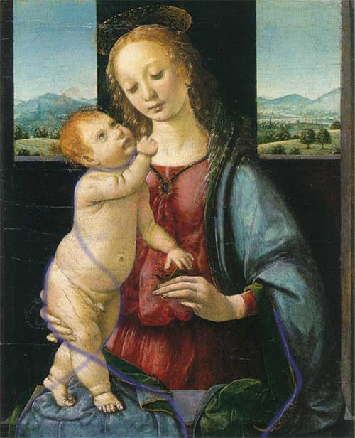
See how the lines of force connect the foreground with the figures and the background in the windows in the background. In the left window, the line of the nearest hill meets the line of the Baby’s chin. The line of the far mountain in the left window goes into the line of force on the outside of the Baby’s face.
The Madonna “enters” the landscape in exactly the same way. The line of the nearest hill continues with the folds of the cloak. The mountain slopes also converge on the lines of the cloak. Notice that the line of the nearest left hill and the line of the nearest right hill continue into the Madonna's necklace and meet each other on the jewelry. By the way, decoration is the visual center of the picture, the point of intersection of most lines of force.

I hope you noticed these features. The lines listed are not all that are in the picture. I don’t know whether Leonardo da Vinci took these lines into account when developing the composition of “Madonna” or not. But these lines are there. And thanks to them, the composition turns out to be not only harmonious and balanced, but also connected. The composition does not fall apart. She is whole.
Thus,
lines that can be clearly traced regardless of the object in each image are lines of force.
They are called power because they carry the whole picture, its integrity. Remove them by arranging objects differently - and the picture will fall apart and become weak. Lines of force are what unite images of objects. These can be either real lines or imaginary ones. They disappear and appear. However, if they can be traced, then the picture is complete.
On the other side, power lines- this is what expresses the character of the object. If their combination changes, then the object changes. Lines of force are what remains when all the unimportant, insignificant and insignificant details of an object are removed. Remove everything that does not unconditionally characterize the subject. Lines of force are the skeleton of the idea of an object. His eidos, ideal image.
Objects interact in the drawing using lines of force. They either communicate or are disconnected from each other. Lines of force show the relationship of objects to each other.
Lines of force have different densities and can form convergence points - epicenters. There may be several of them in the picture or just one. It may not exist at all. Depending on this, the nature of the picture changes.
Learning to use force lines is easy—you just have to watch. Behind the paintings already made, behind what you draw. And at some point, when factual material accumulates, you will understand how to apply it to your specific tasks. Moreover, almost all living things contain many lines of force.
So, first observe with examples, and then draw yourself.
How do these rules apply? Very simple. If you want to draw movement, then this image cannot be balanced. Because movement is not peace. There is no balance in movement, there is a desire to go somewhere. The lines of force converge towards the goal of the movement. If you want to paint a static picture, then the lack of harmony will definitely not allow you to achieve this. When there is no harmony, the viewer's gaze roams around the picture, creating movement.
There must be balance in a static painting. All parts are linked to each other. United by power lines into a single whole. Lines of force do not have epicenters or have one clearly defined epicenter.
Using combinations of these rules, you can achieve a huge number of possible nuances and moods, when parts of the picture intertwine with each other in the order you planned, and, perhaps, even fit into the interior of your room, the lines of force of which continue the lines of the picture. Well, now, actually, instructions for training the composition:
Practice expressing harmony and disequilibrium, lines of force and placement of the drawing on paper to the point where you feel that you have mastered this step completely.

Based on materials from http://wozmoznosti.narod.ru/drow/yegor/step4.html
Lines are one of the main elements of the composition of any photograph. The lines largely determine where the viewer's gaze will be directed when looking at the photograph. Lines play a huge role in the composition of a photograph; depending on their location, they express the dynamics of movement and give the photograph a particular mood.
The use of lines as powerful elements of composition goes back to architecture and the large paintings of antiquity. When creating a frame composition, the photographer must consider the arrangement of lines in such a way as to correctly organize all the elements of the photograph and improve their perception by the viewer. This article will discuss lines and their role in photographic composition.
Types of lines and their purpose in photography
When we talk about lines in photography, we mean any natural, man-made or speculative objects that serve as an auxiliary, organizing element in constructing the frame. For example, such objects in a photograph can be power lines, tram tracks, metal fences, rivers, paths, fences, and highways. They can have any size and configuration.
The purpose of such lines in the composition of a photograph can actually be multiple. Firstly, lines are needed in order to lead the viewer’s gaze in the right direction to the compositional center or main object of the photo, thereby once again emphasizing it. Secondly, the purpose of lines in photography may be to give the picture additional dynamics, to express some kind of movement or even a sense of infinity. Thirdly, lines help to visually divide the photo into separate sections, concentrating the viewer's attention on the most important thing. And finally, photography that uses vertical, horizontal or diagonal lines, or a combination of them, takes on a very interesting character. Lines allow the photographer to give the photo the necessary spatial depth for maximum expressiveness.

When creating the composition of a photo, a photographer can use different types of lines. There are several of them and each creates a particular feeling, ultimately exerting its own specific influence on the photograph:
-Horizontal lines
Horizontal lines are perhaps the most common in photography. The horizontal line can be, for example, a sea coastline or a road. As in architecture and painting, horizontal lines in photography convey a sense of calm, peace and balance. When using a horizontal line, the viewer's eye in a photograph usually moves along it very easily, from left to right. Such lines add a feeling of relaxation and infinity to the photographic image.

However, you need to be careful and not allow the presence of only horizontal lines in the photograph, since the pictures in this case may turn out to be too calm, rather boring and uninteresting. It is best to use a horizontal line as an element that leads the viewer's attention to the central subject of the photograph. Sometimes horizontal lines are also used by photographers to simply delimit an image into two or more areas. The main thing is that the horizontal line does not divide the frame into two equal parts.
— Vertical lines

Vertical lines, compared to the same horizontal ones, look more powerful in the picture; they are a kind of pillar of the entire composition. This line adds an impression of stability, strength and incredible power to the photo. A vertical line does not create tension in the frame and enhances the effect of the photo, adding a certain mood to it. Vertical lines also help give a photo a sense of height or, as with horizontal lines, divide the image space into separate areas. It is worth noting that if there are both horizontal and vertical lines in a photograph, a person’s gaze first moves horizontally, and only then along the vertical lines.
— Curved lines

Curved lines can have different effects on the perception and character of a photographic image. If such a line turns out to be strongly curved, then this gives the composition of the photograph a certain instability. In addition, when seeing too curved or broken lines, the viewer has a subconscious feeling of tension associated with the idea that this line is bent or torn under the influence of certain forces. Strongly broken lines act on the viewer as a certain irritant. At the same time, lines that do not deviate too much vertically or horizontally in the photograph are perceived as stable and, accordingly, give the image a feeling of relaxation and calm. The winding lines of rivers in a landscape or the strong bends of a person’s body are also perceived by the viewer as stable, but at the same time he feels the presence of a certain tension in the photograph.
— S-shaped lines

S-shaped lines are lines with soft, smooth curves that are associated in our minds with the contours or lines of the human body. This compositional element allows you to give the photo additional attractiveness. It’s not for nothing that the S-shaped line is called the “line of beauty.” Such a line can act in a composition both as a framing contour of the object being photographed and as a guide line. It is generally accepted that the S-shaped line, as opposed to simple horizontal and vertical lines, also adds a natural feel to the photo.
— Diagonal lines

Diagonal lines in the composition of the frame not only add dynamics to the image and, in fact, symbolize movement, but also simply attract the viewer’s attention. The starting point of the diagonal line is usually placed in one of the corners of the frame, and then the line is drawn either from the upper left corner to the lower right ("falling" diagonal), or from the lower left corner to the upper right corner ("rising" diagonal). The implementation of both versions of the diagonal line gives the viewer a feeling of tension in the movement.
Diagonals can also be used to direct the viewer’s gaze in such a way that, moving along diagonal lines, he fully perceives all the plot-important details of the photograph. The diagonal can connect the main subject of photography with a secondary one, thereby forcing a person to move their gaze into the frame. In addition, diagonal lines allow you to add depth and some spatial dimension to the photo. In this regard, a special effect occurs when there are any lines converging in the distance in the frame.
Of course, in order to learn how to use different types of lines correctly and, most importantly, appropriately, constant practice is required. When creating a photo composition, you must always find the right place for the lines in the frame. So that they help enhance the effect of the image or add a certain mood to it.
Skyline
Most often, when creating a photo composition, photographers are faced with the horizon line, actually the main line in photography. Often, when evaluating a photograph, you can hear the statement that “the horizon is blocked.” What does this mean? This phrase means that the horizon line does not run parallel to the bottom and top borders of the frame, that is, it literally falls on its side.
Blockage of the horizon– this is an amateurish, simple mistake, inherent mainly in novice amateur photographers. A littered horizon creates an unnecessary feeling of tension in the viewer. The viewer internally feels that something is wrong in the photograph. True, in some cases, blocking the horizon can also be a deliberate compositional technique used by photographers to increase the expressiveness of the frame. But still, in classical photography, the postulate is accepted that the horizon line should be strictly horizontal.
In order to obtain such a strictly horizontal line, it is necessary to compare the horizon line with the lower and upper boundaries of the frame in the viewfinder or on the camera’s liquid crystal display. It is clear that you need to ensure that these lines are parallel to each other. Modern cameras are often equipped with an electronic horizon function, or have special markers in the viewfinder or a mode that overlays a grid on the image, allowing the photographer to correctly position the subject and orientate himself with the horizon.
When it comes to landscape photography of complex terrain with jagged coastlines or mountain slopes, it can be difficult to determine where the horizon line is located. Some photographers use a tripod with a bubble level to determine the true horizon line in this situation.

Placing the horizon line exactly in the center of the frame is not the best option for the simple reason that most often the output is static, motionless and lifeless photographic images. It is still recommended to place the horizon line 1/3 from the top border of the frame if you want to focus the viewer's attention on the foreground, or 1/3 from the bottom border if the emphasis should be on the sky. In particular, if the sky or clouds look very interesting in the frame, then you should place the horizon line a little lower. If the landscape or some object seems to be the most interesting in the frame, then the horizon is placed higher.

However, this rule can sometimes be violated. For example, when it comes to creating a symmetrical photograph with a landscape reflected in water, it is quite appropriate to place the horizon line exactly in the middle of the frame. Another practical recommendation for the placement of the horizon line in a composition is that the horizon should not intersect with the lines of the subject being photographed. Otherwise, if the lines of the subject being photographed merge with the horizon, the viewer’s gaze may simply move away from the center of the composition and begin to wander around the frame.
In conclusion, it should be said that problems with the incorrect position of the horizon can be solved in the subsequent processing of photographs in a graphics editor. An uneven horizon can be corrected using Photoshop and other similar programs. It's not a big deal. The main difficulty is to determine at what angle the image needs to be rotated to level the horizon. To find this optimal angle, use a horizontal or vertical ruler tool.
So, when we are trying to compose a shot in the viewfinder or on the LCD screen of our camera, we need to pay close attention to the lines. They are the ones who can unite various compositional elements of the frame or separate them, determine the mood, expressiveness and dynamics of the photograph. Lines can be both a photographer’s assistant, enhancing a particular effect, and a real destroyer of the entire compositional solution.
The photographer's knowledge of the use of lines in the composition of the frame not only helps him create bright, interesting photographic images, but also allows him to understand how the viewer will view the photographs he has taken. Where will his gaze stop, what details of the image will he pay the main attention to, and what will be his general perception of the photograph.
Hello, dear amateur photographers!
Today we will talk about lines and their role in photographic composition.
So, when we are trying to compose a shot in the viewfinder or on the LCD screen of our camera, we need to pay close attention to the lines. They are the ones who can unite various compositional elements of the frame or separate them, determine the mood, expressiveness and dynamics of the photograph.
Lines can be both a photographer’s assistant, enhancing a particular effect, and a real destroyer of the entire compositional solution.
The photographer's knowledge of the use of lines in the composition of the frame not only helps him create bright, interesting photographic images, but also allows him to understand how the viewer will view the photographs he has taken. Where will his gaze stop, what details of the image will he pay the main attention to, and what will be his general perception of the photograph. Depending on their location, the lines express the dynamics of movement and give the photo a particular mood.
Study for "Madonna in the Grotto" by Leonardo da Vinci
and one of the possible "lines of beauty" of this sketch.
Such a line can act in a composition both as a framing contour of the object being photographed and as a guide line.

Diagonal lines
Diagonal lines in the composition of the frame not only add dynamics to the image and, in fact, symbolize movement, but also simply attract the viewer’s attention.

The starting point of the diagonal line is usually placed in one of the corners of the frame, and then the line is drawn either from the upper left corner to the lower right ("falling" diagonal), or from the lower left corner to the upper right corner ("rising" diagonal). The implementation of both versions of the diagonal line gives the viewer a feeling of tension in the movement.

Diagonals can also be used to direct the viewer’s gaze in such a way that, moving along diagonal lines, he fully perceives all the plot-important details of the photograph.

The diagonal can connect the main subject of photography with a secondary one, thereby forcing a person to move their gaze into the frame.
In addition, diagonal lines allow you to add depth and some spatial dimension to the photo. In this regard, a special effect occurs when there are any lines converging in the distance in the frame.

So, we looked at the main types of lines in photographic composition. But we should not forget that the line along which the viewer’s gaze moves can not only be progressive, but also form an oval, triangle, square, etc. The strongest impression is created when there is an odd number of objects attracting attention in the frame, or more precisely, when this number is equal to three (composition triangle).
Now we know that lines in the hands of a skilled photographer become a powerful weapon with which the photographer helps the viewer see exactly the image and the mood that he wanted to convey in his picture.
But when using lines of directed attention, you must adhere to two rules.
First, you should make sure that the lines always point to the most important objects in the image. This also allows you to direct the viewer’s attention.

Secondly, it is necessary to ensure that there are no noticeable “dots” along the lines that can lead the viewer’s gaze away from the main line that the photographer “laid” for him specifically, so that he can feel the entire image as a whole.
Extra lines and dots outside the image scatter attention, the direction of the gaze changes and the necessary concentration for full awareness of the image is lost, a loss of interest occurs, and the entire photograph becomes boring to perceive.
And at the end we will summarize the main results.
Lines are one of the main elements of the composition of any photograph.
Lines, real or imagined, can enhance the effect of an image or give a photograph a particular mood.

The lines in the frame carry a varied emotional load: curved and horizontal lines calm, broken lines irritate, vertical lines exalt, diagonal lines add dynamics.
Of course, in order to learn how to use different types of lines correctly and, most importantly, appropriately, constant practice is required. The next time you take a walk with your camera, see how you can use the lines in the frame to give the photo more expressiveness and emotional brightness. In addition, try to constantly analyze the shape of objects. Ask yourself the question of how you can photograph this or that object in order to maximize its shape in the picture, make it more interesting for the viewer, and convey the necessary mood in the frame. And you will very quickly develop the skill of analyzing shapes and lines.
The basis of any composition are points, lines and spots. Their configurations and compositional combinations form visible images. In order for the composition to take place as the artistic integrity of the image, it is necessary to arrange all its constituent elements in a certain way. But first, you need to understand what is meant by dots, lines and spots.
Dot
A dot is a very small element in an image. For example, a small berry lying separately in a still life or small wildflowers against the backdrop of a huge field can be considered dots. For composition, they serve as a center or to balance other larger objects.
However, the entire image can consist of dots. There was even a direction in painting - pointillism, whose representatives painted pictures by applying dots to the canvas. In modern reality, all digital images presented on a monitor and printed using any type of printers and printing presses consist of a huge number of dots, which today are no longer distinguishable due to their extremely small size and high density of arrangement on the plane.

Line
A line is formed in an image due to the contact of multi-colored or differently tonal spots, being their outline. Also, a line can be independent against a background that contrasts with it or be formed by points located in a row or along a different trajectory.
Lines add dynamism to the composition. For example, diagonally directed lines in an image create the illusion of movement. Horizontally located lines give the feeling of increasing the image in width, and vertical ones in height. Straight lines add tension to an image, while smooth, curved lines create a sense of calm.

Spot
A spot is a uniformly or unevenly painted area of an image. The spot can be formed by a concentrated accumulation of dots. The spot always has a border, even if it does not have clear outlines. Spots in the image make up most of it. They form the basis of the composition, filling its entire space. For the perception of the composition, the shape, color and ratio of the sizes of all spots in the image play an important role.
Using dots, lines and spots in a composition

Dot and spot
One possible way to combine dots and spots in a composition is to juxtapose large and small. For example, to emphasize the scale of a building in a painting, it can be depicted as a spot that fills most of the image. For comparison, place next to it an insignificantly small person, compared to the building, who will be depicted, almost like a dot.

Point and line
The most striking example of the use of lines and dots in a composition can be considered a road stretching into the distance along which cars are driving. The image of the road is mostly formed by lines going into the distance to the vanishing point. In this case, the cars will turn from small spots, as they move away from the viewer, into dots. This effect perfectly demonstrates the effect of perspective.

Line and spot
The most obvious example of the use of lines and spots in a composition is filling the spots with an ornament of lines. For example, two square spots of the same size, located next to each other in the same image, but having different patterns, will be perceived differently. If one square is filled with vertical lines and the other with horizontal lines, then the first square will appear taller and the second more elongated in width.
The compositional integrity of the costume form provides for balance, that is, a state of the form in which all its elements and parts are balanced with each other. Achieving balance in a composition is largely determined by the equilibrium state of the figure, which by its nature is stable. One of the main conditions for the balance of a figure is its symmetry. Symmetry is one of the most important means of achieving unity and artistic expressiveness of the composition in a suit as a shell of a symmetrical human figure. The symmetry of the costume in its composition is determined by the natural symmetry and functionality of the figure. In the composition of a costume, symmetry plays a leading role; it influences the determination of the size and weight of the form, the distribution of divisions and details of clothing. Consequently, in the composition of a costume, the human figure is a factor that ultimately determines the symmetry of the costume, because its symmetry is the symmetry of tiered complexity, decreasing or increasing upward or downward. For example, there is symmetry of the head, face, symmetry of the shoulder girdle and arms, symmetry of the chest, hips, and legs. In a suit, where the shape is determined by the figure of a person and, to some extent, is his shell, elements of symmetry must be considered in the system the figure is the shape of the suit.” In this case, the structure of the suit has an axis passing through the human spine. This is the vertical axis of symmetry of both the human figure and the suit worn on it. The plane of symmetry runs through the center of the frontal silhouette and separates it into two morphologically equal parts. Each of these tiers, having its own mirror symmetry of shapes, determines the mirror symmetry of clothing shapes. The combination of forms with each other occurs under the condition of reflection from a certain conventional plane. In this case, the forms remain the same, but the left and right parts of the form seem to change places. In Fig. Figure 14 shows an example of classical mirror symmetry, or reflection symmetry.
Rice. 14. Classic mirror symmetry
In a costume, symmetry is one of the most striking and visually appearing properties of the composition, determining the state of the form, it is also the means by which the form is organized, and, finally, it is the most active pattern of the composition. The shape of a suit is considered as a process of spatial movement of elements in a given direction, as a property of certain laws of motion. In the process of such movement, the elements of form are located both in relations of equality, identity, and in relations of difference. Identical arrangement of elements refers to symmetrical transformations; asymmetrical organization is characteristic of form elements located in relations of difference. Symmetry in a suit means the equality of the right and left parts of the form relative to the central vertical, dividing the human figure into two equal parts. Asymmetry, as a concept opposite to symmetry, removes the condition that two parts are equal to each other. The predominance of symmetry or asymmetry in the design of a costume is associated with its purpose. In everyday outerwear, the most common is a symmetrical arrangement of details and parts of the form. In elegant clothing, asymmetry gives more dynamic, artistically expressive forms. The combination of symmetrical and asymmetrical shapes in one suit increases the dynamics of asymmetry. Symmetrical are identical elements of a figure, identically located relative to any point, axis or plane. Along with the main axis of symmetry in a suit, additional axes are possible that characterize the location of individual elements [Fundamentals of the theory of costume design, 1988].
In the structure of the costume, the transfer transformation is observed in geometrically identical forms of different fashion periods. Transfer is the operation most characteristic of ornament. In the structure of the costume, this transformation is observed in geometrically identical forms of different fashion periods.
In clothing design, the principle of symmetry of parallel movement can be used at the stage of sketch searches as a principle for combining various products into complex systems of a set, ensemble, collection. Rotational equality satisfies the condition of rotation of the original figure both around the axis of symmetry and in the plane of symmetry. Rotational symmetry in a suit is considered relative to space and plane. The rotation in space occurs around a vertical axis and characterizes the ideally geometric shapes of the costume. The rotation in the plane can be observed in images of a fashionable suit, which show the plastic capabilities of silhouettes, their dynamics, and increase the emotional perception of the suit. In a suit, helical symmetry is manifested in the distribution of dress drapery, shoe straps, and in the nature of hairstyles.

Rice. 15. Rotational symmetry
For established, quiet periods in the development of costume, the use of classical and similarity symmetry groups is most typical, and during periods of change of forms, elements of the affine symmetry group appear. In a suit, the transformation of affine symmetry - compression - is identical to the shortening of parts of clothing - a bodice or a skirt. If we take, for example, the level of the shoulder girdle as the compression plane in the bodice, and the length up to the waist level as the initial standard, and set the form to move from bottom to top, then the newly obtained shapes up to chest level will be a function of the compression transformation. The maximum compression levels here will be the levels of the chest and shoulder girdle. All shapes can undergo shear transformation in a suit. To obtain a new geometric shape of the suit, the shift plane, the magnitude and direction of the shift are outlined. The shear plane in the bodice is taken to be the plane passing along the waist line, and in the skirt - the plane on which the figure stands. The amount of shift depends on the purpose of the clothing. In elegant forms it is maximum, in everyday ones it is much less. The geometric representation of this transformation shows that at certain values of the shift angle, very dynamic silhouettes and shapes can be obtained, especially for elegant dresses.
Curvilinear symmetry in a costume arises during periods of its development, known for their artificiality (frame structures, deformation of the proportions of the human figure), tension, when calm means are not enough to express states. For geometric models of compression transformation, historical prototypes of two forms are used. The first form is the form of clothing on a figure with a so-called wasp waist, which was achieved by deforming the body with a corset. The second is the flattering shapes that were fashionable in the 1920s and 1960s.
The bend transformation unites all forms of costume into periods of lordly types of fashionable figure posture. In the history of costume, these types are united by the symbol of the Latin letter S . The extreme manifestations of bending in the form of a suit in the history of fashion were the costumes of the Gothic era and Art Nouveau style. The most typical example of curvilinear symmetry is the geometry of the shapes of suits of the 1900s–10s of the Art Nouveau style, with a bend of the figure at the waist, with a simultaneous rotation of the chest and head towards the lowered shoulder. This effect was enhanced by the arrangement of scarves, trains, additions, and color aspects. The picturesque forms of clothing of these periods are the right-left limit of the possible plastic bending of a figure in a suit. Currently, the effect of plastic sagittal bending is achieved not only by the movement of the figure, but also by shaping, cutting, and placing additions.
Fracture transformations are inherent in forms dissected into components and located on one or several axes, as well as the corresponding plasticity of silhouettes, defined by complex movements of the figure. A breakdown in a suit manifests itself as fragmentation of the form by flounces, assemblies that destroy the solidity of the form, which can be seen in Fig. 16, or a sharp change in silhouette shape. Fractional plasticity of crushed silhouettes is most typical for transformations of broken curvilinear symmetry. Historically, such forms were common in 1840–50, and are also seen in advertising posters and booklets of modern fashion.

Rice. 16. Curvilinear symmetry in the formation of the costume (breakdown)
The mechanism for changing symmetry in a suit occurs as follows: first, the spatial arrangement of the form changes, that is, a specific arrangement of the figure becomes fashionable, creating a fashionable silhouette. The placement of the figure visually creates the spatial axis of the future form. Then a redistribution of compositional elements occurs. The movement indicated by posture is visually reinforced by a shift in decorative and psychological accents. An assortment of fashionable additions and decorations appears. Thus, by 1840, shawls that hung down the back appeared in fashion. At the next stage, individual parts of the suit’s shape change, transforming due to a shift in the axis of symmetry. Finishing elements and additions are arranged accordingly, which strengthen the form as it moves backwards. By 1860, the entire structure of the form was transformed according to the principle of the shear operation. The plasticity of dresses, skirts, and coats becomes uniform. In Fig. 17–23 show the main manifestations of the types of symmetry in the formation of a costume.

Rice. 17. Affine symmetry transformations: stretching and compression
|
Rice. 18. Suit Shift Conversion |
Rice. 19. Curvilinear symmetry: torsion |
|
Rice. 20. Symmetry of similarity “operation K” |
Rice. 21. Symmetry of similarity “operation” L" |
|
Rice. 22. Curvilinear symmetry |
Figure 23. Simple bend |


In the use of asymmetry in a costume, two fundamentally different compositional techniques can be distinguished: sculptural and graphic. The sculptural technique of shaping is more often used in the composition of a costume for festive wear. With a graphic technique, asymmetry appears on the plane without adding anything to the silhouette, leaving it symmetrical.
In a suit, asymmetry means a complex dependence in the spatial organization of form elements, the absence of simple types of symmetry. The asymmetrical principle in the symmetrical form of the costume is found in the composition of the samples of folk costume that have come down to us. This is, for example, an oblique fastener in shirts - collared shirts, an asymmetrical arrangement of fasteners, embroidery, body components in Mari and Russian folk shirts, an asymmetrical knot on the belt, etc. With a symmetrical cut of a Japanese kimono, the pattern on it is always asymmetrical, therefore, its color composition is asymmetrical. The asymmetry of the suit fastener, generated by the function, is one of the main points in organizing the asymmetrical composition of the suit as a whole. Asymmetry in a suit exists on a strong symmetrical basis. Thanks to this, the shape-forming, inherently symmetrical outline of the figure is preserved. An asymmetrical beginning in the symmetrical shape of a suit can be developed not only thanks to additions that create asymmetry, but also as a result of asymmetry of rest, the use of asymmetrical details. Asymmetrical accents in the composition of a costume can also be formed with the help of color and texture. Their significance may vary. The asymmetry of the composition in the costume is solved by internal divisions without changing the overall symmetry of the form. Internal development of the form takes place. The role of a balancing element in this process can also be played by design lines (cut lines) and surface treatment techniques (internal processing). Asymmetry is based on a complex relationship of patterns, which together lead to compositional equilibrium.
When considering the structural relationships in the form of a fashionable suit, the structural levels that divide the form in the horizontal direction become significant and can serve as the basis for choosing a horizontal plane of symmetry [Petushkova, 1999]. The most typical examples of symmetry transformations with axes of the third, fourth, etc. orders of magnitude at the corresponding elementary rotation angles of 120 0, 90 0, 60 0, etc. Skirt shapes containing identical wedges can be used: two-, four-, six-, eight-, ten-seam, etc. The initial elements of the forming series will be the shape of the wedge and the order of the axis of rotation.
Transformations of curvilinear symmetry in the horizontal plane of the section of a suit with a straight silhouette provide interesting examples of associative symbols of the silhouette. A rectangular geometric silhouette is often accompanied by more specific names that evoke associations with the characteristic features of objects: pencil, tube, pencil case, for which the important characteristic is the cross-section of the form along the horizontal plane at the level of the chest line. The “pencil” silhouette shown in Fig. 24a, in cross-section it is depicted in the form of a hexagon. In a suit, the shaping of products with a pencil silhouette is achieved through vertical reliefs located quite close to the center line. Side seams give the product a more defined shape. Figure 25a shows a model of a women's suit (jacket and dress) with a semi-fitting silhouette. The geometric shape is close to the “pencil” silhouette, since the shaping of the jacket is achieved through the middle seam of the back and reliefs on the front (and back). To obtain the “pencil case” silhouette (Fig. 24b), the cross-section of which is close to a rectangle, vertical reliefs are placed closer to the side of the figure. The most typical assortment of garments with a pencil case silhouette are flattened men's jackets with a side cut. Figure 25b shows a model of a men's suit made of tartan fabric. Jacket with a straight pencil case silhouette and moderate volume. Women's demi-season coat in Fig. 25v straight flattened “pencil case” silhouette, moderate volume. The shaping of the silhouette is achieved through cutting barrels. a – women’s suit with a “pencil” silhouette;
b, c – men’s suit and women’s coat with pencil case silhouette