Composition of smooth lines. Lines in composition - their role and use
Lines can be real or virtual, speculative objects - as was shown in the article about active image points. Even a large painting has its origins in the lines of the sketch; the lines create the outlines of all the objects in the image.
Lines in composition theory can be real or virtual, speculative objects - as was shown in the article about active points of the image. Even a large painting has its origins in the lines of the sketch; the lines create the outlines of all the objects in the image. The role of lines is also surprising in the understanding that they can both unite various compositional elements of an image and separate them!
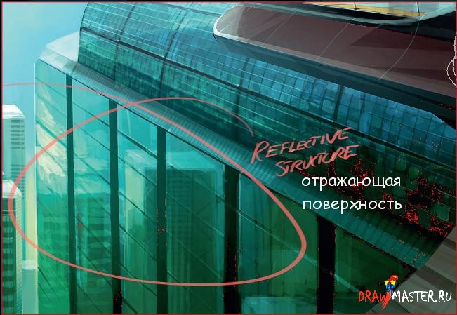
Lines are like a speculative construction. Our visual perception, driven by the brain, strives to simplify the visible world, for example -. emphasizing the edges and contours of objects, looking for connections in the mass of similar objects - so that, for example, seeing a mountain of stones on a construction site - you will first of all perceive it as mountain, the fact that it consists of many elements of different shapes and sizes will not occupy our consciousness much. Tool " edge selection" in Photoshop - acts in many ways like a person, combining minimally similar elements of a photograph - emphasizing their common features, increasing, focusing the viewer's attention on them.
One of the most important lines in photography is skyline.
The horizon at sea is usually perceived as a real straight line and you need to be VERY careful with it, leveling it - not allowing the horizon to “collapse” (unless the oblique horizon is a conscious artistic device in the frame). If the water/sky horizon line is not clearly horizontal, it creates a feeling of tension in the viewer, a feeling that something is clearly wrong in the photograph... This is due to the fact that water at rest always has a completely “horizontal” surface. If you are photographing mountains, then an error in a slightly “cluttered” horizon will not be so noticeable, although here we advise you to be careful, leveling the horizon as much as possible when shooting, otherwise an attentive viewer may also suspect an error...
Skyline. Hover your mouse over the image to compare the normal and "cluttered" horizons. In the second frame, the sea seems to be flowing somewhere to the right... Although the deviation from the true horizontal is only 2 degrees.
It is especially difficult to level the horizon - having both curved coastlines and mountain slopes in front of you at the same time - and it can be difficult to understand where the true horizon is, so some photographers use a tripod with a bubble level in such cases, or install this tool on the camera.
 Frame without horizon line. Establishing the horizon line in such a frame may not be easy, since the horizon is generally not visible. But in this case, you can focus on the verticals of the trees. And in general, in such frames, horizontal alignment is less important than in a frame with a sea horizon.
Lines such as telephone wires, or the condensation trail from a passing airplane, can interfere with the composition, especially if you are photographing a natural landscape. On the other hand, they can also decorate the sky in some photographs.
 An airplane's contrail line as part of a composition when photographing the sky.
Some rights reserved by Rob the moment
Properties of lines, Line shapes of image composition
If you see a vertical line, then such a line itself will never cause tension in the frame, since it is in a state of equilibrium - our perception tells us that the forces acting on this line are equal on all sides, or are absent altogether - therefore it has the ability to be in a stable vertical position. The same applies to the horizontal line.
If we see a line slightly curved on one side, then we subconsciously begin to think that it is curved under the action of certain forces acting on it. If the bend is not great and the line as a whole is horizontal or vertical, then such a line is usually perceived as stable.
A line that deviates from the vertical or horizontal is perceived as unstable. The most unstable line is considered to be one inclined at 45 degrees.

Sinuous, lines that twist like the letter S - can be considered either stable, balanced, or unstable - depending on the specific shape. For example, a slightly accordion-curved line located vertically may well be considered stable; a certain tension will also be felt in it, like a spring. Slightly curved horizontal lines are, for example, the horizon lines in a mountain landscape, the bends of rivers or the human body.
Lines - diagonals
A special case of an inclined line is a diagonal. That is, a line - going from one corner of the image - to another corner. An inclined line - or even a diagonal - can be created even from the “horizontal” horizon itself, by photographing, for example, a horizontal line - with a camera turned relative to the horizon line at a certain angle.
 Composition with a diagonal. The dynamics are palpable.
Some rights reserved by pierre bedat
Due to the fact that the eyes of a European person usually study an image from the upper left corner, gradually shifting to the lower right, diagonals drawn from the upper left corner to the lower right, and diagonals drawn from the upper right corner to the lower left, cause slightly different responses in the viewer's mind. Although this difference is not always obvious... It is believed that the main thing that the diagonal brings to the frame is tangible dynamics! But there are also very “peaceful”, balanced compositions using diagonals.

"up" from Mikelo
Curved lines, "line of beauty"
Lines with soft curves are usually perceived as the most beautiful (it is believed that they are associated by our subconscious with the lines of the human body).
In the theory of composition, there is even such a concept as the “line of beauty”, or “S-shaped line”, this concept was introduced into use by the artist William Hogarth back in 1753 in the book “Analysis of Beauty”. William Hogarth believed that this line is an integral part of any beautiful image.
In accordance with the theory of this artist, such a line has a clear advantage over straight lines, or intersecting at right angles, or parallel lines - which, according to this theory, create the impression of static, unnatural, “artificial” in the image. But the S-shaped line is considered inherent to all living beings (especially people), and, accordingly, to everything beautiful. In this case, even a hint of such a line shape is enough.
 Study for “Madonna in the Grotto” by Leonardo da Vinci and one of the possible “lines of beauty” of this sketch.
Active image lines
In conclusion of this material, I would like to once again mention active (“speculative” or “optical”) lines, which we already wrote about in the material about the role of dots in composition. In this case we use the term A.I. Lapin, in English - these lines are called “leading”.
I would like to once again emphasize the importance of these lines. It is known that the eye, when examining any image, does not move evenly across it, but from point to point (“active points”), along certain lines. The eye finds, first of all, the points of maximum curvature of the contour of the object in question, the highest contrast areas of the image, as well as the points of intersection of various contours of objects, since they indicate the relative position of objects in the frame.
It is very important to understand that the human eye, when examining an image, is guided not by the real lines present in the image, but by the above-mentioned elements.
For example, when examining a portrait, the active points are the eyes, nose, lips, and active lines run between them.
 Active lines and active points in a portrait. The lines show the “route of travel” of the human gaze through the portrait, the dark areas are the stopping points of attention.
What is the practical meaning of active lines and how can they be used in practice?
The practical significance of active lines is that knowing the principles by which they are formed, we can predict with a high degree of probability how our photograph, for example, will be visually viewed (read). What will he pay attention to at the beginning, and what will he pay attention to later... and what will he not pay attention to at all. For example, if there are two people in the frame whose gazes are directed at each other, then the active line will be the line between these people, and the active points will be these two people, and the viewer will practically not pay attention to the background of this image (if there is, of course, there will be no stronger active points).
Lines can also be extremely important for conveying perspective, the depth of the frame, but this is a slightly different topic...
Creating an interesting and eye-catching composition is the key to an attractive illustration.. Paintings with a powerful composition of elements will grab the viewers' attention and hold them until every little detail you worked so hard on is appreciated.
In turn, a compositionally poorly assembled painting can ruin the appearance of even the most beautifully depicted objects, creating the feeling that something is wrong with it. Many will not even understand why, but the picture will be less attractive, and it will be more difficult to understand its meaning. Later in this lesson, I outlined 20 points that, in my opinion, are one of the basic rules of good composition, rules that I always rely on when I take up a brush.
1. Focal point
Every highly compositional painting has a dominant object, or focal point, that is the center of the entire painting. All other elements of the picture should complement or frame this object. The focal point can be anything from a skyscraper in the distance to a paper cup sitting on a windowsill overlooking the entire city. It is very important that the focal point fits into the picture. There are many ways to highlight a focal point - the “One-Third Rule” or the “Golden Ratio Rule” - but I will not go deeper into this issue, because... for me it’s more important to feel the picture, without any rules.
2. Placement of other objects
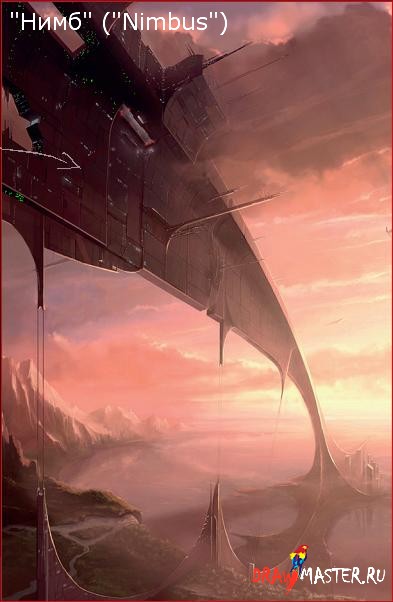
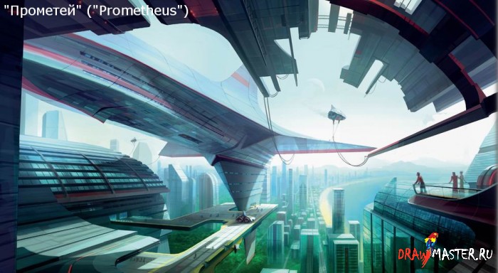
All other objects should be in harmony with the focal point and thereby enhance the effect of the entire composition. Carefully placed elements of the painting will contribute, ultimately adding depth, balance and realism. Pay attention to the painting “Nimbus”, which depicts a landscape that directs the viewer’s gaze into the distance; or on small details, such as the car near the moored ship in the painting "Prometheus".
3. Unity of objects
It is very important that all elements of the picture look appropriate, emphasizing that the shapes and structures of objects located in the distance are dictated by the external conditions between them and the viewer; or that all objects and structures correctly reflect light and cast shadows. With this approach, the composition will benefit. Let's return to the painting "Prometheus" - notice how the ship casts shadows on the pier and the buildings surrounding it, noticeably adding to the realism of this moment.
4. Framing
In paintings with a complex composition, a technique such as framing can be useful, which will help guide the viewer’s eye through the picture and keep him there. This can be achieved by simply adding smooth lines, or clear silhouettes to guide the eye exactly to the place that needs to be highlighted, most often this is the focal point. Pay attention again to the painting “Prometheus” - because. This can be seen very clearly on it - where I framed the center of the picture with a large pier facing forward.
5. Avoid tangent lines
They can have a negative impact on the whole picture and should certainly be avoided. Tangents are lines coming from individual elements of the picture that intersect at the end. For example, power lines that converge right at the corner of a building. Moving these power lines away from the building, placing them a little higher or lower, can avoid the visual perception problem.
Click on the picture to view the image in full size and 100% quality.
6. Color temperature
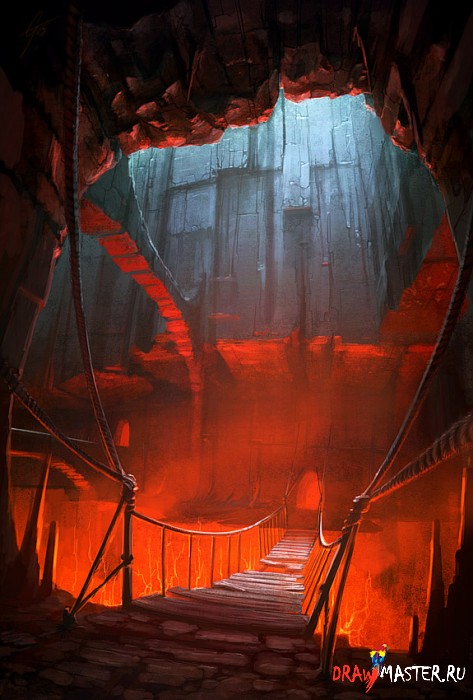
When you are faced with choosing dominant colors for your painting, always remember that the painting will ultimately evoke either cold or warm sensations; it cannot be both warm and cold at the same time (unless this is an author’s technique). Of course, you can use both warm and cool colors in your painting, but one of them should always be dominant, even if not by much (as, for example, in the painting “Dungeon”).
Click on the picture to view the image in full size and 100% quality.
7. White saturation
Contrast gradient is a very important tool when creating an interesting composition. Ideally, you should achieve a balance between light, medium and dark tones, using at least some of them. To achieve a good balance, try using a maximum of one shade, a little of another and just a little of a third, for example, as in my painting “The Room” - I used 60% dark, 25% mid and 15% light. .
8. Depth
Depth and perspective are also very important. Images from a certain angle require a properly organized and realistic depth, using a series of elements that lead the eye deeper into the picture. These elements could be fences, railroads, cityscapes, or even just a line of flowers in a field. The best compositional paintings are drawn as if you are looking at them from the inside.
9. Closing
Unlike tangent lines, this point refers to elements of the picture that meet each other. All elements of the picture should either be located far from each other or be in close proximity. When brought together, the objects create a unified form that draws the viewer's gaze away and causes him to pause while peering into the painting.
Click on the picture to view the image in full size and 100% quality.
10. Light
After giving the object its shape, this is the most important part for me. Before painting a drawing, I pay a lot of attention to the correct setting of the light. I've divided this topic into several logical parts to explain in more detail the different aspects of creating light and achieving realistic compositional balance.
Click on the picture to view the image in full size and 100% quality.
11. Let there be light!
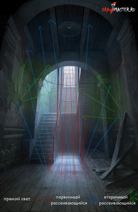
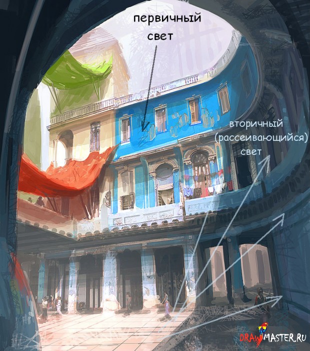
Choose a position for the primary (brightest) light source - the sun, a window, or, for example, a street lamp - in which the object will look three-dimensional and will cast an interesting shadow. The primary light can be the main part of the composition and even its focal point; it determines what color everything it falls on will be. Without light we will not see anything: therefore it is very important, and its correct placement is no less important.
12. Shadows
Shadow can be used to highlight the shapes of an object, attach them to a painting, and, when used correctly, to add additional framing to a composition (for example, as in the painting Prometheus, where the top of the pier casts a shadow on the lower part - the boardwalk ). What is important is that the shadow appears better when positioned under the direct rays of a light source.
Click on the picture to view the image in full size and 100% quality.
13. Additional light sources
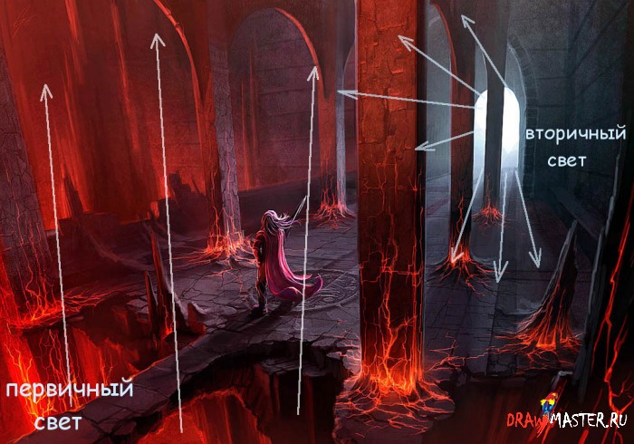
Important factors in the finished composition are the secondary and tertiary light sources. Secondary sources can be scattered or direct rays of light reflected from the surface on which the primary light fell, or weak glow from street lamps and car headlights, and even strong light sources close to the primary. The added secondary light makes it possible to enhance the detail of the picture and the arrangement of the elements of the picture.

14. Atmosphere
Atmospheric depth and occlusion (light absorption) are important components of a single composition in a painting. This can be a spacious area where the transparent air between the viewer and the horizon takes on color and tonal contrast; or it may be a small area where light passes through dusty air, taking on a subtle color (such as in The Room). A strong beam of light can also add atmosphere to a painting by bouncing and scattering around it.
15. Surface structure
For compositional balance, thoughtful and correctly constructed structures of various surfaces are also very important. It must be clearly understood that the use of reflective or shiny surfaces can attract the viewer's attention. In the painting “Prometheus” I used a lot of reflective surfaces that will definitely attract the attention of the audience, but also will not distract too much from the main element of the painting – the ship, but will only enhance its effect. Or, conversely, the use of dull and dirty textures can evoke completely different feelings in viewers (for example, as in the painting “The Room”).

16. Direction of view
You can also draw attention to the picture by using elements that direct the viewer's eye to the center or around the frame. This can be achieved in different ways. For example, good old fences or roads going into the distance, or, as in the painting “Nimbus”, a huge structure cutting through the sky and leading the eye from the upper left corner to the very center. The trick is that the viewer will lead his gaze along the arch until he comes to the end point - the most important part of the drawing.
17. Holding your gaze
If the viewer pays attention to the picture, the important point here is to hold this gaze longer. Let's go back to the good old technique with a fence leading into the distance from left to right. On the right side you will definitely need to add something, for example, a couple of trees or maybe a small house, so that later you can smoothly return the viewer’s gaze to the entire composition. Let us turn again to the painting “Nimbus”. Notice how the eye follows the line down and lingers on the city, looking at the rocks on the left and the city itself on the right.
18. Dramatic
Large-scale and epic images are usually either dramatic or very calm. To add drama to the image, you can play with depth, scale, speed of movement of elements or their calmness. In Nimbus, a large arched structure emerges from behind the viewer, sinks into the clouds, and descends to a point in the distance, showing how enormous it is in relation to the comparatively small skyscrapers at the point where it touches the ground.
19. Balance
Achieving balance in your composition is a matter of practice, especially if your focal point is a large, dramatic feature that takes up most of the frame. Looking again at the painting "Nimbus" - here I balanced the painting by using some shorter buildings, cliffs sloping into the distance on the left, and adding clouds that soften the perception of the painting. Together, these elements create harmony between the huge focal point and the rest of the surroundings.
20. Relative scale
Complex compositions depicting different shapes and sizes must be correctly constructed so that the viewer sees and understands the scale of the elements of the picture. In the painting "Prometheus" I painted several people - some closer, some further from the ship, to show the enormous size of this ship and the pier. You can create huge scales as far as your imagination and the boundaries of the canvas allow you. It’s the same with small objects - be it a glass with pencils, or a telephone on the edge of the table - everything should serve to ensure that the viewer understands the size of the table.
The plane task “Point, line, spot” is intended for students to master the primary skills of compositional thinking based on the use of simple compositional elements when arranging them in 2-dimensional space. The student's objectives are to achieve a balanced formal composition made up of lines, dots and spots of simple geometric shape. Execution steps:
1. Preliminary sketch – 2 sheets of A4. A preliminary sketch of a composition on an associative theme given by the teacher without the use of drawing tools (pencil drawing, brush drawing, appliqué), all options are carried out in the upper part of an A4 sheet (see Fig. 1a, b), and at the bottom of the sheet there is a signature of the work: “Sketches of a planar composition on the theme “...”, completed by senior gr. ..., teachers...” The signature is written in pencil in a narrow architectural font 5 mm high. Sketches are made in 2 versions - using straight and curved lines and are approved by the teacher. The composition field can have either a square or rectangular shape (to be agreed with the teacher).
2. Two approved options (straightforward and curvilinear) are developed in pencil using drawing tools on an A3 sheet and must be agreed upon with the teacher.
3. Compositions approved at the 2nd stage are finalized in black and white fixed graphics (A3 format). Both the applicative method of completion (overlapping elements with overlap) and the transparent method (the contours of the superimposed elements form new figures) are allowed. When finalizing, it is recommended to use solid fills, simple hatching and the use of different thicknesses and types of lines. Examples of work performed are shown in Fig. 2.
b) 
Rice. 1. Sketching a composition created on the basis of straight (a) and curved (b) lines.

Rice. 2. Examples of completing task 1, 2nd stage.
(Students Bryantseva N., Karpacheva A., Lugvischuk E., Khasabyan Yu., Tarasenko A., teachers Shatalov A.A., Minaeva A.V., Yaguza I.A.)
4. Development of 2 color compositions (based on the composition made in a fixed schedule at the 3rd stage) for 2 associative topics specified by the teacher. A3 format (i.e. each option occupies A4 space), preliminary sketch of each of the 2 topics in 2 options on A6 formats (these 4 sketches are arranged in A4 format). One of the sketches is done in an achromatic range, the other in full color. The final compositions are done in full color. Material: gouache. Examples of layout of sketches for execution in Fig. 3., examples of final work in Fig. 4.

Fig.3. Layout on A4 format of achromatic and color sketches, gouache.

Fig.4. Examples of color compositional works, gouache (arts. Tarasenko A., Gorbacheva S., Melnikova O., Nikonenko N., Tunitsky V., teachers Shatalov A.A., Yaguza I.A.).
Note
At the discretion of the teacher, the 2-dimensional part of Section 1.1 may be shortened. half and instead perform a series of mock exercises “Line and plane in space: rod and cable-stayed systems.”
In this case, the complete sequence of work is carried out in agreement with the teacher only according to sketches created on the basis of either straight or curved lines. Preliminary sketches and examples of performing the mock-up exercises proposed instead (“Hut-High-Tech” and “Mast”) are given below (Fig. 5-6 and 7-8). Moreover, in this case it is done development of the final graphic composition into a spatial one in the form of a layout (Fig. 9). Sketches for the exercises “Hut-High-Tech” and “Mast” are done in pencil, in the amount of 2, each on A5 format.
Before performing model work, students must prepare in advance cutting the rods of their thick cardboard, of arbitrary length, but the same width (no more than 3 mm). Stretch cables are imitated with thread or thin cutting of strong but freely bending paper. When securing the rods, it is necessary that each free end of the rod is secured with 3 guy wires. Next, it is necessary to secure at least one plane to the resulting cable-rod system.

Rice. 5. Sketches for the mock-up exercise “Shalash-high-tech” (students Chuprikova M., Okhrimenko N., Yesoyan N., teachers Shatalov A.A., Yaguza I.A.)

Rice. 6. Examples of performing the mock-up exercise “Shalash-high-tech” (students Pastushkov S., Eloyan A., Reshetova Y., Okhrimenko N., teachers Shatalov A.A., Yaguza I.A.)

Rice. 7. Sketches for the mock-up exercise “Mast” (students Abdurashidov M., Eloyan A., Okhrimenko N., teachers Shatalov A.A., Yaguza I.A.)

Rice. 8. Examples of performing a complicated mock exercise “Mast” (students Verkhoglyad D., Orlova L., teachers Shatalov A.A., Rembovskaya V.E., Obukhova L.Yu.)
At the request of the student and in agreement with the teacher, it is possible to expand the mast structure
(introduction of additional rods and braces, securing different planes and curved surfaces when searching for braces, etc.). In all cases, a prerequisite is to achieve geometric immutability of the entire structure.

Rice. 9. Examples of performing layout development of graphic compositions (students Balantseva A., Begun M., Barashyan A., Snesarev A., Gasanbekova S., Kurchuk V., teachers Shatalov A.A., Minaeva A.V.)
TASK 1. Making models of simple geometric bodies (Fig. 1). Goal: Master primary motor layout skills. Objectives: To become familiar with the basic initial techniques for making mock-ups of three-dimensional forms.
Requirements: Make models of: cube (8x8 cm), cylinder (diameter 8 cm, height 16 cm), pyramid (side 8 cm, height 16 cm), cone (diameter 8 cm, height 16 cm) according to the proposed samples. Methodical instructions: The cube and pyramid developments shown in the diagram (Fig. 2) are glued end-to-end with PVA glue. In order for the fold lines on the edges of the cube and pyramid to be smooth and clear, it is necessary to make a notch on the outside of the paper along the fold line. The notch is made 0.5 times the thickness of the sheet of paper; this should be done lightly so as not to cut through the paper. Then you need to bend the paper along these lines and glue the joints.
The bases of the cone and cylinder (circle) are cut out with a knife and trimmed with scissors. The circle can also be cut using a meter if you sharpen one of the needles very well. An additional valve can be provided to bond the side surfaces of the cone and cylinder. In order for the side surface of the cylinder to bend evenly, you can apply notches to its pattern at regular intervals (5 mm). An even curvature can also be obtained by twisting the parts between two sheets of film used for x-rays.
In all the source drawings given below, certain conventions are adopted: the thickest line corresponds to the line of the main contour and is cut through; the dotted line is an invisible contour, it must be cut from the wrong side; the thinnest line corresponds to the notch on the front side.
In order for the quality of the layout to be high, you need to make a very accurate drawing, make notches and slits, and carefully erase pencil marks. Sometimes you can not use a pencil, but make injections with a meter in the right places. First, notches are made on the patterns, and then through slits are made.
TASK 5. Plastic solution of two faces of a cube using metrhythmic patterns. goal: Studying some properties of a volumetric form: geometric appearance, mass, position in space, chiaroscuro, etc.
Objectives: To master the CONCEPTS of frontal and volumetric composition.
Master the techniques of creating plastic surfaces of three-dimensional shapes.
Requirements: Create a frontal composition as part of a volumetric structure, facing the audience with the main façade (static perception). The size of the cube is 10x10 cm, the depth of the plastic should not exceed 5 cm. Orient the cube in space towards the main direction of perception due to the rhythmic divisions of its surface (ill. 16-20). methodological instructions: the COMPOSITION center can be located on one of the faces of the cube or on its edge. The plastic divisions of the cube must be made in such a way that, during transformation, they turn into the plane of a sheet limited by the contours of the pattern.
The examples show that as the plasticity increases, space is introduced into the main volume of the cube. The volume has a predominant orientation to the main point of perception. Depending on the location and nature of the divisions (angular, central, symmetrical, asymmetrical), the perception of the volume itself in space and its orientation towards the viewer also changes.
Illustration 20
TASK 6. Plastic solution of the surface of a cube (ill. 21-23). goal and objectives, see task 5. requirements: Plastically solve the cube as a volumetric shape, viewed from all sides. To trace a single compositional concept in solving the plasticity of all faces. Cube size 10×10 cm.
Methodical instructions: The composition provides for perception from all sides, which does not exclude the main direction of movement towards this volume.
In the examples you can see different solutions for the plastic surface of a cube, from weak to deep relief.
Layouts of cylindrical volumes were solved according to the same principle as cubes.
B TASK 7. Rhythmic divisions of the surface of a cylinder. goal and objectives, see task 6. requirements: Determine the volume of the cylinder in
Account of plastic development of it on top - | ness (ill. 24-26). Base diameter 10 cm, height 18 cm.
Methodical instructions: The model is glued using the butt method. The plastic solution of the surface is achieved with the help of notches, slots, and bends.
FORMATION OF VOLUMETRIC FORMS USING RHYTHMIC ELEMENTS
Let's consider another opportunity to get a three-dimensional shape from a sheet of paper without glue. The drawing (Fig. 28) shows geometric patterns of slots in the form of circles and squares. By cutting through and bending individual parts, you can create a hemisphere and a pyramid (Fig. 27). The pyramid shape is built from mutually perpendicular triangular plates of different sizes. It creates the impression of volume and space inside it. The rhythmic pattern of slits on the horizontal surface of the base determines the orientation of the volume of the pyramid in external space in relation to the viewer. Movement around the pyramid and the direction of the main movement inside it are organized.
This technique can be used to segment surfaces and penetrate into the internal space of a volume. In this case, different impressions are achieved from the solution of the surface and the degree of spatial disclosure of the form itself.
Illustration 29
TASK 8. Division of a three-dimensional form using rhythmic elements. goal: To study the properties of volumetric forms: geometric appearance, size, mass, position in space.
Objectives: To trace how the properties of a geometric shape change depending on the degree of its division and the nature of the elements used for division. requirements: Make models of volumetric forms from rhythmic elements according to the proposed samples (ill. 27-29). Develop one of the three-dimensional forms (cube, pyramid, tetrahedron) using rhythmic spatial elements (ill. 30-33). Methodical instructions: Elements, as parts of a plane, can change according to rhythmic patterns and bend outward or inward to the main volume. It is necessary to bend the elements only after gluing the main volume, so as not to crush the folded parts.
An interesting opportunity opens up to study spatial combinations of different geometric shapes: cube, pyramid, hemisphere, tetrahedron.
Depending on the number, size, and location of the articulating elements, varying degrees of change in the initial mass of the main volume are obtained. From a dull, static form, it can turn into a light, openwork one, having its own internal space. When a volumetric form is smooth, its surface is not developed, then the internal space is not readable. If the surfaces are divided and cut through, then spatial openings appear, and the internal space of the most voluminous form begins to emerge.
One of the BAUHAUS teachers, Mogol-Nagy, considered space as a result of the development of massive form. Here are some stages of transformation that, in his opinion, occur with a simple form on the way to transforming a solid array into a spatial form:
Extreme massiveness, integrity of undivided volume;
Solid form, but already plastically transformed;
A form that preserves the compositional integrity of the building with the active inclusion of space.
These tasks study the primary properties of volumetric forms: size, proportions; geometric view; position in space; mass as a state that varies from the greatest massiveness to the maximum spatiality; Chiaroscuro. Compositional means such as nuance, contrast, and plastic rhythm are used.
Drew Hopper is a fine art and landscape photographer from Australia. In an effort to see and show everyone the diversity of cultures, people and places, he travels a lot and also writes articles about photography. In this article, using examples of his work, he explains how to correctly build a composition in photographs.
“In a nutshell, composition describes the position of elements in a photograph. A strong composition often has leading lines that direct the viewer's attention to your character or subject. These lines can be horizontal, vertical or diagonal depending on the character's positioning.
Let's take a look at the following pictures and see how I constructed the images using leading lines. I've marked them with arrows to explain how I saw and composed each frame.
In this photo, I wanted to lead the viewer’s gaze deeper into the frame, along a long corridor, while allowing the young monk’s gaze to go in the opposite direction, but along the same diagonal lines. A woman with a basket on her head in the background walking along the gallery also helped create the direction. Notice the repeating motif created by the columns getting smaller and smaller. This allowed us to create depth in the photo, even though the focus is on the monk in the foreground.
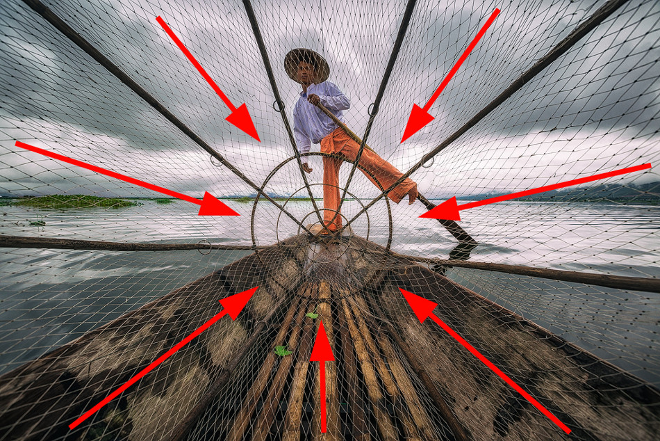
This is a fairly simple composition where the character is in the center. I framed the frame so that the fishing net creates diagonal lines that lead to the fisherman. The photo was taken with a wide-angle lens, the distortion helped give the image depth.

The focus in this shot is on the young monks, but I also wanted to capture the light and use the sun's rays as leading lines. By framing the image so that the monks were sitting under the beams, I was able to direct the viewer's gaze to their books. At the same time, the lines created by the wall on the left edge direct attention to the children themselves.

Here I framed the frame so that the young monk was in the left third of the image, with the columns on the right adding depth to the image. The lines of the gallery direct the eye towards the monk, while the lines of the ceiling lead the viewer's eyes downwards. The eyes of the monk himself, walking forward, are also lowered. This is a very simple but powerful composition shot with a wide angle lens.

Another shot where the character is in the center. Here I used a low angle for shooting and a wide angle lens for distortion - this allowed me to direct diagonal and horizontal lines towards the monk. Floor tiles also create leading lines that extend into the frame and keep the composition compact.

The composition in this shot is unusual for my work - I usually don't like slanted horizons. But in this case it worked great. I shot from a low angle while sitting in a boat. When the fisherman lifted the basket, a reflection appeared in the water, which added an additional line leading to the center of the frame. A horizon line running from the lower left to the upper right creates a diagonal composition.

Another fairly simple composition. The light was coming from the left, so I positioned the young monk on the right side of the frame so that he was looking in the opposite direction of the rays. Additionally, the light shining on the monk created a sharp contrast that helped make the photo stronger."