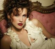
Portrait in pop art style lesson. Photo in Pop-art style
More and more often we see pop art portraits in our friends and acquaintances’ homes, and strangely enough, they fit perfectly into the interior. To make such a portrait, special companies charge a lot of money for it, although making it is not so difficult. If you understand and understand Photoshop at least a little, then this task will not be a problem. Let's figure out how to make a pop art portrait with your own hands.
We will do almost all the work on the pop art portrait using the Gradient Map tool, as well as various textures.
And so, let's begin our work!
1. We select the photo we need. In our case, there will be a fluorescent pop art work, so for it we chose a photo of a girl with beautiful lips painted red. First of all, open the photo in Photoshop and adjust the levels using the Levels tool.
2 . Create a new adjustment layer (click on the icon at the bottom of the Layers palette), select “Gradient Map”.

3. Using this tool, we can choose the tone that suits the photo. At each end of the scale we choose very bright and contrasting colors across the palette. We use light purple to yellow. You can adjust the colors as you wish.

4. Let's complicate our task a little and add a few effects. Create a new layer and select the Fill tool on it. Select Regular Fill Type and then a texture called “B.SG Halftone Dark L” from the drop down menu.

5. To make the texture fit into our photo, change the blending mode of the texture layer to Darken Base. This way we ensure that the texture fits into the look of our work. Then we can reduce the “Fill” parameter at the top of the “Layers” palette, set it to 80%.

6
. Now we need to apply the glare effect, and to do this, download the glare image and load it into Photoshop. We adjust the highlights to the desired size, and also do not forget to blur them.

7. Change the overlay of the highlights layers on the Screen. Set the Fill option to 70% to remove the black background.
How to learn to draw pop-art paintings from photographs. How and in what program to make a stencil, how to print it correctly, what colors to choose, how to cut out the stencil correctly and in what order?
There are several ways to make a Pop-Art painting, we will tell you about the traditional American technology in which Andy Warhol worked and which the Portret-Art workshop uses
Canvas preparation and format
To start making a portrait, you will need a fine-grained canvas on a stretcher. (format 30x40 in the photo)
We recommend using already primed canvases stretched on a stretcher, which can be purchased at any art store. You don’t need to do this work yourself, you will have to buy a lot of materials (stretcher, canvas, white primer, roller), and besides, the first time you definitely won’t do it as neatly as required for a pop art painting. The next step is choosing a canvas format; modern forms of art do not oblige the artist to use formats with the golden ratio. The most suitable formats for making a portrait: 30x40 40x50 50x60 60x80.
Buying a stretched canvas will not only save you time, but will also allow you to enjoy only the creative part of this interesting process, painting a Pop-ART painting from a photograph.
choice of portrait colors (background)

For Choosing acrylic aerosol paints is an equally important step. We use Italian paints MTN94. It should be remembered that pop art style is an excellent example of minimalism in art, surprising people with its brightness and simplicity. That is why we need only 3 tones: light, penumbra and shadow. (which we have already divided our portrait into at the sketching stage) Now the question remains: what color should we start with? We start with the penumbra, which is the main background of the picture. This color should be the brightest of the 3 main ones, as it will create the overall color scheme. To do this, we cover the entire canvas with paint, not forgetting about the ends and not leaving white gaps, but also do not apply the layer too thick, because then we may encounter difficulties in subsequent stages. Leave the painting for 10-15 minutes, the paint should be well dry.
We pay special attention to the accuracy of laying out the background and penumbra.
apply a stencil

To make a portrait we need two stencils. Namely light and shadow. The penumbra is already laid out as a background and cutting out another stencil makes no sense. On the printed stencil, we have 3 colors: white, gray and black. This will prevent us from making mistakes. Because they will match our colors in the picture. First of all we have to cut out the white (light) then the shadow (black)
Before we start applying the light, we need to return to our canvas and tape the ends of the picture. For this we use a paint scorch, the width of which is 20mm. This is necessary so that when applying paint, we do not go beyond the edges, which will greatly affect the visual perception of the finished work. Now we can start installing the stencil using weights of different sizes and shapes, because we will have to place them on top of the smallest areas of paper, distributing them evenly throughout the stencil.
Let's move to the light

At this stage, we begin to paint the cut out areas of the stencil with white. The paint canister should be held perpendicular to the tablet, at a distance of 20-30 cm. If you reduce this distance, you can get a very thick layer of aerosol, and if you hold the canister at an angle, paint will spray beyond the boundaries of the cut out stencil, and as a result, unevenness in the picture and spraying under the stencil or spreading of paint, which is unacceptable when using aerosol acrylic paints. The same consequences can occur if you do not place the weights well on top of the stencil. Therefore, try to complete all the steps indicated in the previous paragraph. There is no need to use caps with a wide spray pattern; these are more suitable for the background. More careful work is needed here.
Watch the tilt of your balloon and the distance to the tablet, the weights on the stencil, and don’t forget to shake the balloon periodically, not forgetting that we are painting with aerosol paints.
LET'S GO TO THE DRAWING AND COMPLETION OF THE PICTURE

At this stage we are laying out the shadow. We do not recommend using black for it. Dark gray or brown is best. Now you will have to tinker a little with installing the stencil, because now we are not placing it on a blank canvas, but on an already drawn light, and we need to make sure that the light on the canvas lies exactly on the light on the stencil, and only then start placing weights on top of the stencil. Next, we simply carry out all the points from the previous point. You also need to remove the stencil carefully and only on one side, so that the dark paint does not get on the light areas of the canvas. At the end of the work, the tape with which we glued the ends is removed, and after 24 hours the picture can be hung on the wall. Just enough is required for the paint to dry so much that the smell of aerosol paints disappears.
The final result depends on how evenly you can place the stencil on the already drawn light.
In this tutorial, you'll learn how to create a beautiful colored pencil drawing from a photograph, using artistic linework, gradients, noise effects to simulate airbrush techniques, and using standard tools to create a simple drawing design. Take out your tablet, open Adobe Photoshop, and let's get started.
Finalresult
1. Create a new document
Step 1
Create a new document in Adobe Photoshop (I'm using CC 2014), set the dimensions to approximately 8" x 10" at 300 ppi. The dimensions of this document are arbitrary, so you can use your own working document dimensions that are suitable for your original photo or for your design.
Open your original image. In this tutorial, I use the photo shown in the screenshot below, it can be purchased on the PhotoDune website. Select the entire image (Ctrl+A), Copy (Ctrl+C), and then Paste (Ctrl+V) the copied image onto our working document. Reduce Opacity(Opacity) of the layer with the original photo to 60%, and then click the icon Saves everything(Lock All) to lock the layer.

Step 2
The brush we use to create the artistic lines is a modified standard brush. Go to bookmark Brushes(Brush), in the settings, select a hard round brush, set the angle and shape of the brush, giving it a pointed ellipse look and an angle of 39° or approximately the same. With this brush, we will give our lines a polished calligraphic look. In settings Dynamics of shape(Shape Dynamics), select Control(Control): Pen pressure Size fluctuation(Size Jitter).

2. Outline the facial features
Step 1
Create a new layer and use the brush you just created to start outlining the model's eyes. Use a dark shade, just not black. I chose the dark purple shade (#362641). I decided to start by lining the eyelid, including lining the outer corners of the lashes. I carefully traced the line, making it thinner towards the center of the face.
Go over the drawn lines again a couple of times to straighten them, make them thicker and more uniform. Don't worry about too many details. We will carefully outline the facial features, so the facial details will not overload the entire design of the drawing.

Step 2
Continue tracing the model's facial features. Draw a thin line to represent the bridge of the nose, nostrils (nose wings and nostrils), and the tip of the nose. To outline the lips, I used a thin line on the upper lip and a thicker line at the tips of the lips, as well as in the center of the lips. To imitate shadow, use a thicker line under the lower lip.
Use the tool Eraser(Eraser Tool (E) to process the lines so that the lines are clear and uniform. That's why I work with a document at 300 px/inch: I can zoom in and work on the artistic line down to the smallest detail.

Step 3
To outline the eyebrows, I increased the diameter of the brush in the brush settings Different dynamics(Shape Dynamics) in the tab Brushes(Brush), and also installed Control(Control): Pen pressure(Pen Pressure) from the drop down menu below option Size fluctuation(Size Jitter). Start drawing the eyebrows from the center of the face to the side using two brush strokes. Use the eraser, reducing the diameter of the same brush we used.
Don't forget what the eyebrows look like in the original photo. You could probably outline them carefully, but in my opinion it's better to draw on the eyebrows with a brush, which will make your lines dynamic and interesting.

3. Draw earrings
Step 1
The earrings that are presented in this lesson are drawn using simple shapes and without a reference photograph of the earrings. Let's take a brush and paint them now:
1. Draw a simple circle. You can also use the tool Ellipse(Ellipse Tool (U) because I know how imperfect a circle can be.
2. Copy the drawn circle and then paste it onto a new layer. Next, flip the duplicate layer horizontally, let's go Edit - Transform - Flip Horizontal(Edit > Transform > Flip Horizontal). Using a tool Moving(Move Tool (V), move the duplicate circle layer to the right. Merge both circle layers (Ctrl+E). Next, draw a straight line between the circles, hold down the Shift key so that the line is straight.
3. Draw short straight lines on each side of the circle, and then use a brush to draw a curve from the left side point of the circle towards the center line.
4. Draw the same curve on the right side.

Step 2
Continue drawing the heart earrings, using #ce3681 as the final color to outline the lines:
1. Copy/paste the shape you drew in the previous step, reduce the scale of the duplicate layer by 50% or approximately. Place the duplicate shape in the center of the large heart shape. Merge both layers. Using a tool Feather(Pen Tool), trace the outline of the heart from the top center point to the bottom center point.
2. Create a new layer. Select a brush, make sure it's the same pointed brush that we set up earlier in this tutorial. Set the brush size to 4 px. Further, Stroke the outline(Stroke Path), selecting the brush as the stroke tool ( Translator's note: further, the author will create a whole heart from half the outline).
3. Copy, Paste, Flip Horizontally a duplicate of half of the heart outline. Turn off the visibility of the layer with the basic sketch of the earring. Next, combine both layers with the heart outline halves to create a whole heart on its own layer. Correct the contour of the heart using the tool Eraser(Eraser Tool) or Brush(Brush Tool).
4. Copy and Paste the outline of the heart onto a new layer. Zoom out on the duplicate layer to get the inner center part of the heart. Use the original layer with the base heart shape drawn to line up the center part of the heart. Create a new layer and using a brush, draw a straight line from the bottom point of the inner heart shape. Draw another line perpendicular to the first line, directing it to the right side, as shown in the screenshot below.
5. Complete the shape by drawing a third line.

Step 3
Create a new layer in the Layers palette. Next, using the tool Feather(Pen Tool), draw a simple plus sign shape using the rectangle you drew in the previous step. Remove the earring outline/baseline layers and refine the final earring design. Combine all layers with drawn earring fragments into one merged layer.

4. Complete the outline of the model's portrait
Step 1
Continue tracing the original portrait of the model. In this case, I decided from the very beginning to use the same hairstyle as in the original model photo. At this point in the tutorial, you can decide what details from the original photo you will use in your final design. Don't forget to draw parts of the model, such as hair, hands, etc. on separate layers so that these fragments can be easily edited if you decide to change the design.

Step 2
Move the earring image onto our working document, positioning the earring as shown in the screenshot below. Using a tool Ellipse(Ellipse Tool), draw small circles above the earring. Next, do Strokecontour(Stroke Path).

Step 3
If you decide to change a model's hairstyle that is different from the original image, then the following steps will be useful for you. Create a new layer and using a small diameter brush (the same pointy brush we used in the previous steps), start painting the hair curls. I started from the top of the head, drawing strands of hair up to the model's eyebrows. If you wish, you can use another photo to copy the hairstyle.

Step 4
To make it easier for you to draw the hair, turn off the visibility of the original model layer. Next, create a new layer and then draw lines to define the shape of the model's head, taking into account the model's facial features. This allowed me to get the right angle of my hairstyle. Next, I deleted the auxiliary layer with the sketches of the contour lines, because... I don't need him anymore.

Step 5
I have completely finished tracing the outline of the model image. Notice how the lines thicken closer to the outer contour of the image and become more arbitrary than those drawn within the contour of the image (in particular, this applies to the hairline). Once you've completed the outline, merge all layers, delete any supporting outline layers, and be ready for the next step, creating the airbrush effect.

5. Color the model's portrait
Step 1
My main color for this design is pale pink #ecd4f6. Create a new layer. Using a tool Feather(Pen Tool), trace the outline of the model image. Once you have closed the path, fill the selected shape with the specified color.

Step 2
Create a new layer on top of all other layers and then use the tool Gradient(Gradient Tool (G), gradient type Linear(Linear), drag the gradient diagonally. The gradient colors I chose: yellow, pink, purple.
Change the gradient layer's blending mode to Soft light(Soft Light). I turned off the visibility of the pink fill layer so you can see the effect of the gradient layer in the screenshot below. This effect will be more obvious in the next step.

Step 3
I highly recommend using gradient colors that complement the base fill color you've chosen for your model's skin color. In this case, we are talking about pastel colors. Using a tool Moving(Move Tool), move the pink fill layer down and then a little to the right to create an offset from the contour line.
Translator's note: move the color fill using the direction keys, i.e. move the fill using arrows.

Step 4
Create a new layer below the color layers. Select a tool Brush(Brush Tool), in the brush settings, select a standard brush Chalk(Chalk), also reduce Opacity(Opacity) of the brush to 60%, and also reduce Pressure(Flow) brushes up to 75%.

Step 5
Using a light shade, such as yellow (#fffdda), paint strokes around the outline of the model's image. I use this step to add a new color tone to the sketch, adding texture to the painting.

6. Add soft colors
Step 1
Create a new layer above the pink outline layer of the model image and below the contour lines layer. Using a brush, select the chalk brush, paint over the earrings, and also carefully paint over the outline of the model's eyes. Next, let's go Filter - Noise - Add Noise(Filter > Noise > Add Noise). Apply the settings for this filter as you wish.
In the filter settings, I set the amount of noise to 10% and selected the type of noise distribution Uniform(Uniform), and also checked the box Monochrome(Monochromatic).

Step 2
Create a new layer on top of the layer you created in the previous step. Select a tool Gradient(Gradient Tool), set Radial Gradient(Radial Gradient), a gradient color from the foreground color to transparent, where the foreground color is white.
Add a slight radial gradient to the model's lips. Do the same on the model's eyes, lightening the shadows on the eyes. Using an eraser, hide the white gradient effect behind the contour of the eyes and lips.

Step 3
Let's use soft gradients to simulate spray paint on the model's body.
1. Create another new layer. Using a tool Gradient(Gradient Tool), add small soft radial gradients of purple color (#9e57d7) on the model's shoulder and arms.
2. Reduce the opacity of the tool or layer if you think the color of the gradient is too saturated.
3. Loosen the gradient on the chest, where the arm touches.
4. Using a tool Moving(Move Tool), move the purple gradient down and a little to the right, exactly the same as we did in Point 5, Step 3.

Step 4
Just like you added a white gradient to the model's face, we'll also add the same effect to the hair. Create a new layer on top of the remaining gradient layers. Using a radial gradient from white to transparent, paint soft gradients on the model's hair. Hide areas of the gradients whose color is on the face.

7. Draw butterflies
Step 1
Create a new layer, then use a radial gradient, the color of the gradient from the foreground color to transparent. I used different shades of purple, blue, turquoise and pink, adding a spray effect around the model's head.

1. Using a tool Free figure(Custom Shape Tool), draw a butterfly. Next, go to the bookmark Outlines(Paths) and in the bottom panel, click the button Load outline as selection(Load Path as Selection). Copy/paste the copied butterfly shape along with the color gradient.
2. While on the gradient filled color layer, draw more butterflies. Load the active selection of the drawn butterflies, copy/paste to a new layer. Vary the size of the butterflies, as well as their placement, as you see fit.
3. Use a tool Moving(Move Tool) to move butterflies around the scene. Turn the butterflies, for this we go Edit - Transform - Rotate(Edit > Transform > Rotate). Once you are happy with the placement of the butterflies, merge all the butterfly layers and then turn off the visibility of the color layer we created in the previous step.

8. Add a spray paint effect
Step 1
Create a new layer again. Add colored radial gradients around the model's shape. Also add a white radial gradient in the center of the image to diffuse the gradients themselves. At this point, the painting looks like it has been airbrushed several times.

Step 2
Add noise to a new layer of spray paint. Set the amount of noise to 10-15%, and also select the distribution type according to Gauss(Gaussian). Don't forget to check the box Monochrome(Monochromatic). Click OK to apply the changes.

Step 3
Place this layer below the pink fill layer of the model's outline. Notice that after adding noise, the painting began to look as if it had been spray painted rather than simply airbrushed onto the surface of the painting.

9. Add More Patterns
Step 1
Create a new layer on top of the layer you created in Step 8. Using the tool Free figure(Custom Shape Tool), draw another shape selected from the standard set of shapes. I chose the figure Flower Pattern 2(Floral Ornament 2) in patterns.
Draw a flower pattern in the top right corner of your painting, overlapping the edges of your working paper.

Step 2
Select the tool again Gradient(Gradient Tool), gradient color from white to transparent, gradient type Radial(Radial). Carefully drag the gradient across the entire selection. The pattern is barely visible, so it is not as bright and also not completely white.

Step 3
Repeat steps 1-2 of this paragraph. Add more floral designs to the corner of your painting. If you wish, you can add floral patterns to the opposite corner of the picture; to do this, copy, paste, rotate the floral patterns.

Congratulations! We have completed the lesson!
This Photoshop tutorial will introduce you to a very famous movement in the visual arts like Pop Art.
Next to pop art is the name of Andy Warhol, who was an artist, a photographer, a film director, and a publisher.
It was he who, in the mid-20th century, created unique collage paintings from completely unexpected things - from images of cans to such glamorous collages with Elvis Presley and Marilyn Monroe.
This style became incredibly popular at the time, resulting in countless imitations of this artist's work.
Because creating pictures in the Pop Art style is very simple, especially if you know Photoshop.
The technique we want to tell you about is that first a black and white stencil is made based on the original drawing. And then parts of this drawing are painted in very bright colors in different variations.
Any portrait can be turned into a pop art drawing, but a photo with clear boundaries is especially suitable for this.
It is advisable that the person in the photo looks directly into the camera lens.
1. Below is the process of cutting out a boy from his original background and placing him on a new one. It is important for us that the boy and the background are placed on different layers.
To quickly remove a monochromatic background, use the magic wand tool, if the background is multi-colored, then take the Pen tool


2. Most likely, you have already noticed that pop art images are famous for their very high contrast.
The following steps will remove a lot of small parts, so you don't want to be too careful as you go.
Place the bright background layer directly below the working layer (with the boy).
3. To make a high-contrast image, first make sure you are on the cutout boy layer and select Image > Adjustment > Threshold.
Adjust the slider so that the image contains enough shadows that all the main shapes and features are preserved.


4. Roughly select each part of the image that you will color later.
Press Alt + Ctrl + J to copy each part to a separate layer. Give each new layer a name. Change the blending mode of each layer to Multiply, and click OK.

5. Activate each layer in the Layers palette one by one.
For each, press Ctrl + click on the layer window and go to the menu Edit> Fill.
Click on the Use line, a window will appear where you can select the Color line. Thanks to this, a color palette will appear, where you can choose a bright, saturated color to your taste to paint over any part of the image.


6. In the “Layer Style” window (Layer Style, appears if you double-click on the layer), select the Color Overlay style (color fill) and change the blending mode there to Color. Select a bright color and click OK.
7. When you repeat these steps for each individual section of the image, you will see that in front of you is a real masterpiece in the pop art style.

8. Save this file in Photoshop format (.psd) and make copies of the layers where you did the coloring. In your layers panel, each area is painted a certain color. Now you can very easily change the color of the area using the Hue/Saturation function (Ctrl + U).
In the end, you can combine all the options into one large image.
This combination of different versions of the same image is very typical of the style of 60s Pop Art.
Photoshop is truly a wonderful tool in the hands of a knowledgeable person. With its help, you can change the original image so much that it turns into an independent work.
If you are haunted by the fame of Andy Warhol, then this lesson is for you. Today we’ll make a portrait in pop art style from an ordinary photo using filters and adjustment layers.
Almost any images are suitable for processing. It's difficult to imagine in advance how filters will work, so choosing the right photo can take quite a long time.

The first step (preparatory) is to separate the model from the white background. How to do this, read the article at the link below.
Posterization
- Remove visibility from the background layer and desaturate the cut out model using a keyboard shortcut CTRL+SHIFT+U. Don't forget to switch to the appropriate layer.

- In our case, the shadows and highlights are not very well expressed in the image, so we press the key combination CTRL+L, calling "Levels". Move the outer sliders to the center, increasing the contrast, and click OK.

- Go to the menu "Filter - Simulate - Outlined Edges".

- "Edge thickness" And "Intensity" we remove it to zero, and "Posterization" give the value 2.

The result should be approximately the same as in the example:

- The next step is posterization. Create a corresponding adjustment layer.

- Drag the slider to the value 3
. This setting can be individual for each image, but in most cases, three is suitable. Look at the result.

- Create a merged copy of layers using a keyboard shortcut CTRL+ALT+SHIFT+E.
- Next we take the tool "Brush".

- We need to paint over the extra areas in the image. The algorithm is as follows: if we want to remove black or gray dots from white areas, then press and hold ALT, taking a color sample (white) and painting; if we want to clean up the gray color, we do the same on the gray area; with black areas everything is the same.

- Create a new layer in the palette and drag it under the portrait layer.

- Fill the layer with the same gray color as in the portrait.

Posterization is complete, let's move on to toning.
Toning
To add color to the portrait we will use an adjustment layer "Gradient Map". Don't forget that the adjustment layer should be at the very top of the palette.

To color the portrait, we need a three-color gradient.

After selecting the gradient, click on the window with the sample.


The color is adjusted as follows: double-click on the point and select a color.

Thus, by adjusting the colors for the control points, we achieve the desired result.

This concludes the lesson on creating a portrait in pop art style in Photoshop. Using this method, you can create a huge number of color options and place them on the poster.